Asus Zenfone Selfie review: Vanity light
Vanity light
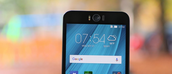
You almost can't tell it's Android 5.0.2 underneath ZenUI
The Zenfone Selfie comes with Android 5.0 out of the box, by now somewhat dated already. Google's OS has been the object of a total makeover by Asus, and the overlay is called ZenUI. It's not merely a skin too, instead the company has added a host of proprietary apps.
With the power button all the way up on top, you'll be grateful there's a double tap to wake feature. Sending the phone back to sleep works by double-tapping on an empty area of the interface. If you're running a full-screen app, double-tapping on the notification bar will do the trick. You could disable the feature in settings, if you want that extra 1-2 percent of standby endurance, but we don't see ourselves doing that.
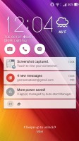
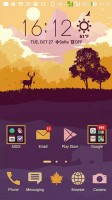
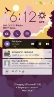
The lockscreen is a typical Asus affair. You're greeted by a time and weather widget, but also three shortcuts to the camera, dialer and messaging apps. They are customizable too, and you can assign any installed app of your choice to either of the three slots.
The list of notifications follows and, unlike some other Lollipop builds, double tapping on one takes you straight to the app that pushed it. Unlocking only works with an upwards swipe.
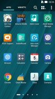
Beyond the lockscreen is the Android homescreen with four customizable shortcuts docked at the bottom, the app drawer shortcut always in the middle. You cannot add more icons beyond these four, but there is folder support. Removing one does not rearrange the others, leaving an odd empty space.
There are preloaded Asus and Google folders, packed to the brim with a selection of applications from the respective companies - custom Asus apps in one, and the default Google apps in the other. When you install a new app, the phone will suggest a folder for its placement, aiming to keep things nicely organized.
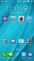
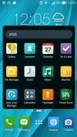
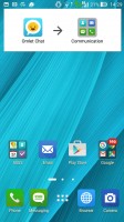
Default homescreen • grouping suggestion
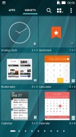
A pinch zoom lets you rearrange your homescreens, as well as select a default homescreen and add additional ones up to seven total, which can be cycled.
Holding your finger on a homescreen brings a popup menu. It gives access to icon packs (of which there's only one on board, but the Play Store has plenty), scroll effects (a grand total of 11) and wallpapers. Additionally, it provides another way to get to the app drawer and settings menu.


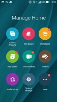

You can have a total of seven homescreens • Customization menu
There's a theming engine with plenty of free themes available online, if you want to abandon the default cartoonish Asus theme, or go for an even more colorful one.
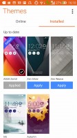
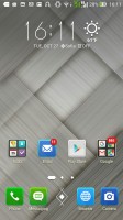
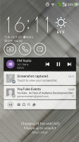
Theme store • Effect of themes on the interface
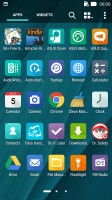
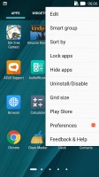
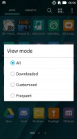
The app drawer has plenty of customization options itself. Grid size can be adjusted in the 3x3 to 5x5 range, with the latter making more sense on the 5.5-inch screen. Apps can be arranged alphabetically (the "All" setting), manually, or by frequent use, and you can also choose to only display the ones you downloaded yourself. Alternatively, you can have the Selfie group apps into folders according to their use.
The notification area has seen extensive customization as well. A single-finger pull-down only brings up the notifications and no quick toggles. Side swiping removes the notifications and a "clear" button does away with all of them at once. A second swipe from just below the date reveals the toggles, and whatever notifications you have left get squished to the little space underneath.
A two finger pull-down gets you straight to this state, which features a brightness slide with an auto mode, a 4-in-a-row set of quick tools and a 3x4 grid of toggles. Both the quick tools and the toggles can be chosen and rearranged, but you need to have exactly 4 tools and at least 8 toggles lined up.

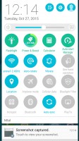
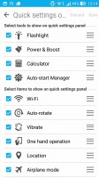
Notification shade with tools and toggles
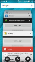
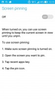
The task switcher is the standard Lollipop style virtual rolodex, but with a twist. In between the typical "Close all" button and shortcut to the Apps section of the Settings menu, you get a pinning option. What that does, is keep the selected app in view regardless of taps on the capacitive buttons. It's a bit fiddly to get out of requiring a press-and-hold on the back and task switcher buttons simultaneously.
Quick trigger is Asus' answer to the problem of handling large devices single-handedly. It's evoked with a double tap on the home button, provided you've enabled it first in settings. What it does is shrink the entire interface to a portion of the screen, which is resizable and can be moved around to suit left or right handed use.
With the touchscreen always-on for the double-tap-to-wake feature, Asus was able to implement a few other nifty shortcuts. For example, drawing the letter "C" on the screen while it's sleeping will wake the phone and straight up launch the camera app. "W" launches the browser and presumably stands for Web. While the letters are preset and you get six of them, you can assign any app of your choice to any letter - very convenient!
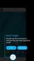


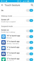
Quick trigger simplifies one-handed operation • Touch gestures
Reader comments
- Anonymous
- 01 Jun 2018
- 2SD
no infrared
- nithin
- 01 Jun 2018
- 2SD
Good phone with very bad battery life. 1 star rating is also too much for its battery. 99% Asus phones fails to make battery life atleast average. Gaming also too bad.
- Anonymous
- 18 May 2018
- Dkc
this is the worst phone i have ever seen with cost of 14000 Rs. (at launched time) except camera department all other is dump.....it does not mean that camera is very good at all, picture quality is fab..but processing time is very poor...and custome...
