Back to iOS after years of Android use
Two months with the iPhone 13 Pro
iOS
Seriously, how can there not be a separate volume setting for the alarm? Sure, there is a slider if you set up your alarm from the Sleep utility, but that very utility is a clunky and overly complicated way to go about your sleep/wake up routine, I think. I want a simple alarm that won't tell me when to go to sleep or change my lockscreen, but I still want at least some level of control. The lack of a setting for snooze interval is easier to live with but not ideal either.
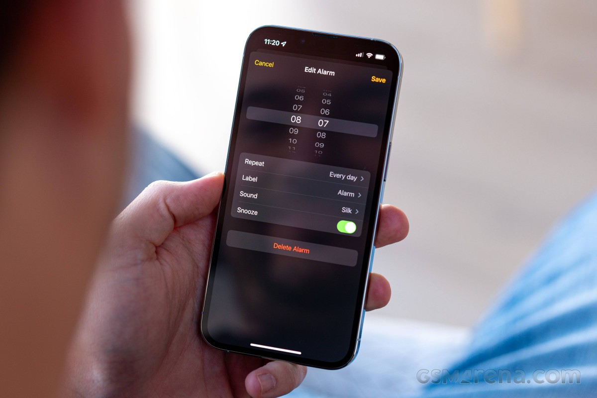
It's little things of this sort, annoyances rather than actual issues, that I've had to learn to accept and live with. I've been told that's just the iOS way - simple to a fault. It's what allows it to be so fast and fluid and all that, and while I do appreciate the smoothness, the balance point could be nudged towards just a handful of extra customizability, maybe?
I should point out here that I got the iPhone well aware of its software quirks and fully expecting there will be concessions to be made in terms of functionality. I wanted its hardware, though, and that was a price I was willing to pay. Having said that, right from the get-go, I tried to limit the Apple software in my life - no iCloud, no Safari, no Siri, not even their Photos app.
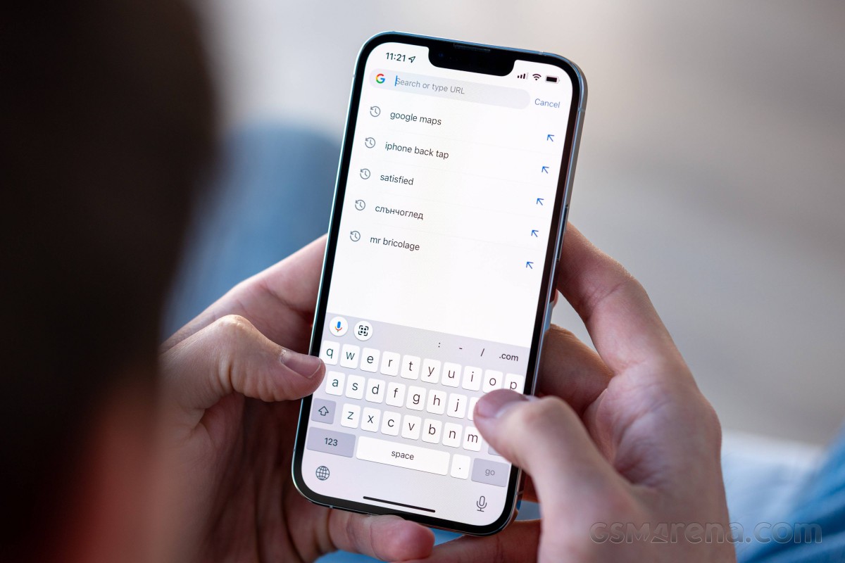
One of the things I can't really de-iPhone-ize is the keyboard, and it's one of iOS' biggest setbacks - it offers limited functionality and minimal options to change that. For one, there's no way to have a number row displayed at all times. A long-standing pain point of iOS' default method of input, it can be sort of circumvented by using Gboard - Google's keyboard at least allows you to have the digits accessible with a long press on the top-row keys. I was used to this long-press way of inputting symbols on Android, functionality that's missing on both the Apple and the Google keyboards.
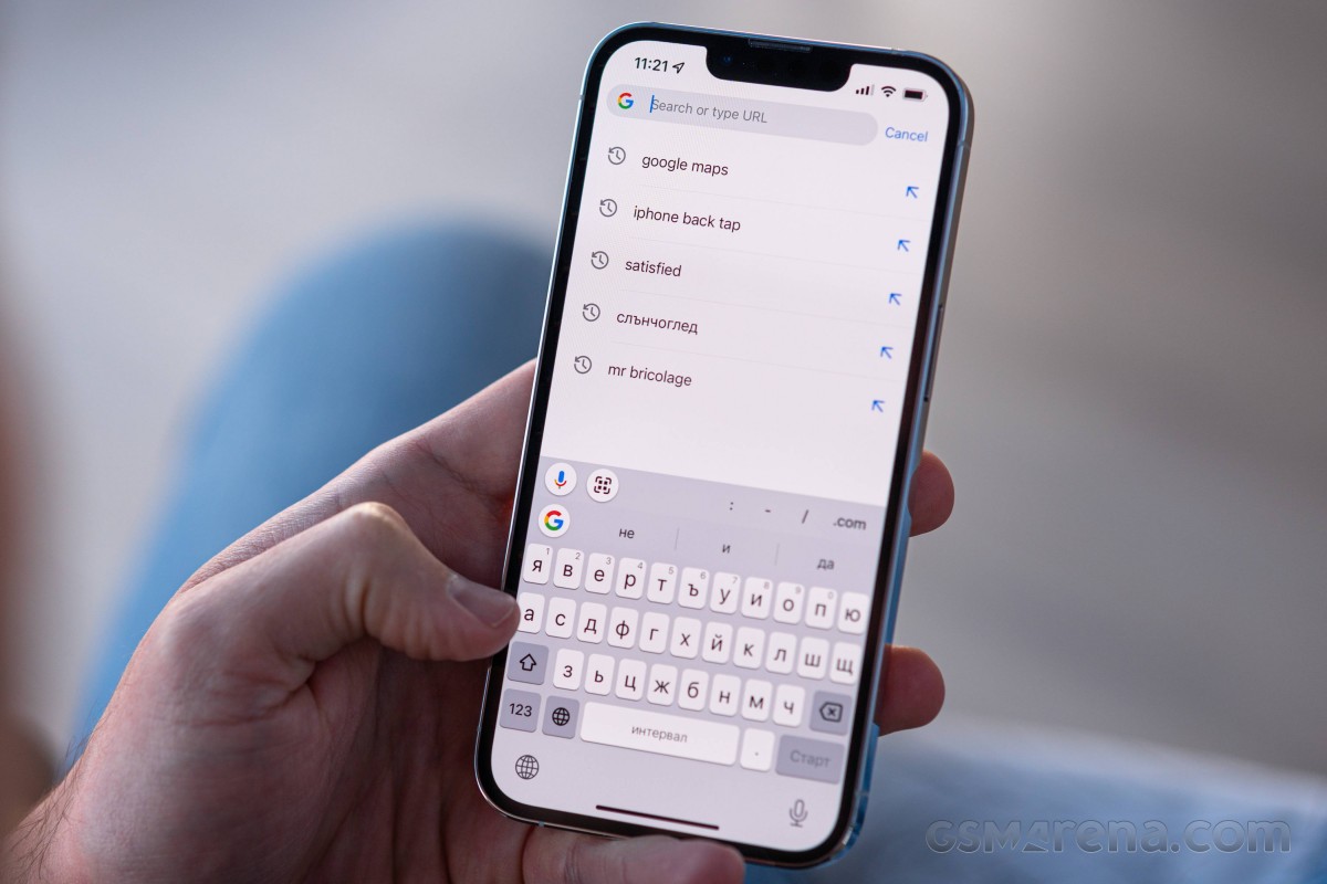
I used to complain about the lack of a setting to have the comma symbol available at all times (I'm a bit of a stickler for punctuation). As time went by, however, I adopted the swipe-in for a symbol method, and I found it a decent compromise. It was a revelation to find out that Gboard supports it, too, after I had already gotten used to it on the native keyboard.
Mind you, I have no love for any sort of auto-complete, and auto-correct, and auto-anything for my typing, so I can imagine the experience might be different if you let the phone do some of the typing for you. Not me, though.
My typing woes continued into navigating around the text input field. The more experienced iPhone users at the office have been trying to get me to use the tap on the space bar and swipe around method and it does work great. Only it works great in the native keyboard, while Gboard's implementation has its own issues like not being able to move vertically.
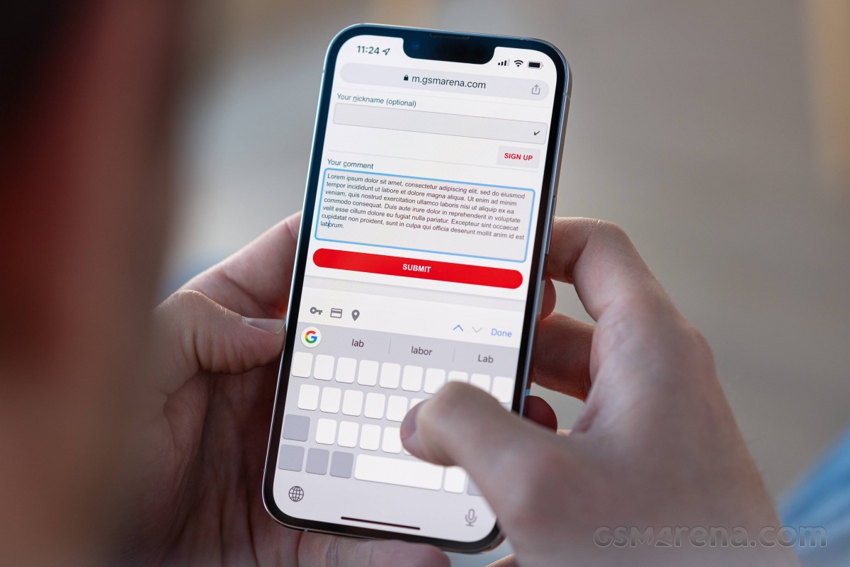
But that's the thing - Gboard has other features I find important like the number row workaround I already mentioned, but also haptic feedback on a keypress - Apple's own doesn't do that. I'd appreciate suggestions for a better keyboard that can do everything I want it to, since my App Store hunt for the ultimate keyboard has returned a myriad of god-awful colorful efforts and not one that makes sense practically.
Another aspect of navigation that manifests itself in typing, but is prevalent throughout the UI, is the inability to just tap and get your cursor to appear there. Through years of typing and editing, I've gotten pretty accurate at positioning the cursor where I want it with just a tap, but on an iPhone, the best you're going to get is the beginning or the end of the word - certainly not in the middle as it just doesn't do that. So it's tap to get to the word, then tap and press to move to the middle, and at this point, you're better off just resigning to deleting everything from the end to where you need to edit and retyping the rest.
A similar behavior is also present for all things sliders. You're at the bottom end of the brightness slider and want to get to the top - you can't just tap at the top; you've got to touch the slider and drag it in the direction you want. Or a progress bar in a video - you can't directly jump to a point, you have to do at least some sliding on the progress bar to get it to move.
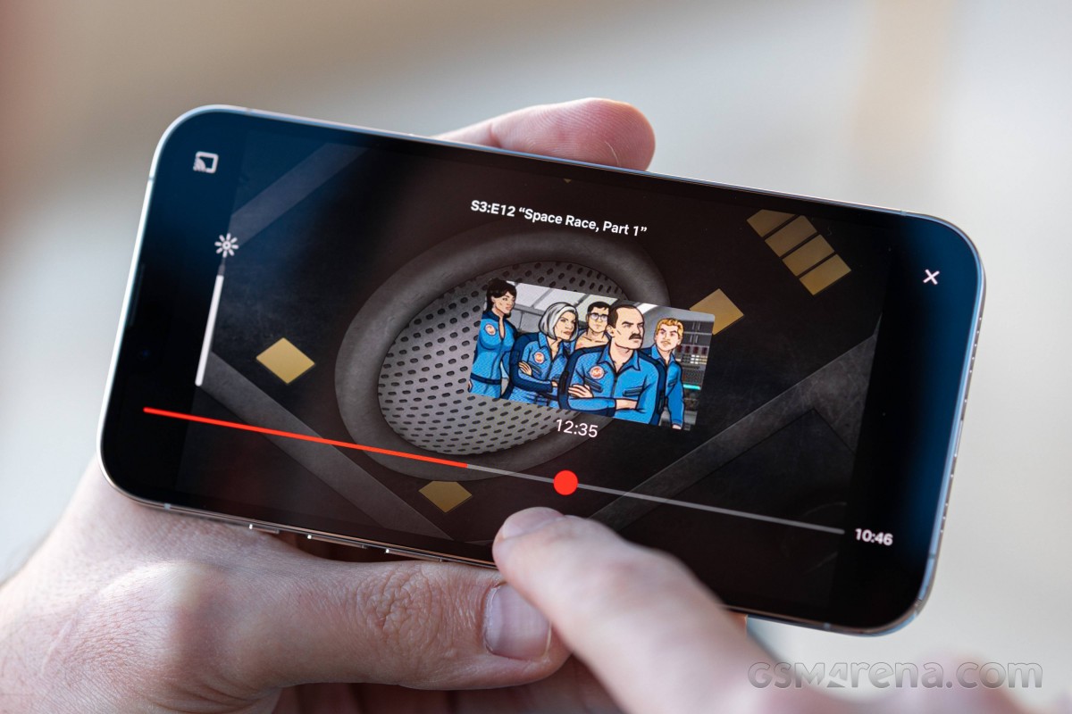
All of this may sound like nitpicking, and I know I'll read a bunch of comments saying I just don't get it or I'm using it wrong. Two months into it, however, I haven't really internalized this concept, and I'll die defending the hill that it's just dumb UI.
Reader comments
- Positive
- 02 Sep 2023
- Nue
What phone does my favorite "Will" use Hey what's up guys,am will for GSM arena 🥰😍
- Onimisi1
- 16 May 2022
- Nu6
I was searching for a genuine pro and I found nothing.... Lol guess I will have to say away from Apple now....
- Baldilocks73
- 20 Feb 2022
- 49Y
I’ve always been able to put the cursor at any point on a word in iOS, it’s not that difficult. You can also hold down on the space bar abs slide the cursor anywhere you want. I guess you just need to learn about how the software works - like tapping...