BlackBerry Storm2 9520 review: Back in Black... Berry
Back in Black... Berry
BlackBerry OS 5 goes touch
The BlackBerry Storm2 9520 runs the new, fifth, version of the company's proprietary OS. It brings a couple of nice new extras to the touchscreen-operated Storm, unlike most other BlackBerry devices which benefited very little from it.
If you have been keeping track you would know that we aren't in love with the BlackBerry OS looks but, in all fairness, the touch implementation is a bit better. The little 3D touch to the icons and the few nice transitions look better than what the 9700 Bold has to offer.
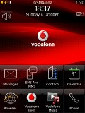
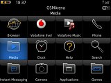
Touch makes the BlackBerry OS look better
The BlackBerry OS 5 also introduces kinetic scrolling which greatly facilitates handing of longer lists. The automatic rotation is also supposed to be faster now. Those upgrades have also made their way to the original Storm via a firmware update so they aren't Storm2-exclusive.
Unfortunately, very little has been done about the tons of plain ugly text-only submenus that can still be found in the BlackBerry Storm2. Even with the slickest theme applied you are still just a couple of clicks away from these eyesores.
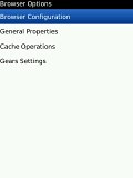

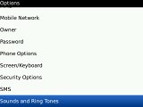
Unfortunately, there is still a lot of work to be done
And with the Storm2 we aren't talking hardcore business users only - the target audience has now widened and might include some people that, you know, might have an eye for the aesthetics. Touchscreen handsets need to provide nice user experience or else their existence is pointless.
Coming with a generally new touchscreen platform took quite a lot of R&D effort, but they should have saved some for the UI polishing. We really hate it when nice ideas fail only because of negligence. But we digress.
The homescreen is pretty well organized with 8 (by default) shortcut buttons placed at the bottom and all status icons at the top. The profiles can also be accessed straight from here, as well as two other features that you choose to assign to the convenience keys. Tilting the handset to the side doesn't bring a landscape mode of the homescreen but opens the main menu instead.

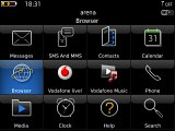
You can enter the main menu by simply turning the handset landscape
The BlackBerry Storm2 has a menu structure completely different from any other touchscreen handset on the market (save for the original Storm of course). Unlike the iPhone's what-you-see-is-what-you-get approach, you have a menu button here, which revels a list of context-sensitive options. You might want to spend some time learning what is available where if you are a newcomer to the BlackBerry world.
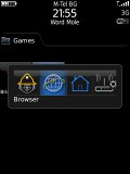
A press and hold of the menu key brings up the task manager
We are pleased with the Storm2 performance. Lagging was very rare and the handset seemed pretty stable for the time of our review. There was only one restart in about a week's time and that's not bad at all. RIM doesn't provide any information about the CPU inside the Storm2 but either it is faster than the original Storm or the new version of the OS is better optimized to make the device feel snappier.
Phonebook: this is Spartaaaaaa
Sorry, we just couldn't help it - the Storm2 Spartan phonebook graphics really brought it out in us. The unlimited capacity and the decent functionality is of course what matters more but, again, the overall experience counts too.
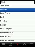
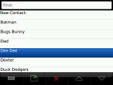
Not quite the looker this phonebook, is it?
The search line color has been changed from black to white in the new 5.0 version but that hardly makes much difference.
The contacts get listed alphabetically by first, last name or company in one of those black and white lists that we warned you about. You can search contacts by gradually typing a name like on almost any other phone.
You can put your contacts in one of two categories - personal and business and then filter your phonebook accordingly. There is also grouping available this time and you can create as many groups as you like.
Editing a contact gives you a vast number of fields which are organized in several sub-groups. You can also replicate some of the fields (those that you are going to need anyway) as many times as you like.
Telephony fares much better
Getting some eyesores from the phonebook we went over to inspecting the Storm telephony and we were in for a nice treat this time.
We really dig the Smart dial feature, which works when inserting contacts in messaging too.
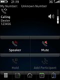
The BlackBerry Storm2 9520 in-call screen offers four large and easy to press buttons plus five shortcuts to features you are most likely to need during a call. Those include notes, calendar, contacts, dial pad and home screen. Well that last one might not be what you need during a call but it's the quickest way to an application that is not on the list.
The phone offers good in-call voice quality and we didn't experience any drops or coverage issues at all.
We also ran our traditional loudspeaker test on the BlackBerry Storm2 9520. We weren't overwhelmed but the Storm2 still snatched a good score, meaning missed calls are only likely in noisier environments. More info on our loudspeaker test as well as other results can be found here.
| Speakerphone test | Voice, dB | Ringing | Overall score | |
| Apple iPhone 3G | 66.1 | 62.1 | 71.7 | |
| BlackBerry Bold 9700 | 72.7 | 66.6 | 73.6 | Good |
| BlackBerry Storm2 9520 | 72.2 | 66.3 | 72.9 | Good |
| BlackBerry Storm 9500 | 75.8 | 65.0 | 72.7 | Good |
| HTC Touch HD | 77.7 | 73.7 | 76.7 | Excellent |
Reader comments
- Sunil
- 21 Dec 2016
- g}w
Blackberry
- EU PHONE REVIEWS PRO
- 23 Mar 2016
- puv
Only we don't like is the battery.It dead very fast.
- papanosend
- 31 May 2012
Can I get a new 1 in nigeria.
