Gigabyte GSmart S1205 review: A smart duo
A smart duo
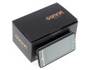
Modest retail package
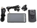
The tiny box of the Gigabyte GSmart S1205 packs everything you’d expect to get with such a phone. There’s a USB charger, a standard microUSB data cable and the usual paperwork.
There’s a one-piece headset, but the supplied headphones aren't your only option as the S1205 has a 3.5mm audio jack. However, there is no bundled memory card so you’ll need to buy one.
Gigabyte GSmart S1205 360-degree spin
The GSmart S1205 is more than decently sized for a dual SIM touch phone. On a second look though, the wasted space around the screen doesn’t quite make sense. The handset measures 110.6 x 55.0 x 13.1 mm and weighs in at 114.5 grams. It feels solid in the hand, but the battery cover creaks annoyingly every now and then when you tap the screen.
Design and construction
Touchscreen phones are not the best devices to get creative with design and the GSmart S1205 is no exception. It’s a simple handset, finished in black with gray accents down the side. Again, it’s a reasonably well built phone but perhaps looking a bit cheap for a PocketPC. But you know what – that’s not too bad. After all, it is a cheap PocketPC – and dual SIM at that.
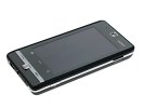
The Gigabyte GSmart S1205: nothing fancy on the outside
The Gigabyte GSmart S1205 uses a 3.2” WQVGA resistive touchscreen. It’s responsive enough, but the sunlight legibility is one of the poorest we’ve ever had to deal with. The plastic over the screen is highly reflective and gets covered in fingerprints in no time, which doesn’t help at all. Basically the screen is good enough indoors and as good as useless outdoors.

A small, resistive and low-resolution display
Above the screen we find the earpiece, which acts as a loudspeaker too. There is also a small status LED next to it. It blinks in different color to indicate charging, or various active connections.
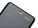
Earpiece and status LED at the top
Underneath the screen, there’s a mix of hardware and buttons and touch controls. You have a touch-sensitive (resistive) Start button to access the Honeycomb launcher. The other touch control is a Phone Settings key to access the various settings of the two SIM cards.
There’s no call management involved though, just the essential user-defined settings for the two phone modules. In between these two buttons is what looks like a home key but it doesn’t do anything other than turn on the backlighting of the two call buttons.
Further down are the call/end knobs, either side of the Center key. The latter is no Home button either – strangely it’s a confirm button and it’s absolutely redundant on a touchscreen device. It will activate the currently selected item in a list or icon in a menu. The only time it becomes remotely usable is in some of the custom homescreens of the Smart Pack plug-in.
It’s a shame really – a dedicated back button would’ve made so much more sense.

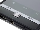
Too many touch-sensitive and hardware controls but still no proper Home or Back key
The left side of the Gigabyte GSmart S1205 features a thin volume rocker, while the right one hosts the dedicated camera key and the microSD card slot.

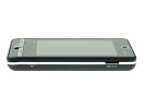

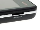
Volume rocker on the left • The camera key and microSD slot on the right
Unfortunately there is no cover for the card slot and it’s likely to pick up dust Cleanup is recommended every once in a while.
At the top we find the lonely and very thin Power/Lock key.
As usual, at the bottom of the phone you will see the mouthpiece. The standard microUSB port accommodates both the charger and the data cable. Right next to it is the 3.5 mm audio jack.

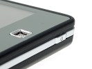
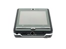
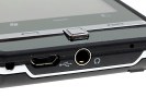
The tiny Power/Lock key • the microUSB slot and the 3.5 mm audio jack
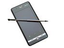
The other thing to note here is the stylus compartment. Unfortunately, there is no active stylus here – a feature we quite liked in some PocketPCs by HTC. What’s worse though is that the stylus is essential in the Gigabyte GSmart S1205. Despite the Smart Pack customization, using this phone isn’t exactly thumb-friendly. But more on this in the interface chapter.

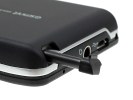
The stylus and its compartment
The back of the S1205 features only the 3 megapixel camera lens and the GSmart logo.
The material used on the rear cover is similar to HTC Desire’s soft-touch plastic – it’s still plastic but with a soft rubbery feel for a great grip.
Under the battery cover, you'll find the two SIM card slots and the 1320 mAh battery right next to them. The SIM beds are one on top the other and have a tiny lock mechanism. Tampering with the lock switch turns off the phone immediately.
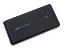
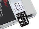
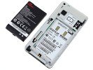
Gigabyte GSmart S1205 rare panel • the SIM beds • the battery
The Gigabyte GSmart S1205 is a well-built phone. It looks cheap but we guess most of the potential customers won’t mind the cost-cutting. No fancy finish, poor screen and all, this phone is trying to deliver where it counts and the lack of competition in the dual SIM smartphone niche certainly works in its favor.
We for one wouldn’t care so much about the looks and finish. The lack of proper Home and Back keys however does make the handling a bit awkward. Anyway, compromises were obviously inevitable but the price tag takes due notice.


Gigabyte GSmart S1205 held in hand
Take the jump for the custom user interface and applications.
Reader comments
- Bishop casey
- 25 Jun 2012
- HDQ
my hand set also broken, no one can help me to repair bbroken lcd. anyone there who could say something?
- Anonymous
- 17 Apr 2011
- SX1
LCD was broken. I cant repair it. It's very expensive for repairing - 100 euros!!!
- Jayaram
- 12 Feb 2011
- utV
Gigabyte GSMART S1205 is the best dual sim available with all the features of a mobile (except 3G and front camera). Its connectivity is super in both the sim. You will not miss any call any where. The sound volume though low is very clear. In distur...
