Google Nexus 4 review: Royal road
Royal road
User interface
Every new member of the Nexus family runs an updated Android version and the Nexus 4 is no exception. It has the latest Android release, 4.2 Jelly Bean.
Yes, it sounds like a routine .1 upgrade to the Jelly Bean we know, but there're quite a few new features added. We'll go over them in full in the following pages, but the Google Nexus 4 hands-on video below offers a glimpse.
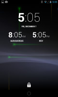
The lockscreen in Android 4.2 Jelly Bean features the same large dotted circle around the center-placed padlock button. But that's where the similarities to Android 4.1 end. Enter lockscreen widgets.
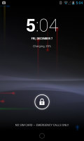
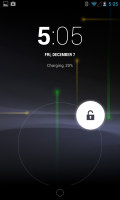
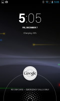
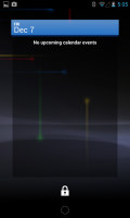
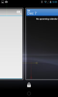
The Android 4.2 stock lockscreen
Widgets are full-screen, resizable tiles, one of which is always visible at the top of the main lockscreen, above the padlock icon. The rest are a swipe to the right away. The one on the main lockscreen is collapsed to make room for the padlock button, but can be expanded to display additional information.
As this is a brand new feature to Android, custom widgets are hard to come by, so you are left with just a limited selection of few stock ones: Messages, Calendar, Gmail and Digital Clock. The camera shortcut, previously located at nine o'clock on the unlock circle is now a stand-alone widget, a swipe to the left away from the lockscreen.
Lockscreen widgets are resizable - tap and drag down to expand and show more content, if available. Lockscreen widgets can also be reordered by tapping and dragging, so you can choose which one is visible on the main lockscreen. They can also be dragged up to discard.
There are multiple unlock patterns to choose from: simple slide, pattern, pin or password, and face unlock. The lockscreen could even be skipped altogether.
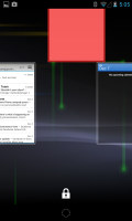
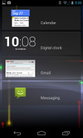
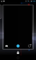
The Android 4.2 stock lockscreen
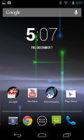
Once unlocked, you're welcomed with the familiar homescreen interface introduced in Ice Cream Sandwich. The bottom of the screen is reserved for the three navigation controls: Back, Home and Recent Apps.
Above the on-screen controls, you get the customizable shortcut dock - two shortcut icons on either side of the app drawer key. You can have folders there, each with multiple shortcuts.
Android 4.2 Jelly Bean isn't just business and no play. Google has integrated a little feature called Daydream, which is simply a sort of a screensaver. Once turned on, you can set it up to show photo albums or the latest news from Google Currents when the device is either docked or idle.


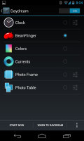
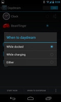
The new Daydreams feature is cool
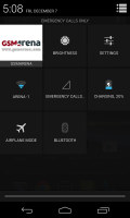
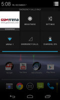
The notification center has been slightly revamped. Quick toggles have been added, accessible via an icon in the top right corner of the notification area. You get access to key device settings such as brightness, Wi-Fi, Bluetooth and Battery. They aren't actual toggles, but only quick access shortcuts to their respective panels in the Settings menu.
Currently, only the Brightness can be adjusted on the fly, without paying the Settings menu a visit. The quick settings menu can be accessed by a two-finger swipe down from the top of the screen.
Google has added a bit of personalization to the Quick Toggle panel in the notification area. Your name and photo are displayed but only after you've logged in to Google+.
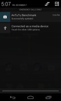
Notifications can be expanded and collapsed with a two-finger swipe, and the top one is expanded by default (if the app that put up the notification supports it, of course).
The homescreen consists of five panes, none to be added or removed, to fill with shortcuts, folders and widgets. More often than not, the latter are resizable in all directions in order to fit any tight space. To resize a widget, you tap and hold and then release. Four handles will appear on its sides, allowing you to change the widget's size in the direction you want.
Folders haven't been changed since Ice Cream Sandwich and function as you'd expect. A folder is created by dropping a shortcut on top of another and can be named by tapping on the "Unnamed folder" label. Opening a folder expands it only as much as needed to fit the icons inside.
The folders themselves are circular with the shortcuts inside drawn as if they are in a line one behind the other and you're looking at them at an angle (complete with perspective). They are lined up so the first shortcut in the folder will be the only one unobscured - the rest of the icons are nearly impossible to tell apart.
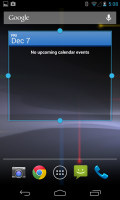
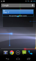
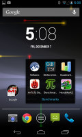
Resizable widgets and looking a folder
The app drawer of the Nexus 4 consists of 5 rows of icons, instead of the usual four. It features two tabs - Apps and Widgets, each with side-scrollable pages. If you scroll past the available apps you move into the Widgets tab. There's also a Market shortcut next to the tabs, for quicker access to Android's app repository.
Apps and widgets are ordered alphabetically and there's no other sorting option.
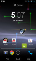
Placing a shortcut or widget on the homescreen works as you would expect: press and hold to grab it and then position it on the homescreen pane of choice. Two more options appear at the top of the screen while you're dragging - Uninstall (to quickly remove apps) and App info, which opens the application's entry in the Manage applications list. Drop the app or widget on either one to activate it.
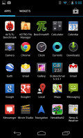
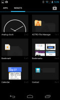
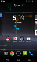
The app drawer and widget picker
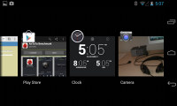
Last but not least, the Recent Apps list has remained virtually unchanged, save for some optimizations in load time and a few neat animations here and there. It all adds up as a really polished user experience and feels fantastic.
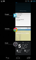
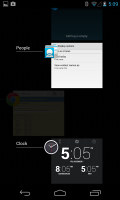
Resizable widgets and looking a folder
Here's where Google's Project Butter comes into play. We've covered it already, but it's generally Google's way of getting the Android user interface rid of stutter and lags. Essentially, Jelly Bean runs at 60 frames per second where the hardware allows it. Since software engineers didn't stop there, they also added triple buffering (CPU, GPU and display working in parallel, not waiting in turns).
As a whole, Android 4.2 Jelly Bean offers a polished and smooth user interface. The OS is getting closer to offering a lot of the features that skins like Sense 4+, Nature UX and Optimus UI have been having for a while now, and it's interesting to see Google's spin on them.
However, the Android 4.2 tweaks don't end here. Follow us as we continue to explore. Next up, Google Now.
Reader comments
- james
- 05 May 2024
- Sq6
Upgradable to Android 5.1 (Lolipop)
- Anonymous
- 21 Oct 2015
- 3%F
Press power button and volume down button in the same time
- AnonD-403739
- 07 Jun 2015
- H3M
The volume of my ringtone is diminishing down to zero sound. Can anybody advise the likely cause and cure?
