Samsung Google Nexus S review: Royal droid
Royal droid
User interface – stripped Gingerbread
We rarely get to see the default Android user interface but here it is, the latest available phone UI from Mountain View. Not much has changed since the last couple of versions, at least there are no major visual changes.
Still, there is plenty of polish and fine tuning that has gone into Gingerbread, so let’s begin.
We have the UI on video too, because static screenshots rarely tell the whole story.
The homescreen has grown two shortcuts around the virtual menu key – dialer and browser.
You get five homescreen panes, with dots in the bottom left and right corners, indicating how many screens in what direction. You can tap on the dots to move in that direction and a tap and hold brings up a thumbnail overview of all homescreen panes.
The main menu is the same as on the Nexus One – it’s vertically scrollable, with icons at the top and bottom edge curving off into the distance. This ups the eye-candy quotient of the menu, but it’s useful too – in very little vertical space, you can see the next four rows, which helps in finding the app you need.
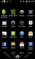
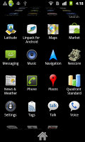
The main menu shoots for infinity
The homescreen estate is all yours to fill up with shortcuts to applications, folders and widgets of your choice. Folders can help you keep the shortcuts organized but you can't put folders within folders.
You can create a shortcut for just about everything – an app, a bookmark, a contact, a Gmail label or even a destination.
Live folders are also interesting – they automatically curate info, such as received Bluetooth files, recently opened documents and so on.
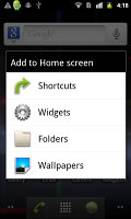
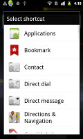
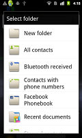
Adding to the homescreen • Shortcuts • Folders and Live folders
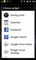
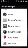
Widgets are the most practical part of the Android homescreen. You’re probably familiar with the widgets that come with the Google Nexus S – they are the default set included on every droid out there.
These widgets can be quite useful. The Power Control widget gives you one-tap command over the power-hungry features of the phone. The Rate Places widget is for those who like to read and write reviews of places they eat or just hang out. There are a couple of Google Voice widgets preinstalled too.
Live wallpapers really do bring the homescreen to life – they are always animated, always on the move. There’s a new one, Microbes. It shows a colony of “microbes”, which feeds (a tap on the screen produces more food), and when they get big enough microbes split into two.
Probably not particularly useful and it’s a drain on the battery, but as far as looks go, very little beats Live wallpapers. If usability tops eye-candy for you, then you can use regular static wallpaper.
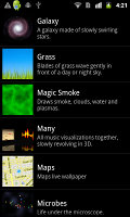
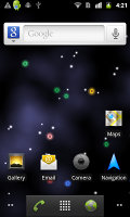


The Live wallpapers, including the new Microbes one
One of the most powerful and useful parts of the Android UI is the notification area. It shows various notifications (e.g. new message), but also has some more advanced features (certain apps can have corresponding widgets in the notification area). Since it’s accessible from everywhere, you can check the notification and go back to what you’ve been doing, or tap the notification to switch over to the relevant app.
The notification area does wonders for the workflow on Android. We were a little disappointed that Google didn’t do what some custom launchers do, i.e. put some more functionality into it (power toggles and such).
The task switcher is about the same as it was on the unskinned Eclair of the Nexus One, except that it now lists the eight most recently used apps (up from six). It’s just a task switcher, you can’t kill an app from here – and you shouldn’t have to, really, Android takes care of that all by itself.
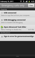
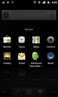
The notification area is one of the best parts about Android • The task switcher
Some of the more minor changes include new icons and an orange glow to signify the end of a list.
The Google Nexus S is running on the Hummingbird chipset we’ve seen on the Galaxy S, but Android 2.3 Gingerbread optimizes the performance. The experience is smooth with instant response.
The stability of the OS wasn’t rock solid though – it is a very new version but the video player crashed on us a few times, even the live wallpapers managed to crash.
One interesting change under the hood of Gingerbread is a new file system, Ext4. Google uses it in its data centers too, so we expect to see a speed boost in some benchmarks.
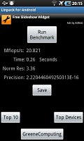
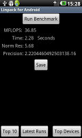
Here they are – the Nexus S benchmarks. We’ve pitted it against the Samsung Galaxy S and the dual-core LG Optimus 2X, both of which are still using Froyo. The Sony Ericsson XPERIA Arc joins the fight as the second Gingerbread contender.
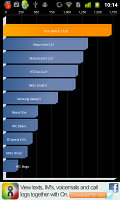

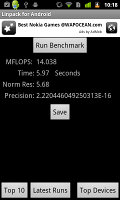
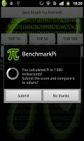
Google Nexus S (Android 2.3 Gingerbread, 1GHz CPU, 512MB RAM)
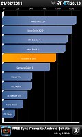
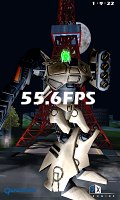
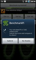
Samsung I9000 Galaxy S (Android 2.2 Froyo, 1GHz CPU, 512MB RAM)
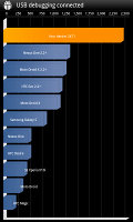

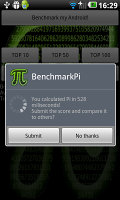
LG Optimus 2X (Android 2.2 Froyo, 1GHz CPU, 512MB RAM)
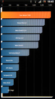
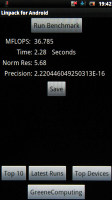
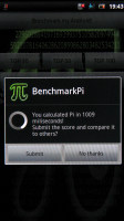
Sony Ericsson XPERIA Arc (Android 2.3 Froyo, 1GHz CPU, 512MB RAM)
A few quick words on the benchmarks. Neocore seems to hit the software frame rate limit that the Galaxy S had, so the GPU wasn’t going full throttle. It’s curious that the CPU-intensive tasks posted slightly lower results than the Galaxy S, but the Nexus S pulled well ahead in Quadrant, which includes memory and I/O tests. This could be the result of the new file system. We didn’t have time to do extensive testing.
Reader comments
- Faizu faiz shaikh
- 15 Oct 2014
- GQ9
Its a nice n very interesting features use n get response
- Anonymous
- 28 Jun 2013
- TXM
Maybe a review update is in order with android 4.1: http://www.google.ro/nexus/#/galaxy/specs
- Anonymous
- 01 Nov 2012
- utK
Galaxy s is the iPhone 4 competitor?? Kidding right?? It can competitor with nexus s but iPhone 4 is a way out of league. A phone with no update = it's a pice of crap Samsung at least should have given ICS for Galaxy S.


