HTC Sense 3.5 gets poked on video
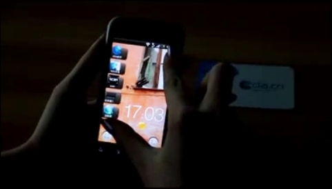
We recently saw the upcoming Sense 3.5 in leaked screenshots but now there is an entire hands-on video of a phone running the said UI. The phone running this UI itself is a yet-to-be-announced HTC Bliss, said to be targeted towards women.

From the video we can see that the lockscreen has seen minimal changes from 3.0 and in fact looks nearly identical. The first changes are seen on the homescreen, with new widgets on the side and a lack of the menu bar at the bottom of the screen. You still get the same seven homescreens with the helicopter view. The notification screen looks identical as well to that on 3.0.
The similarities continue with the rest of the UI, but you can still spot some changes, such as a new look for the tabs that appear at the bottom of the screen of certain apps. The transition effects in the UI have also been changed and they now are bit flashier. Overall the UI does seem snappy though, something we could not tell with the screenshots before, so all that glitz isn’t coming at the cost of usability.
You can check out the UI in action in the video below.
Reader comments
- AnonD-20831
- 16 Sep 2011
- KIf
Waiting for SENSE 3.5
- sethpogi
- 01 Sep 2011
- vaN
wth? sense 3.5?! port sense 3.0 first on the desire Z, S, and HD first!
- ikypop
- 31 Aug 2011
- H5x
HTC need to wise up and sort their tech boys out,Sony Ericsson & Motorola are stealing the smartphone SHOW.


 Samsung
 Samsung
 Apple
Apple Apple
Apple Xiaomi


