HTC Titan review: Huge is the new big
Huge is the new big
People Hub as a phonebook
The People hub is present in the Phone app too. It takes the form of a contacts tab but only instead of contacts, you have people with profiles – a term taken right out of social networking.
The first screen of the People hub shows you a list of all your contacts (phone contacts, social network friends, email pen friends – everything), with a search shortcut and an add contact button.
Contacts are ordered alphabetically, indexed with colored squares with a letter. You can tap any one of those letters boxes and the screen shows you the whole alphabet highlighting the letters actually in use. You can tap a letter to scroll to that part of the list.
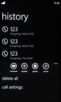
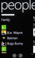
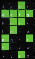
Call history • Contacts • Contact search
Contacts can be sorted by either first name or last and they can be displayed as “First Last” or “Last, First” (the two settings are separate), you can also include or exclude Facebook friends, import only Facebook contacts that have a phone number and add several accounts to sync with.
Swiping to the side shows only new events from all contacts from social networks. Another swipe shows the recently called contacts. Instead of favorites, you can pin a contact to the homescreen.
Viewing a contact’s profile shows the contact photo. Below that there are actions – “call mobile”, “text mobile”, “write on wall”, “view website” and so on. Below each actions, in smaller type and grey or blue letters, are the target for the action (e.g. phone number, email, site URL) and where that info came from (Google, Facebook, etc.).
The soft keys let you pin a contact, link two (or more) contacts from the various services and edit. Swiping to the side brings out the “What’s new” panel”, which shows the latest updates and events just from that contact.


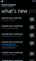
A contact’s profile • what’s new with Dexter
When editing a contact, you can add multiple phone numbers and email addresses of different types (home, work, etc), a custom ringtone, a note or a variety of different fields (like birthday, website, office location and so on).
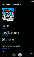
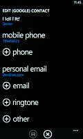
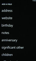

Editing a contact • linking two contacts
Telephony is good
Call reception on the HTC Titan was good and it held on to signal even in closed quarters where by default the signal bars drop a few. In-call sound quality is brilliant and loud.
The phone application shows you the call history, with shortcuts to voice mail, dialer and phonebook. The phone live tile will show the number of missed calls as will the lock screen.
The dialer itself is as simple as it gets – a phone keypad with a Call and a Save button. The lack of smart dialing is an annoyance, but the People hub is good at finding contacts.
You could use voice dialing instead - the HTC Titan did good in recognizing our commands, though it did have issues separating the two Dexter's in our contact list - "Dexter" and "Dexter Morgan". Still, it did recognize the unusual name "Mandark".
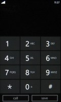
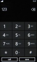
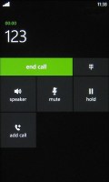
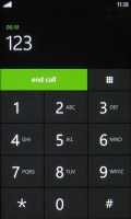
Dialer • In-call screen
An interesting option is the International assist – it comes in handy for dialing while abroad or calling someone outside the country. What’s missing is the ability to set any song from your collection as a ringtone – a feature some of you might miss. You can download new ringtones from the Marketplace though (possibly at some cost though).
When there’s an incoming call, the contact’s photo will appear full screen and you can slide up to reveal the answer and reject call buttons. This will prevent any accidentally answered or rejected calls.
A quick note – status indicators are hidden by default (except the clock) but you can bring them up with a quick tap on the very top of the screen.
We did our traditional loudspeaker test on the HTC Titan and it got a Very Good mark. Turning the device on its back increases the ringing even more. More info on our loudspeaker test as well as other results can be found here.
| Speakerphone test | Voice, dB | Ringing | Overall score | |
| Samsung I9000 Galaxy S | 66.6 | 65.9 | 66.6 | |
| LG Optimus 2X | 65.7 | 60.0 | 67.7 | |
| HTC Sensation XE | 65.8 | 65.4 | 76.9 | Good |
| HTC Sensation | 66.5 | 66.6 | 78.3 | Good |
| Samsung I9100 Galaxy S II | 70.0 | 66.6 | 75.7 | Good |
| HTC Titan | 75.8 | 66.2 | 82.7 | Very Good |
| HTC Gratia | 73.2 | 73.6 | 83.5 | Excellent |
All-round messaging
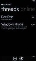
Messaging was heavily retooled for version 7.5. Threads are the building blocks of all non-email messaging. Although a sort of conversation view, threads mash together SMS, Facebook and Windows Live messages.
That's the thing about Windows Phone: the Messaging hub removes the old division between texts, IMs, social messages. The other hubs do the same for the other functionality, making the whole thing simple yet powerful.
Anyway, Messaging is separated into two tabs - threads and online. Online shows you who's online with the people you've talked to most recently on top. This makes finding someone to talk to very easy.
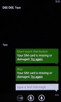
Threads is where this hub's impressive features kick in. A new thread is created for each person you start a chat with. Messages are displayed as speech balloons and a label on the left shows the type of message - text, Facebook or Live Messenger. Labels are placed only when the conversation moves to a different platform so it's not cluttered.
You can choose which platform to use to send a reply and the text box will remind you what you're currently using with a message like "chat on Facebook". Individual messages can be copied (the whole message is copied to be pasted later, you can't copy only a part of the message), they can be deleted or forwarded. Whole threads can be deleted too.
You can't attach anything to Facebook messages, you'll need to use MMS for that.
The visual voicemail functionality is also part of the new OS (that is dependant on the carrier and your plan). It works as you would expect, by letting you read your voicemail messages instead of listening to them.
Moving on to email where Mango contributed too.
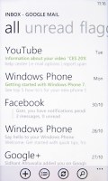
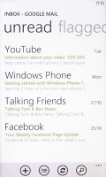
One of the highly requested feature was a unified inbox for email - and Windows Phone 7.5 delivers. You can now link multiple inboxes (and unlink them individually later), so that you have a single place to check for new messages.
Linking several inboxes will also automatically combine their live tiles. You can browse individual folders for each account, which lets you view messages from only one email account even if it's linked.

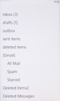

Email main screen • Linking inboxes
Conversation view was expected - it lists emails between you and a contact chronologically, grouping them by subject. It’s the display style that Gmail popularized and is the best way to keep track of a conversation over email.
Each email conversation is listed with a subject and number of messages, plus how many of those are new. A tap on a conversation expands it to show the messages plus a line from each message.
You can tap on an individual message to read it, as well as skip messages back and forward to navigate the conversation. We expected to be able to swipe between the messages, but that wasn’t the case.
You can mark individual emails, make them read/unread, set flag, clear flag and more.
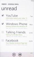
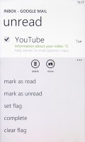
Marking emails • Email options
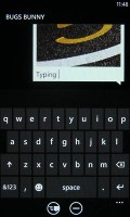
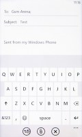
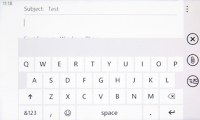
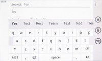
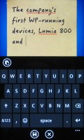
Text input on Windows Phone constitutes of the default QWERTY keyboard and offers portrait and landscape modes - that's it. The layout remains the same on all WP devices and the only options you have are changing the language of the keyboard and resetting the dictionary that displays word suggestions.
The WP QWERTY keyboard is very comfortable to use and offers sound feedback. There's no haptic vibration feedback and there's no way of enabling it.
The keyboard comes in many sizes, depending on the device. On the HTC Titan it's very comfortable and given that currently the smallest WP7 screen found on a phone is 3.5" there can't be any size complaints.
Finally you can search your entire mail for individual emails - it's a very useful feature, especially for those with large inboxes.
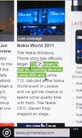
Text selection and copy-paste functionality were desired functions even before the 7.5 Mango update. They became a reality with the pre-Mango No-Do update. Selecting text is very simple, but does require some getting used to. You hold your finger over some text for a second or two and then release. The text area gets highlighted and then you can move the beginning and end cursors to adjust how much text you want to select. A little icon pops up for copy and the selected text is available to paste anywhere in the OS.
Reader comments
- AdamBoy64
- 23 Nov 2017
- Hqc
I appreciate being able to go back and read these reviews. How much has changed in 6 years.. It is a shame Windows Phone ended the way it did.
- che
- 26 Apr 2014
- t7X
I don't know how to transfer files using HTC titan Bluetooth.
- che
- 26 Apr 2014
- t7X
I don't know how to use its Bluetooth since I can't transfer music from other phone going to HTC titan.
