HTC Wildfire review: Desire Mini
Desire Mini
Retail package: good enough
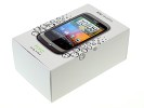
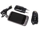
Considering the lower price range, the HTC Wildfire’s package is fairly complete. It has the essentials and a couple of small perks: a 2GB microSD and a one-piece headset with music controls. The headset uses the a standard 3.5 mm audio jack so you can use your own instead, but you will have to live without the remote.
The microUSB cable plugs into the charger so you will need both to charge your HTC Wildfire the old fashioned way. USB charging is enabled too. A bunch of manuals complete the list of items in the box.
HTC Wildfire 360-degree spin
Keeping it compact was high on the Wildfire designers’ priority list. At 106.8 x 60.4 x 12 mm the device can easily slip in any pocket – let alone a purse. The phone certainly hopes to appeal to both male and female customers, and has the color range to do it. The Wildfire will be available in white, black, brown and red.
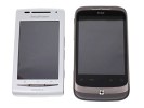
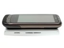
The Wildfire next to the Sony Ericsson XPERIA X8
And while some may frown at the relatively heavy weight of 118 grams, we actually think it’s a benefit. The nice solid feel we’ve come to expect from high-end phones brings the Wildfire another step closer to the HTC Desire.
Design and construction
So, the Wildfire is a pretty close replica of the Desire (and the Nexus One). It doesn’t have the kind of looks to make your heart skip a beat, but it’s a subtly stylish and solidly built phone – and that’s nothing to be ashamed of.
Ok, it’s a phone that will grow up wearing its older brother’s old clothes. But we don’t have to worry about its self esteem. The designers were after decent functionality in an attractive looking package and we think they’ve done a pretty good job. The only thing to be concerned with is the screen. WVGA AMOLED was a treat in the Desire, but sadly the Wildfire is nowhere near that.
At 3.2” and QVGA resolution, the HTC Wildfire touchscreen offers the lowest pixel density we have seen lately and that’s a real disadvantage for the picture quality. 125 ppi is pretty good for a computer screen but you look at it from a much greater distance. The Wildfire you are meant to hold in your hands.
The contrast levels of the LCD unit are also quite underwhelming and we’re particularly disappointed with the depth of blacks on the Wildfire screen. The brightness levels are good but they are not enough of a boost for the overall poor picture quality.
And the Wildfire isn’t any better when exposed to direct sunlight either. You will struggle to find a proper angle for working with the phone when outside on a bright sunny day.
In general, the screen is where most of the cost-cutting has been done on the Wildfire. This doesn’t seem like a particularly smart move. The fact is, on a full-touch device the screen is almost all you look at and use. Having such a relatively large yet low-res screen creates a rather negative effect for the whole user experience.
On a positive note, the sensitivity of the capacitive touchscreen is excellent, plus 3.2” is more than enough space to press on. But still, a smaller display to make the low resolution less prominent might have made more sense, and the device would’ve been even more compact too. We just can’t see the point of making such a big QVGA screen. Neither Android nor HTC Sense looks good on it.
Below the display we find four capacitive controls. They are in charge of bringing you back to the homescreen, opening the context menu, taking you a step back in the menu navigation and getting you to the quick search box.
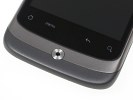
There are four touch-sensitive keys below the display
Sufficiently spaced and sensitive enough, those cause no usability problems whatsoever. The transition between them and the screen is seamless.
Under those four keys we find the optical joystick, which by the way is of pretty limited use. It will work in some menus to replace sweep gestures and can be used to take the occasional photo but that’s about it. Most users would probably never notice even if it didn’t work at all,– you can get by just fine without it.
Above the display we see the earpiece, the proximity sensor and the status LED.
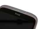
The status LED and the proximity sensor are next to the display on top
The left side of the Wildfire features the large volume rocker and the exposed microUSB port. The right side of the device is completely bare. A dedicated camera key would have certainly been nice.
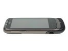
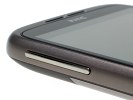
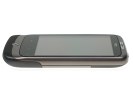
The volume rocker and the exposed microUSB port • The right side is perfectly bare
At the top there are a couple of elements to note. The silver key in the right corner is the power/screen lock button, the 3.5mm audio jack is at the other end.
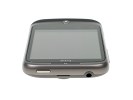
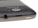
The audio jack and the power key are on top
The tiny mouthpiece is the only thing of interest at the bottom.
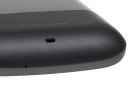
The mouthpiece is as usually, on the bottom
The 5 megaxpixel camera lens is near the top of the back cover, flanked by the loudspeaker grill and the LED flash. The lanyard also attaches at the back, near the bottom of the phone. You do need to remove the cover to attach it though.
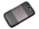
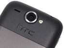
The camera lens is flanked by the loudspeaker and the LED flash
Under the cover you will find the microSD card slot and the 1300 mAh battery. The Li-Ion unit is quoted at up to 480 hours of stand-by or 7 hours and 20 minutes of talk time in 2G networks, and 690 hours and 8 hours in 3G mode.
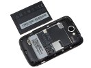
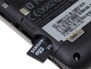
The microSD card slot is under the battery cover
Those are some impressive numbers indeed but here’s one case perhaps where the low-res screen does count in its favor. The Wildfire did last for about three days of moderate use (10 minutes of calls and just under an hour of using the other features a day), which is still good but not that great.
The HTC Wildfire feels nice in the hand. Its size is just perfect for single-handed use and the screen sensitivity is a point in favor too. It’s ultimately the same screen though that puts the whole package in question. Users coming from touchscreen feature phones will probably not notice anything wrong. But upgraders from the Magic or the Tattoo might be disappointed.
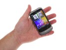
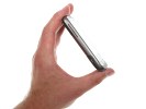
Handling the Wildfire feels nice
We have no arguments with the build quality and the finish. The Wildfire is a solid looking and stylish phone that will suit conservative tastes. There’s a selection of paintjobs too for those looking for something more expressive.
Now let’s go through the software side of things.
Reader comments
- Thiza
- 22 Apr 2025
- X5X
My htc phone has a becoming hot
- J
- 28 Dec 2016
- 9F7
Jumped into a swimming pool back in summer 2012 with this phone in me pocket, I thaght it was completely water dammeged but I decided to try n charge and woop woop it works hahaha excellent phone back when I first got it in 2010 but there nothing com...
- math
- 08 Feb 2013
- srr
No, it does lier
