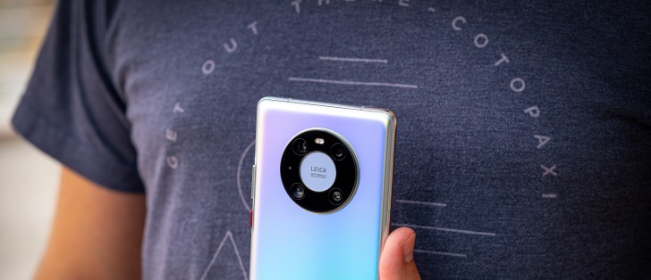
A month with the Huawei Mate 40 Pro
EMUI 11 is still Android 10
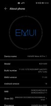
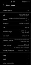
The Mate 40 Pro runs EMUI 11, and with that number, you might expect it to be based on Android 11, but no - it's still Android 10 under the hood. That's weird, and we're assuming it's connected to one of the multiple bans from the US Government. This, however, raises more than one question - we're not sure if the Mate 40 Pro will ever be updated past Android 10.
Huawei seems more focused on its upcoming Harmony OS at this point, so it hasn't said anything about underlying Android version updates. A good rule of thumb would be, in our view, not to expect anything but EMUI updates, and then, perhaps, at some point in the future, an update that will replace Android and EMUI with Harmony OS. At least that's what the rumors seem to think will happen, but we'll cross that bridge once we get to it.
On the security patch front, things aren't as good as we would have hoped. We have received one minor update during our month with the phone. Still, even after that, our review unit was stuck on the September security patch level, which is unacceptable for a flagship smartphone. We wouldn't expect the timeliness of these updates to improve in the future, either.
Current software
EMUI 11 is a very evolutionary update, and as such, it's incredibly similar in looks and functionality to its predecessor, EMUI 10. If you've used EMUI 10 before, you'll feel right at home, but you will also find some neat additions here and there, and some improved design too, but nothing too revolutionary. We can't object to this, as EMUI was already one of the best Android skins out there even before version 11 regarding what it delivers and how speedy it feels in operation.
One of our pet peeves with EMUI 10 that hasn't changed one bit in EMUI 11 is the icons' placement in the status bar up top. Huawei likes to do its own thing here, giving us a setup that's unlike anything else in the Android world, with the Wi-Fi, mobile connectivity bars, and VoLTE/VoWiFi indicators all residing in the leftmost side of the usable space, while the clock, battery icon, Bluetooth, vibration, and alarm icons are at the opposite end. Because of the big pill-shaped cutout for the camera and face unlock sensor, the icons on the 'left' end up being almost centered on top of the screen, with notification icons showing up to their right.
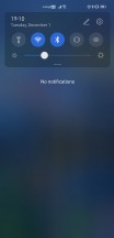
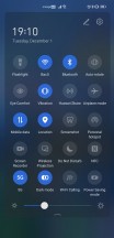
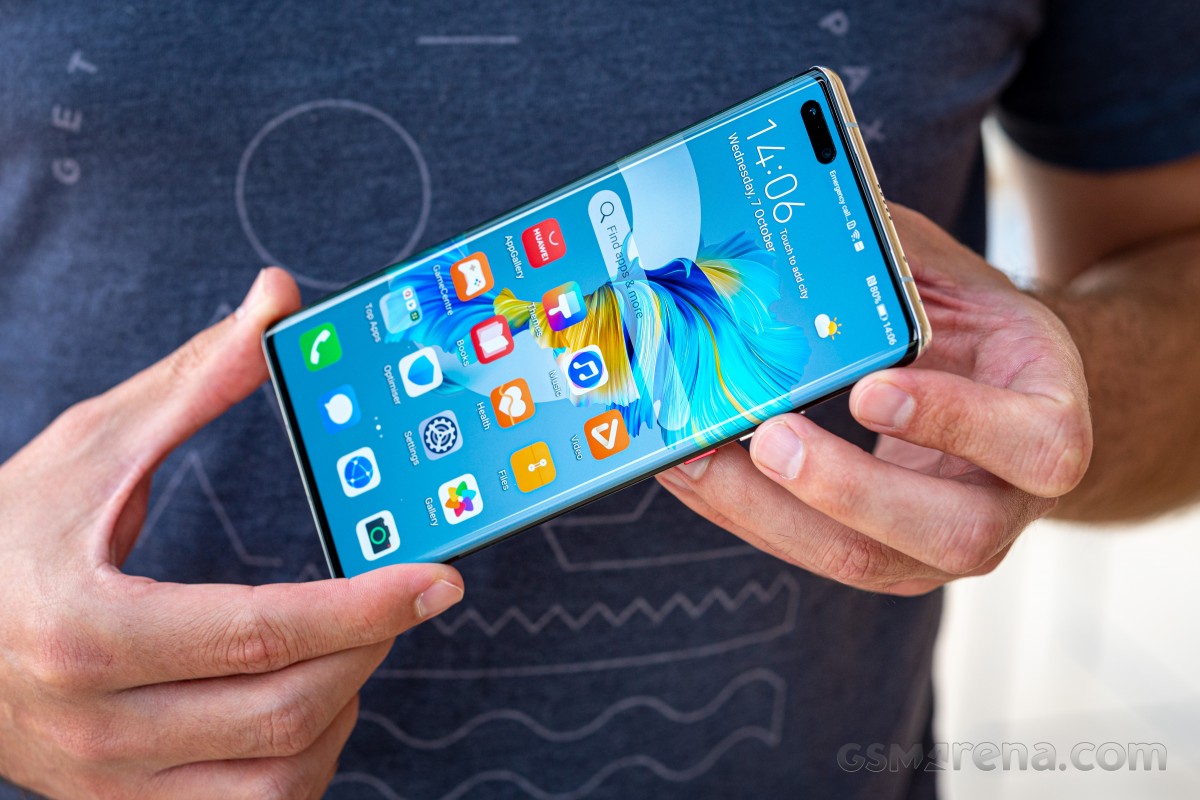
EMUI 11 design, weirdly placed icons
The combination of the big notch and the placement of these connectivity icons makes for unintuitive placement of the notification icons. It's not a huge usability issue, but nonetheless, we can't figure out why Huawei decided to organize its icons this way.
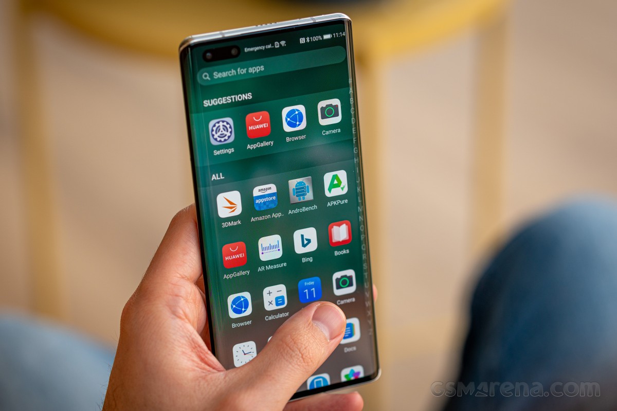
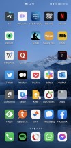
Launcher
The built-in launcher has an app drawer, thankfully, and there's not really much more we can say about it. It's there, it works, and is a godsend for people like us who have 200+ apps that would otherwise clutter up home screens left and right.
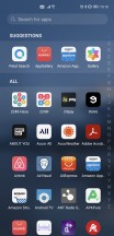
The launcher also has the Today screen to the left of the leftmost home screen, and it's apparent that it wants to present itself as an alternative to Google's Feed, but what it shows seems to be a more or less random collection of news items. Google definitely has the upper hand when it comes to the personalization of what you're being shown. On the other hand, Huawei's Today view is infinitely scrolling, and the transition to it from the leftmost home screen (and back) is by far the smoothest we've seen so far on any phone that has such a panel/view/screen.
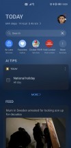

Launcher and its settings
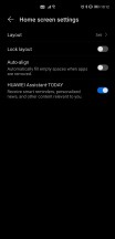
The main issue we've had with the launcher is that there's still no setting to make a swipe down from anywhere show your notifications pane. So when you perform that gesture, as we did after having been used to it from basically every other Android phone out there, you're sent to a search screen, which is just Petal Search in disguise. We'd much rather have a choice here, but we don't, and that means that you always have to reach the top of the screen to pull down the notifications shade, which considering how big the Mate 40 Pro is, isn't always doable without some awkward finger/hand placement gymnastics.
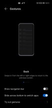
Settings, Dark mode, gestures, Recent apps
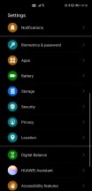
By now, you're probably used to Android phones having ample, convoluted Settings menus, and the Mate 40 Pro is no different. The top-level section isn't overly long, but there are, of course, submenus within submenus to discover. It's not the worst offender from the organizational structure point of view, either. In fact, it's probably one of the more logically organized we've seen recently.
The good thing is that most settings are easy to live with in their default states, so you don't necessarily have to dive into the menu countless times unless you want specific things to behave in a very specific fashion. Even then, you can use the very good search bar up top to quickly jump to where you need to go.
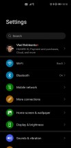
Settings
There's a Dark mode too, of course, and it works well while being very pleasant looking, with ample use of real blacks and not very many dark gray gradients. It works well; by this point, dark themes are fully a solved problem in the Android world, thankfully.
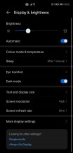
Dark mode toggle
The gesture navigation is excellent, easily among the best implementations out there. As usual, you swipe from the left and right edges to go back, from the bottom to go home, and from the bottom and hold to open the Recent apps menu. All of this works very well all the time, but you can additionally enable a setting that lets you easily switch between apps by swiping across the bottom of the screen, even with no white line monstrosity being visible there (the way Google would like it).
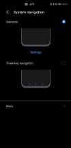
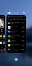
Gesture navigation, Recent Apps screen
This ability to quickly move through apps with a left or right swipe across the bottom of the screen is very well done and has been one of the most pleasurable aspects of using EMUI 11 on the Mate 40 Pro for us.
Reader comments
- Waiz
- 09 Aug 2023
- UUK
I love this phone, Camera is awesome. I wish someone will replace my mate 10 pro with mate 40 pro.
- AAA
- 03 Nov 2021
- gL8
One of the best in this category Camera battery life and touch is amazing Only problem is we don't have many applications in Huawei app