Huawei Mate 9 review: Mighty Mate
Mighty Mate
Nougat out of the box, touched up EMUI 5.0
The Huawei Mate 9 runs on Android 7.0 Nougat, so no complaints here. As usual, you get a healthy dose of Huawei customizations behind the EmotionUI name, or EMUI. The proprietary overlay is a brand new version 5.0, which reuses a lot from previous iterations but also introduces a few changes.
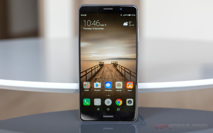
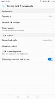
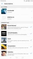
The lockscreen is one of the elements being carried over, but it was already quite functional. The Magazine unlock style greets you with a different wallpaper every time you wake up the device, with new ones being downloaded when you connect to Wi-Fi and an option to delete ones older than 3 months.
The lockscreen itself is minimalist at first glance, with just a large clock with a date and a shortcut to the camera. You can also quickly start the camera by a double press of the Volume Down button with the option to take a snap right away, or just go to the app.
Back to the lockscreen, you can pull up an iOS-style menu from the bottom, where you get a ton of functionality. The top row lets you manage the wallpapers - you can remove, favorite, share, or pause on the current one. In addition to that, you get a row of handy shortcuts for basic apps - voice recorder, calculator, flashlight, timer, and QR code reader.
Now, you likely won't be seeing much of the lockscreen, though, as the fingerprint unlock works so fast it makes it redundant. Huawei advertises a 0.4s unlock time, which is no big deal when other makers have cited 0.2s, but the reality is that it works almost instantly and every time.
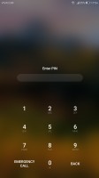
On top of the multi- and guest user support that comes standard with Android, you can also set up a so-called Private space, which you can access with a different fingerprint. The data accessible there is independently encrypted, Huawei says, and is inaccessible to the other users. Only one Private space can be set up per device.
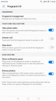
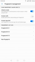
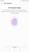

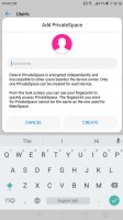
Fingerprint settings • enrolling a fingerprint • multi-user support • private space
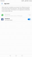
In addition to that you can have two app instances for some social apps, so two users can access their accounts from the same phone user profile.
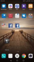
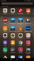
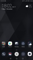
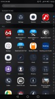
We got a little carried away with the privacy talk, but back to basics now. Beyond the lockscreen we're treated to a pleasant surprise - on top of the usual all-apps-on-the-homescreens approach Huawei now gives you the option to pick the standard Android two-tiered interface with homescreens for your most-used apps and an app drawer for all of them. Kudos to Huawei for letting the user choose.
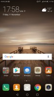
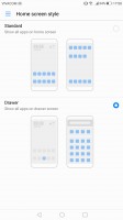
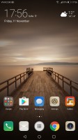
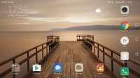
No app drawer by default • but you can opt for one • app drawer shortcut in the middle of the dock • optional landscape homescreen
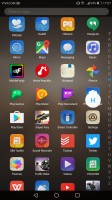
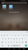
The app drawer is a vertically-scrollable list of all your apps, 4 in a row, with a search field on top.
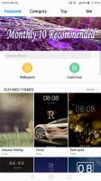
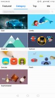
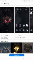
Themes are available as well. A theme will change your homescreen wallpaper, lockscreen style, system and app icons, system font, system color and the sound profile. You can also adjust things like homescreen transition effects.
The notification area is a 50/50 mix between stock Nougat and Emotion 5.0. Huawei has tweaked the look of the quick toggles, and added the much coveted auto brightness switch, which Google so stubbornly refuses to keep in plain sight. The notifications themselves look just like on a Pixel.
The Mate 9 will also let you pull down the notification shade with a downward swipe on the fingerprint reader, though it's a setting and it's off by default. It'll only do the first step, showing you a single row of toggles, but that's all it takes to view notifications single-handedly, and if you're going to be flipping toggles, you'd need your other hand anyway. That said, two swipes on the Pixel will give you the full list of toggles.
The task switcher is rather straightforward, but again with added functionality over Google's own - apps in the rolodex can be locked by tapping on the padlock icon, so killing all apps will spare the locked ones. The kill all button is readily available too, not up in the right corner as Google does it.
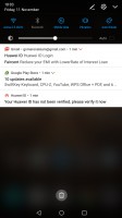
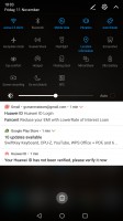
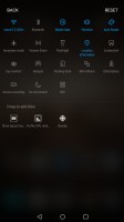

Notification shade, step 1 • step 2 with more toggles • toggle settings • task switcher
Update (Dec 20, 2016): The Mate 9 has received a rather major update which among other things addresses notification handling.
We complained in the original review (in the video, specifically) that the notifications in the status bar could only be displayed as a number, cumulative for all of them, or not be displayed there at all - you couldn't see which apps had pushed you those notifications. Well, that's been fixed and you can now select 'Icons' from the settings.
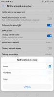
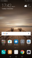
Icons option for notifications • Icons indeed
For certain scenarios, like in-car use, you can enable a Simple homescreen mode, which features large tiles for easy tapping. It's not particularly consistent, though, offering simple version of some menus, but not others - the dialer is the same size as in regular mode (in all fairness it's fairly oversized to begin with).
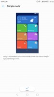
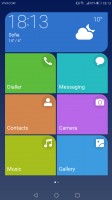
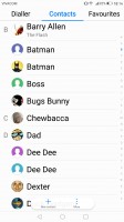
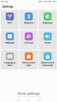
Simple homescreen with a tiled interface
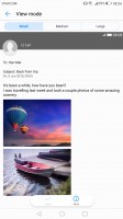
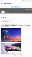
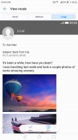
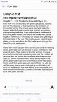
A system-wide scale setting is available from within the display options, the Medium option enabled by default. We'd go with Small as the interface could be quite wasteful otherwise, but if you have trouble seeing tiny menu elements, do go for Large, the option is there. Additionally, you can independently set the font size (you'd be surprised to find out that the default is "Normal").
Throughout the interface you get contextual menus with relevant options right at the bottom of the screen above the navigation bar - hugely convenient for single-handed operation. The universal drawer that pulls out from the left side of Google apps is a lot better suited for left-hand use than right-hand, and even for lefties some of the higher-placed options are still too far away.
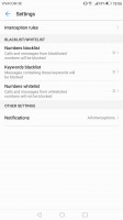
The Mate 9 features the same granular notifications manager that Huawei high-end smartphones have had since before it was a part of vanilla Android -you can control which apps can send you the three types of available notifications - the shade notifications, the lockscreen notifications and the banner style notifications.
This level of control is also employed when it comes to the app access to network data. The user can control the rights of each application to access either WiFi or mobile data. This can save a lot of traffic and help you optimize your data plan and consumption in an easy and convenient way.
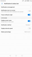
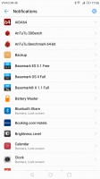
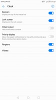
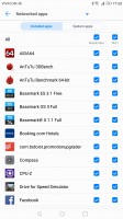
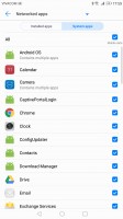
Notification permissions • data permissions
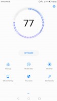
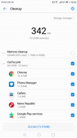
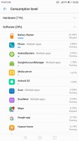
While these are options accessible from the settings menu, they are also featured inside the Phone manager app. In there you'll also find a one-touch optimization button (which may make you feel better, but we see no reason not to let Android do it for you). A virus scanner, powered by Avast is on board as well.
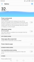
Battery saving modes are available from the Power manager, two of them. There's Power saving, which imposes some minor limitations on hardware and software, and then there's Ultra power saving, which condenses your entire Mate 9's functions to a single black homescreen with 6 shortcuts. You can choose all of those, and you can pick from any app on the phone, so it's very much a psychological constraint than anything else.
By Huawei's estimates, that should triple your battery life, so apparently there's more going on under the hood. Ah, there's no task switcher in this mode, you only get one app at a time, though judging by the loading times, they have to be in the RAM. Screenshots are definitely disabled.
As part of the extensive Smart assistance package, you can customize the bottom navigation bar - you can swap the task-switcher and back keys, or even add a shortcut for the notification area. There is also a one-handed UI mode, for easier menu surfing on the go.
You can enable the so-called Floating dock - it's a virtual key you can move anywhere on the screen, allowing you to expand it to the primary Android keys - Back, Home, Task Switcher, Lock and Close all running apps. It will help you control your phone with just one hand.
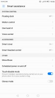
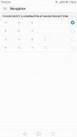
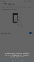
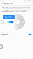
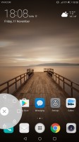
Smart assistance • navigation bar options • mini screen view • floating dock • floating dock in action
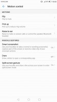
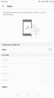
Motion control also plays a significant role on the Huawei Mate 9 as it did on previous Huawei models. There are flip gestures, as well as picking up, tilting and even things like knuckle detection and drawing. All of those are extensively customizable to your liking as well.
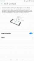
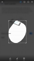
You can start recording a video of your interaction with the UI by the intuitive double knock with two knuckles while drawing an S with a single knuckle launches the scrolling screenshot. Thank goodness that latter is available from the regular Power/Volume down shortcut.
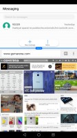
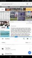
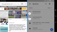
The Mate 9's multi-window feature has been expanded since its basic Mate 8 days. While you're in one app, holding down the task switcher key will send it in the top half of the screen with recent apps taking up the bottom half for you to select which one to view. You'll get the same effect by one-knuckle-swiping left or right.
You can resize the windows swap the two, but you need to have both apps already open in the task switcher to be able to take advantage - you can't launch a new app once you're in multi-window.
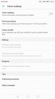
Voice control lets you operate the Mate 9 entirely hands-free. The functionality boils down to the ability to trigger a voice command even when the phone is locked and its screen is off.
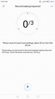
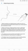
Huawei does this by always listening for a "trigger word", which by default is... "Okay, Emy." Once triggered, the phone wakes up and awaits further voice instructions, like placing a call. Speech awareness is also customizable. The wake-up phrase can be changed, and you can also train the device to recognize better your voice.
Reader comments
- Malalas
- 07 Mar 2024
- 3pS
Yeah, go ahead, buy
- vino
- 18 Apr 2022
- PIu
Bought on April 2017, still using till now. Its been 5 years to be exact. Long lasting.
- Anthonhio
- 17 Nov 2018
- F0x
The silver color is very nice in short Huawei mate there all nice


