Instagram changes its logo, updates the design of its apps
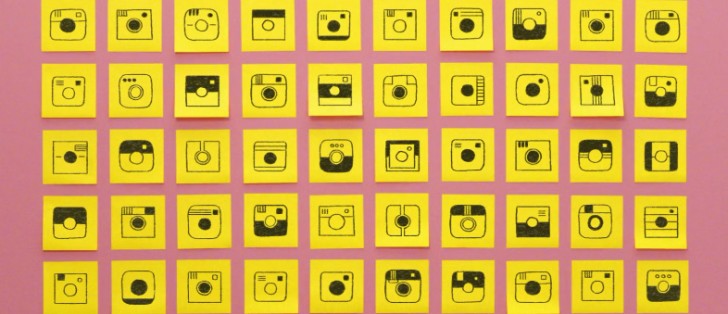
Instagram has announced a big update for its mobile apps today. This affects users on both Android and iOS, and the newest version of the app should have already been offered to you as an update through the iOS App Store or the Google Play Store.
The first thing you'll notice once you install the new iteration is that the app has a different icon. Instagram has gone through a lot of ideas until it settled on the colorful new logo you can see below.
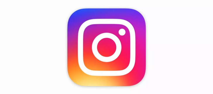
Not only the main Instagram app has received a new icon - the same treatment has been applied to Layout, Boomerang, and Hyperlapse, the other three mobile apps developed by the Facebook-owned photo sharing social network.
In the Instagram app itself you should also see a new design at some point, though this doesn't seem to automatically appear once you have the newest version, so it's probably a server-side switch which is getting a staged rollout. When the new UI does land on your device, you'll notice it's much simpler and much more devoid of blue than the old one.
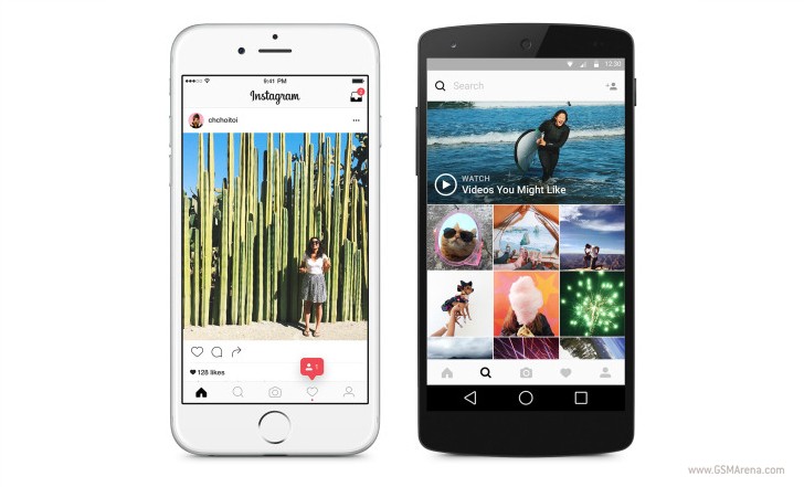
The top and bottom of the app are now white, and the icons in the bottom navigation bar seem to have gotten smaller than they used to be.
Instagram says 80 million photos and videos are shared through its network every single day, and this updated look "reflects how vibrant and diverse" the "storytelling" on the service has become.
Related
Reader comments
- AnonD-530807
- 13 May 2016
- v0q
I prefer the newer user experience and packaging of the product. Puts it among it's competitors (because I think it was lagging behind them, design wise) i.e. eyeEm, VSCO, etc.
- Hi
- 12 May 2016
- UD{
who told you iOS created it, read the article not only from GSMArena kid, the app is not owned by iOS
- Anonymous
- 12 May 2016
- 7Jp
Why do you hate it if you just said you don't even use it...?





 Samsung
 Infinix
 Apple
Apple Apple
Apple Xiaomi
