Moto G9 Plus review
Design and ergonomics
As one would expect from a 6.8-inch device, the Moto G9 Plus is an unwieldy phone. Sure, the curved edges to the side make a difference, but the rather thick top and bottom bezels and the 223g weight make up for a hefty chassis. Thickness might be an issue for some as well - it's 9.7mm. The extra battery, however, and the barely noticeable camera bump on the back are appreciated.
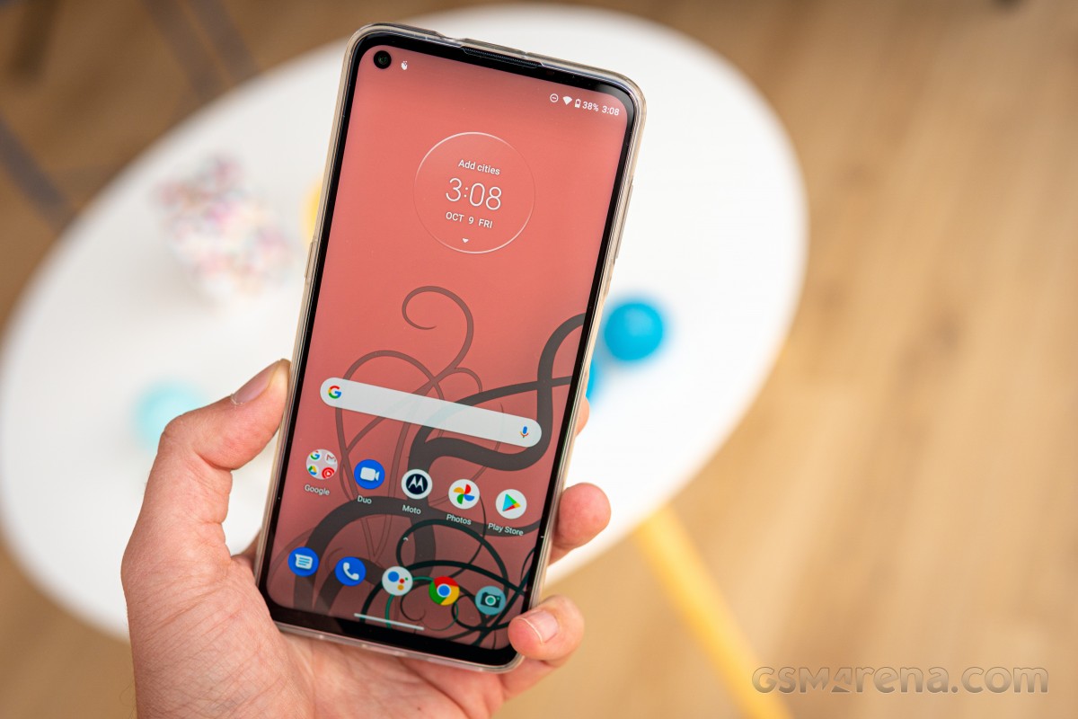
What we liked about the Moto G9 Plus is the unibody design approach. The entire back along envelops the sides of the phone. There are no gaps, sharp edges, or protrusions - it just feels nice holding the handset.
Unfortunately, the unibody design has been made possible by the fact that there is no glass and metal on the body. After the Moto G7-series, Motorola began cutting corners, and the backs of the G8 Plus and G9 Plus are made of plastic, and so are the frames. Motorola doesn't mention Gorilla Glass about the front glass either.
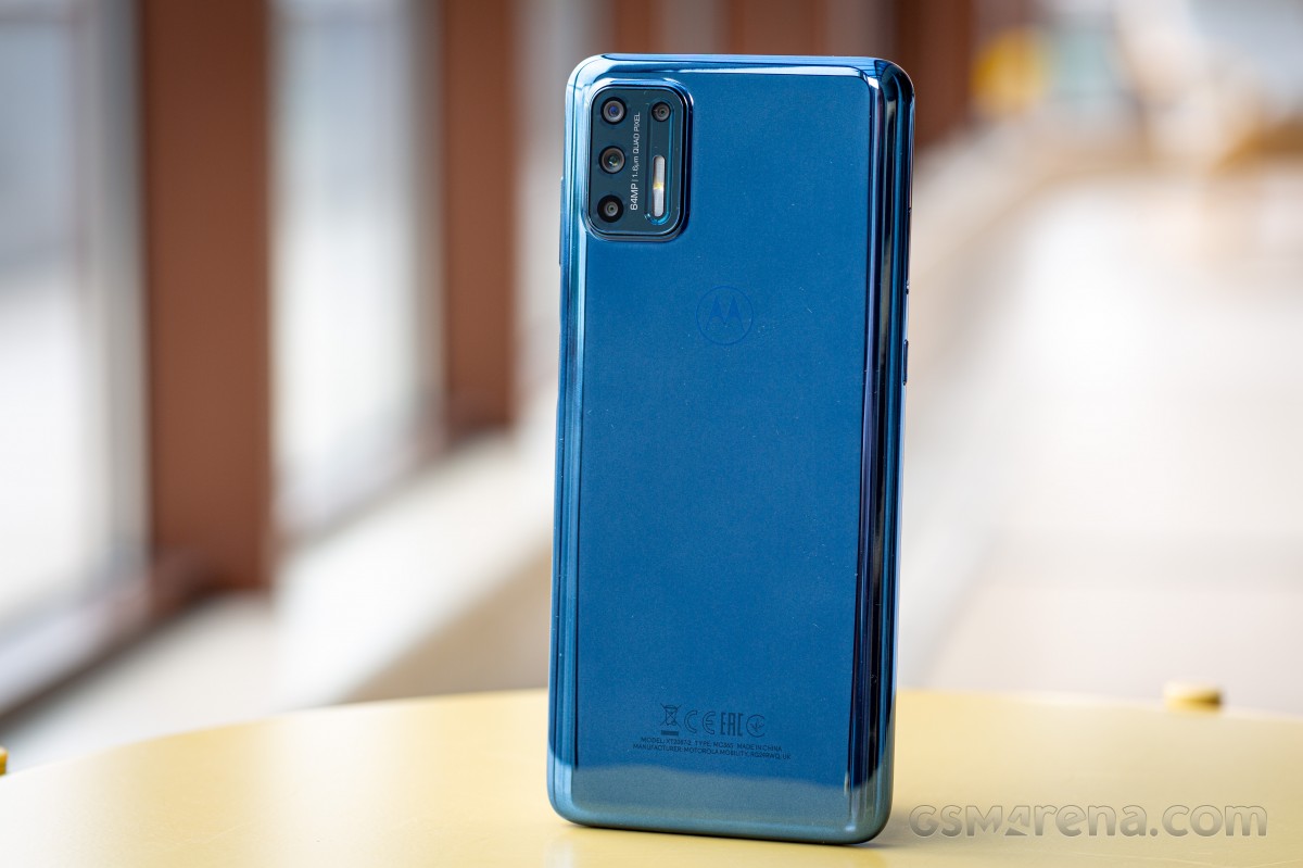
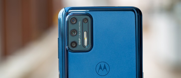
The camera design has changed drastically and is now a rectangular-shaped module housing all four cameras with the elongated flash. As we already pointed out, it's not protruding by much, so when placed on a flat surface, the wobble is barely noticeable.
The phone comes in two color variants - Rose Gold and Indigo Blue. From the official press renders, the Rose Gold variant looks intriguing, but we got the Indigo Blue variant. It looks good, it's simple, and it almost becomes a mirror when you turn the phone's back directly at you. This particular paint job makes fingerprints and smudges quite visible.
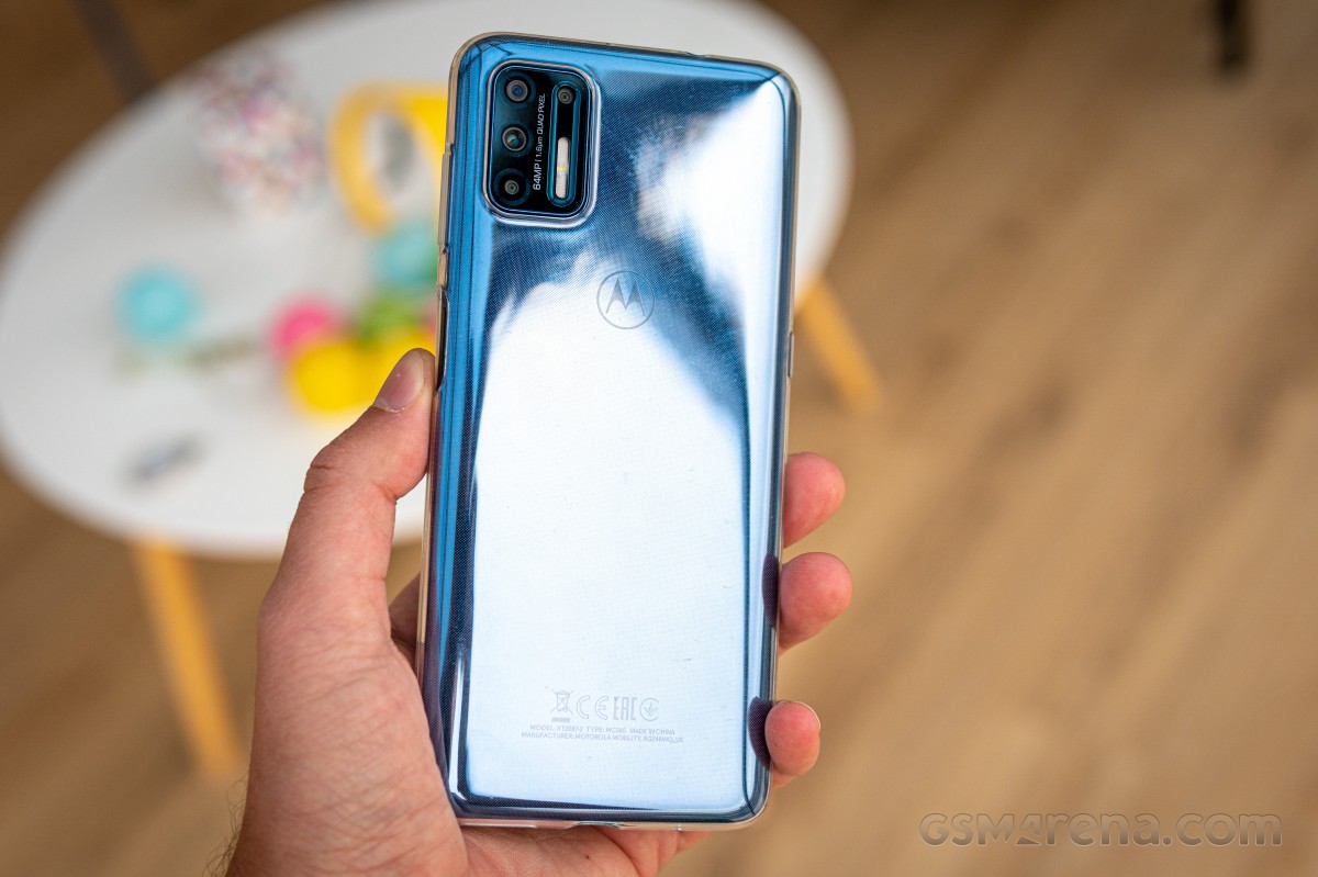
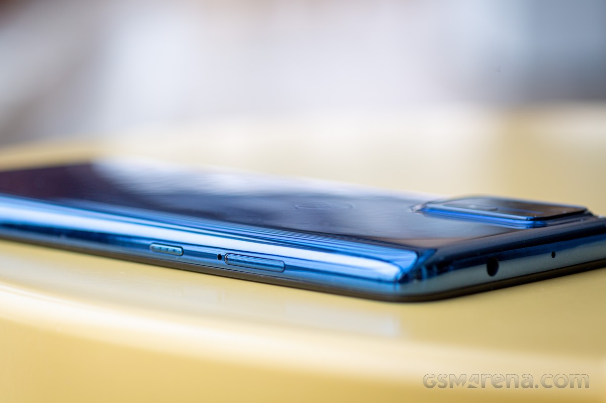
Going around the sides, we see more buttons than usual. On the left, we have the dedicated Google Assistant button, which is slightly textured. On the right, we have the power button that doubles as a fingerprint reader and the volume rocker right above it. The volume key requires some finger gymnastics to reach. On the other hand, the power button is well-placed, and we didn't have any issues reaching it.
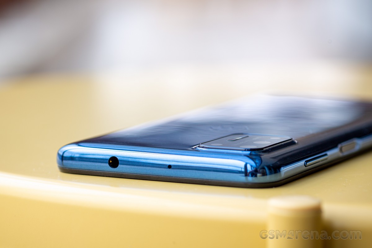
The headphone jack is positioned at the top, whereas the bottom is reserved for the USB-C connector and the speaker grille only.
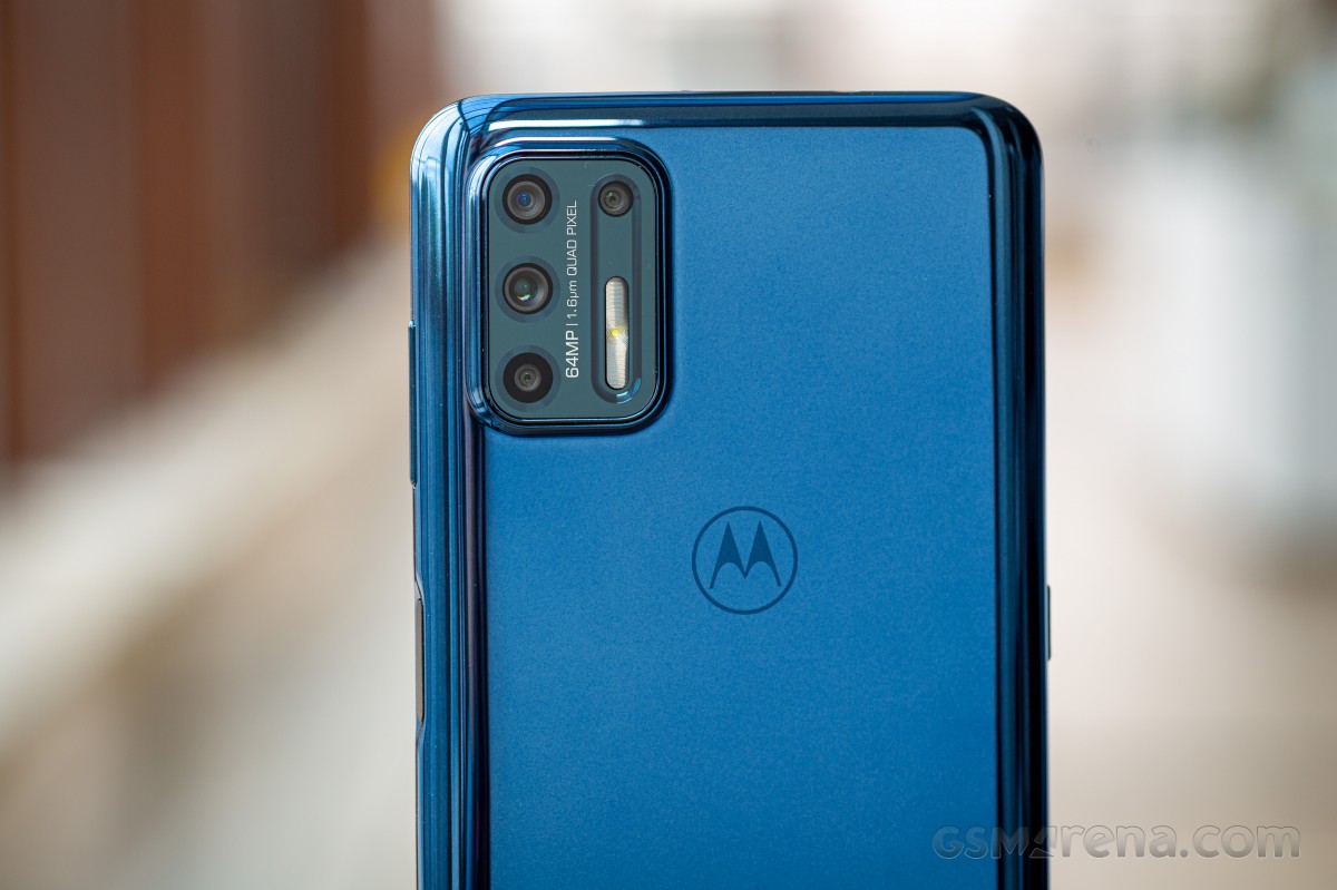
All and all, the Moto G9 Plus doesn't stand out with build quality or looks, and it definitely isn't a device for small hands. The 6.8-inch display on board gave enough headroom for the G9 Plus' body to grow quite a bit compared to its predecessors.
It's also unusual to see the latest addition to the Moto G family going backward in the choice of materials and the fact that there is no Gorilla Glass on the front and no water-repellent coating.
Reader comments
- Toca
- 28 Jan 2024
- 0xY
Not true. It has Android 11. Usig it for 2 years now,and no problem. Great batery life and camera.
- Anonymous
- 14 Feb 2023
- tZ0
Motorola is also historically and notoriously bad at providing software update. The G9 Plus started with Android 10 in 2020 and after 2 years is still on Android 10. Actually, Motorola should be called legendarily bad because Xiaomi and Realme phones...
- Uganda
- 15 Sep 2021
- C8h
I have to buy this fine sure