Motorola Moto G (2014) review: Baby steps
Baby steps
Phonebook
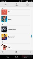
The phonebook is made up of three tabs that you can switch between with sideways swipes. The middle tab is the default one, listing all of your contacts. Contacts are listed with a name and a picture to the right. They can be sorted by first or last name, and viewed as first name or last name first.
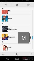
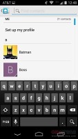
There's a permanent scroll bar available that you can grab and jump straight to contacts starting with a certain letter. There's regular search as you type too.
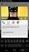
The quick contacts feature triggers on tapping a contact image to bring up a tabbed popup window. The tabs are phone and email with a list of the available numbers or addresses. These tabs can be navigated with sideswipes as well.
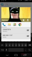
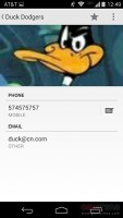
Single contact view displays the contact's name along with a star to mark a contact as favorite and a Settings button that lets you edit, share or delete a contact, as well assign custom ringtones to them or set the phone to redirect calls from that contact straight to voice mail.
Under that is a list of all contact info sorted by category - phone numbers, emails, events, notes and so on.
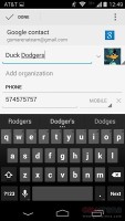
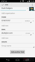
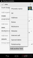
While editing a contact, you can add various new fields to fill in more info for the contact. You can link contacts too, if you've added the same person on multiple services.
The other two major tabs in the phonebook are Groups and Favorites. Groups are listed by service (e.g. your Gmail account), while favorites are a listed as a grid of large contact photos, which is readily thumbable.
Telephony
In-call of the Moto G is exceptional. Voices come out loud and clear and the device held on to signal without issues - hardly a surprise as its metal frame was developed from the ground up with antennas in mind.
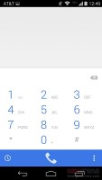
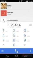
Android 4.4.4 KitKat offers a smart phone app with new design. Upon launch it brings you to its default dialing tab where you get a search field, the most recent dialed contact and a list of contacts you've dialed most often.
You can bring up or hide the dialer by its dedicated shortcut at the bottom. It supports smart dialing both by name and phone numbers.
The search field on top of the page scans both your contacts and nearby places. For example, you can type Subway and you'll automatically get the nearest Subway phone number. You can turn the nearby search off from settings, of course.
There is also a standard history tab in the phone app. It has two sub-tabs - all and missed. There you get the complete history of all your phone calls.
The Moto G (2014) made the move to front-facing stereo speakers. This improves the sound quality for listening to music, but unfortunately led to a drop in loudness. This pushed the Moto G from Excellent to Average. It's good enough for notification purposes (especially if you use a loud ringtone), but the old models could push through a lot of background noise when there's an incoming call.
| Speakerphone test | Voice, dB | Ringing | Overall score | |
| 61.5 | 58.5 | 72.6 | Below Average | |
| 66.5 | 66.2 | 75.1 | Average | |
| 66.6 | 66.7 | 75.7 | Good | |
| 73.5 | 67.7 | 78.7 | Very Good | |
| 75.9 | 71.5 | 81.6 | Excellent | |
| 77.1 | 76 | 83.3 | Excellent |
You can read about our testing methodology here.
Messaging
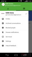
You can choose Google Hangouts or the default messaging app to handle your text messages. Hangouts has two pages - the first one shows all of your conversations, while the second lists the people you exchanged Hangouts with, plus suggested contacts and other contacts (a.k.a. from your phonebook).
The messaging section is business as usual. All SMS/MMS communication is organized into threads - each thread consists of all messages between you and one of your contacts.
Each thread is organized like an IM chat session, the latest message at the bottom. You can manage individual messages (forward, copy, delete) and even lock them (to prevent deletion). You can use search to find a specific message in all conversations.
Quick contacts work here too and there's a call shortcut at the top of the screen when viewing a thread.
You can add multimedia (photos, videos, sounds, etc.), which will convert the message to an MMS. If you need multiple slides or multiple attachments, you can go to a full-blown MMS editor as well.
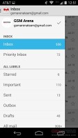
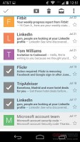
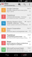
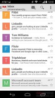
The Gmail app and the generic email app are now almost identical in both looks and functionality. They feature color-coded sender images, based on the first letter of the sender's name. Both apps support multiple accounts, but the unified inbox is available only on the default email client.
You can swipe left or right to move between messages in your inbox.
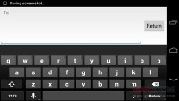
The Google keyboard is the default text input option out of the box. It is one of the most preferred Android keyboards out there and its screen the keys are comfortably large in both portrait and landscape mode.
Gesture typing is available as usual. Naturally, it benefits from the already existing Android word prediction, so you can just click on the words the keyboard suggests.
A tap on the text area will reveal a "handle" attached to the text cursor - it's easy and more accurate, which makes correcting mistakes easier. A double tap will bring up the select options - Select word and Select All - with two handles to adjust the start and end of the selection.
If a word has a typo, it will be underlined in red and when you tap it, the phone will offer a number of suggested corrections along with options to add the word to the phone's dictionary or just delete it.
Voice input is available as well and it works great too. It doesn't even require network connection if you download the specific language file and make it available for offline usage.
Reader comments
- Anonymous
- 20 Apr 2018
- YTY
Phone super prise lowe
- Anonymous
- 03 Dec 2017
- jK7
Can't get passed the Google login page
- Smiggy
- 16 Oct 2016
- 3HG
Having read your comments I can only assume you had a bad experience. I have had no problems at all with this phone and absolutely love it! I have had no problems with overheating or slowing down and can honestly say it's the best I've ever used and ...
