Motorola Moto M review: M for Midranger
M for Midranger
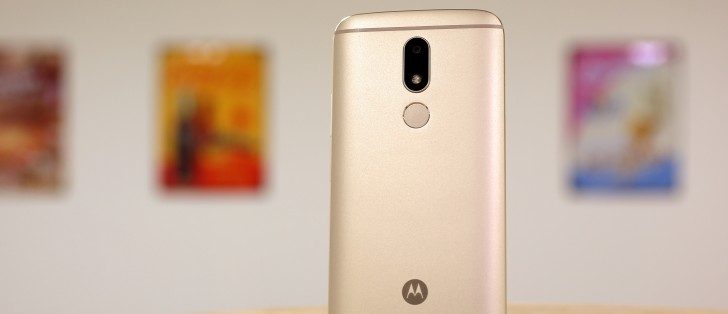
Motorola Moto M 360-degree spin
The Moto M measures 151.4 x 75.4 x 7.9 mm, which is just about average for a mid-range 5.5-incher with zero claims for bezellessness (don't look it up, we just invented the word). To put things into perspective, the 5.5-inch Galaxy S7 edge is just 0.5mm shorter and 2.8mm narrower.
At 163g, the Motorola phablet is also as heavy as you'd expect it to be - the latest Redmi 5.5-inch models (the Pro and the Note 4) are 10g heavier with more battery inside, but the plastic G4 and G4 Plus would be less of a burden on your pocket (in more ways than one) at 155g.
Hardware overview
We've seen iterations on the same base concept a million times, but that doesn't take away from the fact that the Moto M is one reasonably good-looking device. The satin-finished metal back with antenna bands top and bottom has become sort of a go-to design when you want a phone to look premium (in no small part - by association) while maintaining radio reception, obviously. Nothing overly fancy, but not a noname black slab either.

Motorola's design team (or rather Lenovo's) has added a few touches that make the M look like a part of the same family as the rest of the current devices. While the Moto Zs of late have a prominent circular camera bump, the Moto M is more like recent Moto Gs with an elongated bump. After all, there are no Moto Mods to worry about here, so they could trim the circle.
You'd also find a fingerprint reader in this vicinity. We're not particular fans of the square front-mounted implementation on the Moto Zs, which feels like a bit of a retro-fitted afterthought. The rear-mounted solution seems more natural, even if it can't be accessed when the phone is placed on a table. For what it's worth, the Moto M is the first Moto phone to have the fingerprint reader positioned on the back.


Satin back with a dearly loved logo • Camera bump and fingerprint reader
Just don't let the M batwing logo on the bottom play tricks with your nostalgia of a time when Motorola ruled the world of mobile all on its own, instead of being part of a huge multinational electronics company.
Looking at the front of the M, a lowercase 'moto' badge continues on that sentimental note, right in the middle of a chin that could have been a millimeter shorter. Okay, we're being too picky now.
Above the display you'll find the stuff that usually goes above the display - the earpiece is in the middle and on its right side are the proximity and ambient light sensors, plus the selfie camera. Fret not, there's a notification LED too, tiny as it may be, hidden on the left underneath that golden passe-partout.

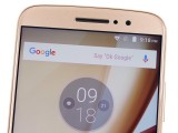
Hello 'moto' • Top bezel with all the right ingredients
Not strictly innovative either, the shiny chamfered edges of the perimeter also immediately evoke a sense of luxury. The frame is a bit too thin to easily pick up from a table, yes, but on the other hand it makes the handset look sleeker and more refined.
On the left side you'll find the SIM card slot, and the tray would take a couple of nanoSIMs or a nanoSIM and microSD. On the plus side, the Moto M is a dual SIM device by default (there's no single SIM model), but the hybrid nature of the slot makes it less flexible than a dedicated 3-card solution.
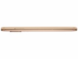
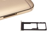
Just the card slot on the left • The hybrid slot is not a fan-favorite
The power button is on the right side, perfectly high up to be accessed by the thumb of your right hand. That renders the texture on top of it a bit useless, as you won't be scrambling to find it, but it's still nice to have. The volume rocker is above the power button, on the same side of the phone.
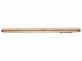
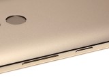
Power button and volume rocker, both on the same side
USB Type-C is on the rise and the Moto M is staying in touch with the times - the symmetrical and more versatile port is in the middle of the phone's bottom plate. On each of its sides you'll find a tiny screw, and a grille, but there's a loudspeaker behind the right one only. Up top the 3.5mm jack resides, joined by the secondary mic.
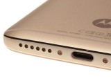
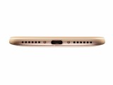
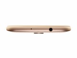
USB Type-C port • Symmetry • 3.5mm jack, secondary mic, and no symmetry
In the hand, the premium look of the Moto M translates into premium feel. That doesn't necessarily mean secure handling though, as the satin finish is about as slippery as they come. Then again, it's so much better at keeping fingerprints away than a glass panel.
Reader comments
- Lucky
- 25 Jan 2022
- gM}
Very poor charging
- Raaz Ahmed
- 25 Nov 2021
- XWG
I have to change my mobile new version repairing my battery battery is the very low
- Nayeem
- 19 Jul 2021
- ubI
Your mobile charges are low and there is no place for service in Bangladesh