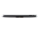
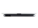
Motorola XOOM review: The Big Bang
The Big Bang
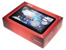
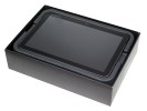
Unboxing the Motorola XOOM
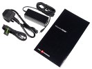
The Motorola XOOM comes in a spacious box but the contents are standard – a charger (not much smaller than a laptop charger), a microUSB cable and a manual. If you’re hoping for a microHDMI cable, you’re out of luck.
To be fair, the iPad 2 box didn’t include anything extra either. Still, the charger is bigger than it needs to be, or at least bigger than we would have liked.
High-res display
The 10.1” screen of the Motorola XOOM has a resolution of 1280 x 800 pixels, which means 149ppi pixel density. That’s slightly higher than the iPad and enough for comfortable reading.
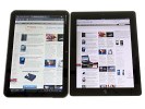
It’s a plain TFT however, which suffers from color and contrast distortion when viewed at an angle.
The change in colors is small but visible, it’s the contrast that’s the bigger problem. Text remains readable but if you’re viewing photos you will want to look at the screen head on as the image quality suffers at even the slightest tilt.


Motorola XOOM’s screen (left) at an angle compared to the iPad 2 (right)
Unfortunately, this isn't where the problems of the Motorola XOOM display end. The coating of the screen is highly reflective and it often makes you look for a proper angle that doesn’t have reflection issues.
Stepping outside in the sunlight makes things even worse. The stronger the ambient light, the more visible the reflection. You can easily gaze at the clouds by looking down at the XOOM – even at full brightness the reflection is still too prominent for a good viewing experience.
Fingerprints are also a problem – the screen quickly becomes a mess (nothing out of the usual for tablets), and it’s not very easy to clean.
Display brightness and contrast
We’ve already released our display brightness and contrast measurements in a blog post but we’ll recap them here.
The Motorola XOOM turned out to be quite bright – a tad brighter than both the iPad and the iPad 2 at full blast. 436 nits of brightness is hard to get even on much smaller mobile phone screens.
But it was the contrast ratio that made our jaws drop – 2041:1 at full brightness makes short work of any LCD display we’ve tested so far (AMOLEDs are in a different league). That includes Retina displays, Reality displays, NOVA displays – all the big names on the market right now.
The brilliant contrast ratio is tarnished by the reflectivity of the display – unless you’re in a dark room, there’s always something reflecting off the screen making the perceived contrast ratio much lower.
Here’s a table that pits the Motorola XOOM against some of the other displays we’ve tested.
| Display test | 50% brightness | 100% brightness | ||||
| Black, cd/m2 | White, cd/m2 | Black, cd/m2 | White, cd/m2 | |||
| Motorola XOOM | 0.12 | 216 | 1853 | 0.21 | 436 | 2041 |
| Apple iPad 2 | 0.18 | 167 | 925 | 0.55 | 429 | 775 |
| Apple iPad | 0.21 | 178 | 834 | 0.53 | 410 | 776 |
| iPhone 4 | 0.14 | 189 | 1341 | 0.39 | 483 | 1242 |
| LG Optimus Black | 0.27 | 332 | 1228 | 0.65 | 749 | 1161 |
| Sony Ericsson Xperia Arc | 0.03 | 34 | 1078 | 0.33 | 394 | 1207 |
Design and construction
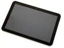
The Motorola XOOM sure looks attractive, mixing glass, metal and plastic for the finish. With its rounded corners, tapered edges and thin bezel around the screen, we dare say the XOOM is quite a looker.
There’s very little in the way of hardware controls on the front of the Motorola XOOM. Actually, besides the screen, the front-facing camera and an ambient light sensor, there’s almost nothing else. Android Gingerbread moved the Back, Menu and Home buttons on the screen.
Above the screen, there’s a 2MP front-facing camera and an ambient light sensor.
To the right of the screen there’s a status LED and below the screen there’s a charging LED. We nearly missed them: for some reason the ones on our unit never lit up.
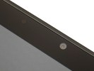
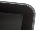
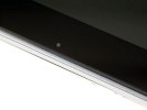
The 2MP camera and ambient light sensor • Notification LED • Charging LED
Time for a tour of the hardware controls on the Motorola XOOM – it won’t take long we promise. In fact, with Android Gingerbread replacing the standard controls (back, home, menu) with on-screen ones, there are only two controls left.
The first is the volume control on the left. It consists of two separate buttons, which are small, thin and somewhat recessed – and quite uncomfortable to press.
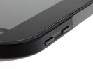
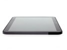
The volume control on the left • Nothing at all on the right
The other control is the Power/Lock key on the back – it sits flush against the surface to prevent accidental presses and is fairly easy to reach with your left hand when you’re holding the XOOM landscape.
It’s not as comfortable to reach when the tablet is held in portrait mode. It’s either in the top right corner or the bottom left one (depends on how you turn the XOOM) and depending on how you hold the tablet, you might cover it with your hand. Reaching the Power/Lock key after you’ve placed the XOOM down on the table is also a pain.
The back also features quite a few other things of interest – on a single strip of contrasting color we have the 5MP autofocus camera, the dual-LED flash, one of the two speakers and the Power/Lock key.
They are arranged symmetrically making the whole layout quite attractive though it gives the lens virtually no protection against scratches.
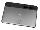
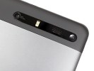
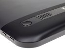
The back of the XOOM with a close-up of the camera, LED flash, speakers and Power/Lock button
The curve of the back is also not enough to completely protect the stereo speakers against getting muffled when placed on a level surface. On the upside, the two speakers are quite far apart improving the stereo sound.
The bottom of the Motorola XOOM is where the wired ports are: microUSB, microHDMI port, a docking connector and finally, the 2mm charger plug. None of these is covered with anything.
We were a little disappointed to find out that a microUSB connection wouldn’t charge the XOOM – you’ll have to use the old-fashioned 2mm charger port for the job. On the upside, the microUSB has host functionality – rather will have – once you update to Android 3.1. You will need a proper adapter though and those can be hard to find.
Also at the bottom is the mic pinhole and two Torx T5 screws that hold the back cover – we’ll get back to it in a moment.
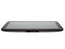
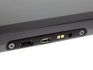
At the bottom of the XOOM: microUSB, microHDMI, docking port and charger plug
Let’s take a look at the top of the Motorola tablet first. There’s a 3.5mm audio jack dead center and a small tray to its left. The tray serves a two-fold purpose: you put your (regular-sized) SIM card in it and it’s the cover of the memory slot too.
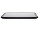
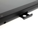
The 3.5mm audio jack • The SIM card tray with the microSD card slot behind it
Now, technically, the Motorola XOOM will support 32GB cards. You read that right – it will. We’re just waiting for a software update to enable it. Motorola even put a transparent dummy in the slot with the message (in tiny letters) “Replace with microSD only after Android system update”.
But don’t blame it on Android – the OS has supported microSD cards since day one. You’d think that a tablet that has been on sale for about two months would have basic stuff like that working, but the more we play with the XOOM, the more we get the feeling that Motorola rushed it to the shelves before it was finished.
The matt metal cover on the back is top notch – pleasant to the touch, great at hiding fingerprints and in combination with the black strip above it, it looks pretty nice too. Unfortunately, the battery hides underneath it. Not that it’s common for tablets to have user-replaceable batteries – but still.
Anyway, the 24Wh battery promises up to 10 hours of browsing over Wi-Fi or video playback, and nearly three and a half days of music playback. The standby time is quoted at 14 days.
We ran our own browsing-over-Wi-Fi battery test and the Motorola XOOM lasted 7 hours and 50 minutes – quite close to what they claim. You can check out our blog post for some more details on battery performance.
The Motorola XOOM is as big as tablets come – in fact due to its 10.1” screen it’s slightly bigger than the iPad 2. The build quality is great with quality finish though the XOOM is quite heavy at 730 grams.
One-handed use is tricky – your hand gets tired pretty quickly, made worse by the smooth metal finish at the back. 730g of slippery tablet is easier to drop that any user would be comfortable with. As much as we like metal, it just doesn’t provide enough grip.
Compared to an iPad 2, the XOOM is almost the same size. But when you hold both in the hand, the iPad 2 is noticeably lighter and quite a bit thinner.
Reader comments
- AnonD-502814
- 18 Feb 2016
- 8KN
What is the latest android version it runs?... I saw a page to download rooms to upgrade for latest version, android marshmallow but the links doesn't work... any help, opinion please?
- har
- 06 Jan 2013
- t1$
hey m frm india..i hav a xoom with verizon..can i use a usb dongle in ma tab for surfing..?help me out!!thanks in advance..
- AnonD-18887
- 09 Nov 2011
- bC7
Xoom is very attractive. But no one buys it and everyone takes Galaxy Tab10.1 instead. It is because it lacks many features. There is no USB port(only micro-USB). Yet it costs high. When you buy a tablet please update it fully , download all the apps...
