Nokia 6303i classic review: Retro chic
Retro chic
User interface
The Nokia 6303i classic employs the Series 40 6th edition user interface. The environment is very familiar but there are still some visual novelties since the 6303 classic. While we are pretty much in favor of any visual tweaks, we would have also liked to have seen a few new features as well.
A document reader is where the S40 still loses out to its Samsung competitors, while the multi-tasking and vastly better multimedia tip the nod in favor of the Sony Ericsson A200 platform. Nokia on the other hand are still relying on their vast market share with its feature phone user interface and prefer to deliver a familiar user experience rather than try and create a revolution.
There are two points of view to this approach for the two large groups that buy these low-end and lower-mid-range featurephones. The first is that if you want a simple call and text device a familiar interface will be better than a higher spec’d handset with a more confusing UI.
The second large group of customers that buy similar phones are the ones looking for better bang-for-buck deals, the bargain hunters. Those will probably be better off with some of the competition’s offerings as they have a richer list of features. But anyway, let’s skip to the actual interface.
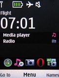
The slightly redesigned standby screen of the Nokia 6303i classic features the pre-selected wallpaper with the usual status readings, such as signal strength, battery status, ringing profile icon and time occupying the top part of the screen. The fonts have been noticeably enlarged.
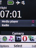
Active standby mode (or Home screen mode, as Nokia call it here) is also available. It now consists of not four but three sections that can be edited or relocated as users see fit. Normally, one of the areas is reserved for the Shortcut bar which grants instant access to favorite functions denoted by their respective icons.
A nice feature is that pressing the end key while the keypad is locked brings up a clock that shows time and date. It's something of a poor man's tap-for-time feature that's usually reserved for more expensive phones.
Along with the redesigned homescreen the 6303i classic also comes with a refreshed menu. Now in some submenus there is a More button which hides the rarely used features. This makes finding your way around the menu a bit easier.
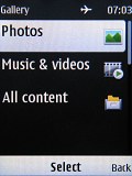
There is also a new view mode for the main menu, displaying a single icon at a time, much like in their S30 ultra-low end handsets and first generations of the S40 UI. Icon can be freely reordered within the grid, should the user find their original order inconvenient. Unfortunately, the icons again lack animation as we have seen in the past.
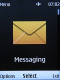
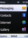
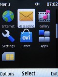
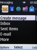
The new menu view mode, along with some of the old ones
With the lack of multi-tasking support, you can't just minimize a Java application (such as the Opera browser) and go read a new message.
A decent phonebook
The phonebook of the Nokia 6303i classic stores up to 2000 contacts, which isn’t as good as unlimited storage but should do for 99% of the users.
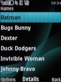
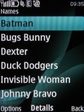
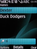
The difference between normal and large font • the phonebook can be searched by gradual typing
Each contact can be assigned a variety of fields but the phone numbers are limited to 5. First names are separated from last names, eliminating problems which may occur with synchronization. Ringtones can be assigned to each contact.
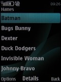
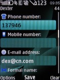
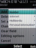
Some of the available fields when editing a contact
A nice extra touch is the Find-on-Map option which locates the contact's address on the new Ovi Maps for S40 application if it is entered correctly.
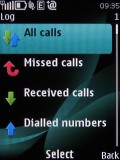
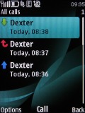
The Call Log on the Nokia 6303i classic is unchanged. It can display Dialed, Received and Missed calls separately, as well as all of them in bulk. Every submenu can hold up to 20 call records with their date, time and duration.
Reader comments
- James Smith
- 27 Sep 2023
- a0r
I'm still using it 13 years after its initial release because it does what is supposed to do. Phone calls. I have replaced its battery twice and it works like a charm needing to recharge once a week. It's loudspeaker is great, and with a ...
- Durga sahu
- 27 Aug 2016
- rKG
My first Mobil is nokia6303 ilove to us this mobial but idont have now this Mobil but iam looking for the next my phone is Nokia 6303
- AnonD-76297
- 11 Apr 2013
- TL5
I'm using it since november,2010. i'm glad to have such a beautiful & metallic set. camera is fine for me as it deliver excellent photo in proper light. this metallic set is pure rough & tough. i've downloaded popular apps like NIMBUZZ,...
