OnePlus 6T review
Design and 360-degree spin
Circling back to the whole BBK Electronics Corporation ownership situation, it's pretty easy to understand the design trends and limitations the lines of Oppo, Realme, Vivo and OnePlus have to work with.
While not necessarily a bad thing, or a new reality, for that matter, it does take away some of the design novelty and create similarity within BBK's various smartphone lineups. That being said, as per expectations, the OnePlus 6T looks very similar to the Oppo R17 and R17 Pro.
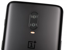
Overall, you get the same familiar metal frame, glass sandwich design. It is still the prevalent look of the day. The OnePlus 6T is 2mm taller than its predecessor and about 5% thicker, also a bit heavier. Still, it does include a larger battery and bigger display. Unfortunately, ingress protection is still not on the OnePlus list of features. However, the front protective glass layer has seen a upgrade to the new Gorilla Glass 6 material, compared to Gorilla Glass 5 on the OnePlus 6.
The official specs don't really mention anything about the back glass panel, though, other than a 40-step count for the manufacturing process. We haven't had any durability issues with the review unit so far. Plus, OnePlus has a solid track record in this regard, so it should be a non-issue. We have to admit, we a re a bit bummed-out that the Silk White color option is gone. At least in this initial release, that is.
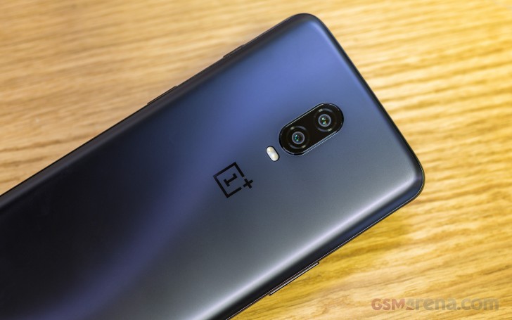
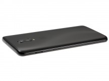
The OnePlus 6T can currently be had in a reflective Mirror Black or a mat Midnight Black. That might sound kind of boring, but the two actually look very different. Plus, going by track record once again, more colors are bound to pop-up in the future, in special limited editions of the OnePlus 6T or otherwise.
Both back panel variants looks and feel very nice to the touch. The reflective one, naturally, attracting more dirt and grease. It is a bit unfortunate that there is still no wireless charging on OnePlus phone, since it would have been a perfect match for the glass back plate.
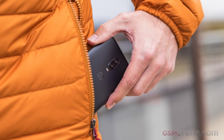
One thing that's clearly missing from the back side of the OnePlus 6T is a fingerprint reader. The 3.5mm audio jack, IP rating and wireless charging might be notable omissions, as already pointed out, but OnePlus decided that the under-display fingerprint reader is a worthwhile feature to jump on this year.
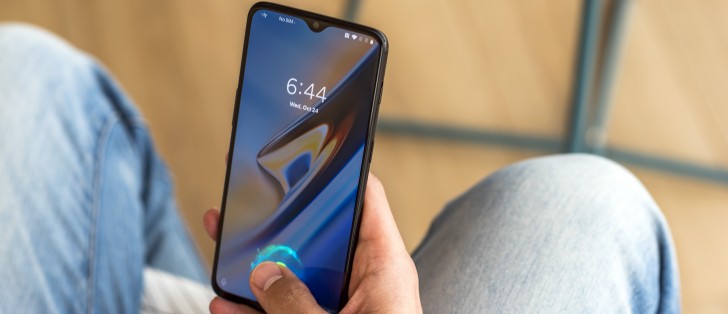
In case this is your first encounter with the tech, it does have certain limitations to overcome. Since the reader is optical by nature and placed a few inches away from the display glass surface, reading requires plenty of light and good transparency (which the OLED panel provides), a good and wide surface area without a lot of motion and a second or two to complete. Hence, for the best result, you need to get the finger placement right on top of the reader, conveniently marked with an on-screen circular animation then press slightly harder, so your finger spreads out more and doesn't move too much.
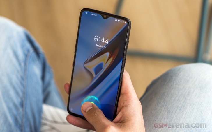
Sure, this type of readers are still not at the level of speed and accuracy that the conventional readers offer. We're happy to share that the UD fingerprint reader on the OnePlus 6T is definitely leaps ahead of earlier implementations we've seen. It is a lot less picky about the placement of the finger, the strength with which you press down is quite reasonable and the reading accuracy is nearly perfect. The only thing that still needs a bit of work is speed. And even that is no longer that far behind a conventional fingerprint reader and it's perhaps the fastest UD reader we've seen so far (Huawei Mate 20 Pro included).
The OnePlus 6T finally brings one of the first usable and reliable in-display fingerprint reader implementations to the table.
If you find its limitations hard to swallow at this point, there is always Face Unlock, you can use instead or in parallel. It is just as snappy and accurate as the one on the OnePlus 6.
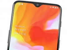
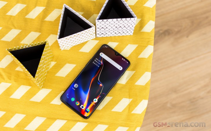
Enough beating about the notch then, shifting our eyes up a bit from the trendy in-display fingerprint reader, we instantly spot the "teardrop" notch - another 2018 trend. Now, we won't go defending the notch design regardless the shape or size it comes in. However, to OnePlus's (or rather BBK's) credit, the one on the OnePlus 6T is really small. Definitely a lot less intrusive than the one on the OnePlus 6. Well, a hole is still a hole and if you really despise it, you will probably have to hide it from the settings menu and sacrifice a bit of screen real estate.
Still, that relatively small area does manage to hold the 16MP selfie camera, along with the full array of traditional sensors, namely a three-in-on ambient/distance/RGB module. Plus, the earpiece is somewhere in that region as well. No notification LED, though. This obviously had to go.
On to controls then. In keeping with tradition, the OnePlus 6T has one extra button, compared to most conventional handsets. And it's definitely better than a dedicated AI assistant button. The three-stage mode selector toggle key has remained one of the OnePlus design staples for yet another year. It is positioned pretty high up on the right-hand side of the device and complete with a textured finish and plenty of customizability on the software side.
The only real issue we have with it is the stiffness. Granted, compared to the OnePlus 6 unit we have at the office, the rocker on the OnePlus 6T feels a bit lighter and easier to slide. However, the force required to do so is still a bit too much and it could easily lead to a nasty fall.
Underneath the mode switch there's a standard power button. Nicely defined and wide enough to press comfortably.
On the opposite side - a volume rocker. Also, pretty bog-standard. These provide a nice tactile feedback and feel "clicky" so no complaints at all.
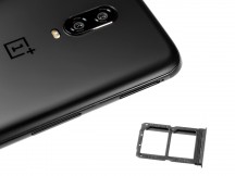
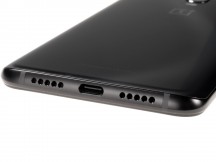
The top of the OnePlus 6T is pretty much empty, with only a small secondary microphone hole in sight. The bottom side has a bit more going on, but with one notable omission - no 3.5mm audio jack. Instead, OnePlus decided to go for a double grill aesthetic. Only one of those actually houses a speaker, while the other is for the main microphone. And that's the only speaker you get on the OnePlus 6T. The earpiece does not pull double duty for a hybrid setup. A potentially missed opportunity, in our book, but also likely a cost-saving measure. The same can be said about the USB Type-C port, namely since it still houses a USB 2.0 data connection. A minor annoyance for most users, for sure, but non the less, it is worth pointing out that the port lacks any additional whistles, like fast data transfer rates or video out. OTG is present, though.
Reader comments
- Shailesh
- 17 Apr 2023
- nCc
I hate this notch because of full dust go inside in front camera from calling speaker.There is gap in display and calling speaker.
- Tom
- 09 Feb 2022
- uvf
GSMArena should really consider dropping geekbench from the benchmark tests. It's really inconsistent and shady just like antutu. That is why very technical sites like AnandTech does not include geekbench test results when they review a CPU. Gee...

