OnePlus 6T review

Oxygen OS with a slice of Pie
OnePlus has a solid track record of delivering and maintaining a clean, snappy and near-stock Android experience. The Oxygen OS ROM running on the OnePlus 6T is the latest iteration and a perfect embodiment of that mentality.

The ROM manages to maintain a near-stock appearance, with minimal clutter, while still including a few usable extras and quality of life additions. Another crucial part of the OxygenOS formula is a tight update schedule. OnePlus has been delivering quite well in this department, which is why the OnePlus 6T ships with Android 9 Pie out of the box. Plus, older OnePlus devices have already gotten a taste of the latest Google core as well, so there are few real software novelties to speak of on the OnePlus 6T. And anything that is still exclusively found on it will surely be making its way to other parts of the company's lineup shortly.
After a bit of battery endurance controversy on the OnePlus 6, the true Always-On display feature is gone. Still, there is an Ambient display that can be set to automatically pop up when you tap the screen or pick up the phone. It's the usual mostly monochrome affair, complete with a customizable clock widget, optional display message, and notifications. Of course, there is the immediately noticeable round icon guide for the in-display fingerprint reader.
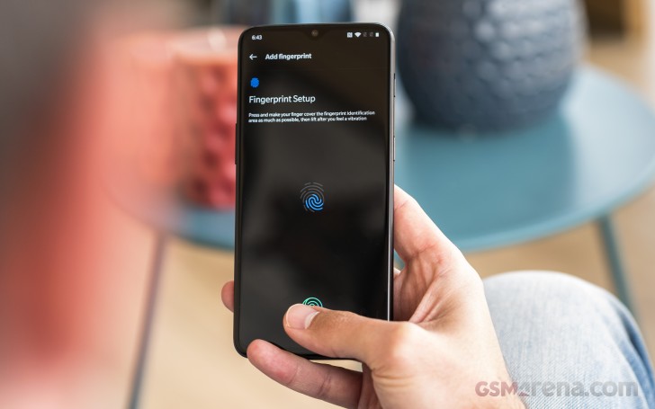
Since we are on the topic of security and the fingerprint reader already, it's worth mentioning that it does come with a few customization options to play around with. The new fingerprint enrolment process is pretty similar to what you would do for a standard reader, only the wizard is a bit more thorough. It definitely takes a minute or so to register a finger, since the OS is adamant about recording as much of the surface area as possible, prompting you to shift your finger around on its edges.

In our mind, the extra time spend in setup compared to something like a recent Samsung Galaxy device is definitely worth it, considering how accurate and speedy the UD reader tech has become in just a few short months since we saw its first implementation on a phone. As far as customization goes, you get three distinct and very well made animations to choose from that play out while the reader is engaged and sort of mask the bright green spot of light that shines on your thumb while it is working.
Of course, you can always opt out of the futuristic fingerprint reading tech, if it's not your cup of tea or even choose to simply accompany it with a Face Unlock. It is both incredibly fast and reliable on the OnePlus 6T. The only times we saw it struggle was in very dim environments.
If you're one to enjoy gestures, the 6 has them. While the screen is still off you can draw letters or symbols on the screen to do stuff. For instance, draw < or > for previous/next track, || (two-finger swipe) to pause, or assign an app to the letters O, V, S, M, and W. Beyond that, there is also flip to mute and a three-finger swipe down gesture to capture a screenshot. Double tap to wake and send back to standby are also present.
Gesture navigation isn't exactly new to the OnePlus family. OnePlus has its own iPhone X-inspired scheme set up that came optional on the OnePlus 6 and was also introduced on the OnePlus 5T via update. Swipe up from the bottom center to go to the homescreen, swipe and hold for recent tasks, or swipe up from either side to go back. Of course, if you're not for of this way of getting around the UI, you can go back to the good old navigation bar and its buttons.
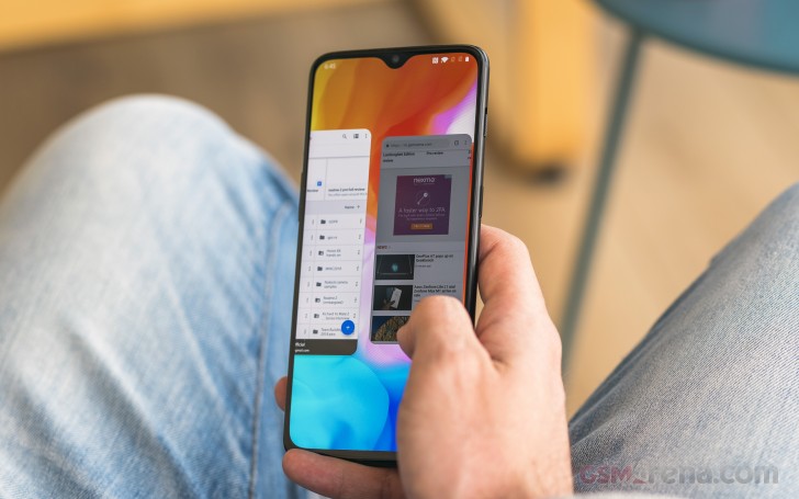
New to the Android Pie version of Oxygen OS is Google's own new navigation scheme. It sort of sits in-between the OnePlus all gesture approach and conventional buttons, since it does have a back button and a central control knob, of sorts. Tapping on it takes you to the home screen. Long pressing it triggers the Google Assistant. The "menu button" or task switcher/recent apps button is gone. To replace that you swipe up from the navigation area, or even slightly above it to bring up the revamped recent apps interface. A second swipe up, or alternatively, one longer/wider swipe, to begin with, takes you to the app drawer. It definitely takes some getting used to.
And speaking of gestures and navigation schemes, we definitely can't overlook the signature OnePlus alert slider. It still toggles between Ring, Vibration and Silent modes, like always, but there are also a few minute tweaks that can be made to some of these modes.


Lock screen • Home screen • App drawer • Folder • Launcher settings
As far as aesthetics go, the OnePlus launcher comes pretty close to stock, with only a few minor additions. There is the Shelf, which is in place of your leftmost homescreen and is quite similar to the Google Assistant feed. It shows the weather, your most used apps, and frequent contacts. You can also add widgets and change the header image.
While there is no full-featured Theme support in Oxygen OS, there are quite a few customization options, scattered throughout the various settings menus. You can still choose between a predominantly white or dark UI, the latter, of course, makes a lot more sense on an AMOLED panel.


Theme • Notch options • Font • Accent Color
OnePlus offers a couple of options for system Fonts, as well as Icon Pack support, with various shapes and dyes. Speaking of colors, there is also the option to select a custom Accent color. This is the secondary color that gets dissipated all throughout the UI and can really make a noticeable difference to the appearance of the device.
One spot the different color accent instantly shines through is the notification shade and especially the quick toggles area. The notification shade can be lowered with a single swipe from anywhere in the UI (that's a setting though, and it's off by default) and an additional swipe will reveal the entire list of quick toggles. You can also use two fingers to bring down the whole thing in a single motion. The brightness slider is complemented by an Auto switch, something Google keeps refusing to build into stock Android. You can also handpick the icons that show up in the status bar.


Notification shade • Expanded view • Recent apps • Multi-window
OnePlus stuck to the rolodex style recent app switcher for quite some time, but now Oxygen OS finally decided to go stock and adopt the Android Pie horizontally scrolling view, with its huge interactive windows. There's the option for split-screen multi-window, naturally, accessible via the three menu dots in the app windows corner.
Digging down further in the Oxygen OS menu structure, we find a few more interesting additional features. Apparently, OnePlus adopted the smart Adaptive Battery management layer from Android Pie as well. It definitely can't hurt to have it work alongside the company's other Battery optimization.


Battery optimization • Adaptive Battery
Speaking of Android Pie additions, we were hoping to see the rest of Google's wellness center implemented as well, complete with options like Wind-down and app timers. These are absent from Oxygen OS at the time of writing this review, but our guess is OnePlus will waste no time in implementing them.
Oxygen OS also has a Utilities menu, entirely dedicated to some of its additional features. Gaming mode doesn't actually boost performance or anything similar, but can offer a distraction-free experience, better control over notifications, calls and brightness, as well as a priority network mode that won't let other apps steal vital bandwidth away from your games.


Utilities • Gaming Mode • OnePlus Switch • OnePlus Laboratory • Smart Boost
OnePlus Switch is a phone migration utility, likely familiar to OnePlus fans an users. However, in its latest version, it comes with the additional promise of app data migration. From our limited testing, it appears to work well enough, but there's little it can do for certain misbehaving apps that don't want to or haven't correctly exposed their data.

Last, but not least, there is Smart Boost, which we already mentioned in the performance section of the review. It currently resides in the OnePlus Laboratory section, which does speak of its beta nature, but is non the less, turned on by default. Again, we can't really test how well it speeds up cold app start-up times, but it can't really hurt to just leave it on. Especially if you get the 8GB RAM OnePlus 6T tier.
Reader comments
- Shailesh
- 17 Apr 2023
- nCc
I hate this notch because of full dust go inside in front camera from calling speaker.There is gap in display and calling speaker.
- Tom
- 09 Feb 2022
- uvf
GSMArena should really consider dropping geekbench from the benchmark tests. It's really inconsistent and shady just like antutu. That is why very technical sites like AnandTech does not include geekbench test results when they review a CPU. Gee...


