OnePlus 6T long-term review

Software
A lot of people say that OnePlus' OxygenOS is like Google's Android but with a lot of useful bits and pieces added on top for good measure. And we'd be inclined to say that those people are right, mostly. There are some things in its software that we assume won't get much use, but not too many and the company's skin on top of Android is definitely one of the lightest around.
This means that OnePlus' additions, whether you find them particularly useful or not, never feel like they're in the way - like they impede the experience in any way. You just get some more choices and options than with Google's interpretation of the OS, and that's it. And when it comes to looks, the two are pretty much aligned, so coming from a Pixel OxygenOS won't feel alien to you at all.


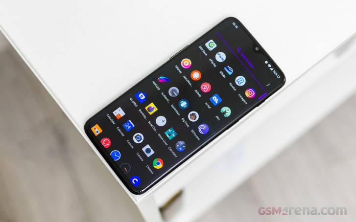
Oxygen OS home screen, app drawer, notification pane, quick settings
Some of the things OnePlus has been doing in OxygenOS may actually start making their way to Google's version of the OS, such as being able to pick a different accent color. So, even by Google's standards, clearly OnePlus has been doing some things right.
There's also basic theming built into OxygenOS, with three options of which "Dark" will do nice things for battery life since you have an AMOLED display and those use the least amount of power when showing black (as the pixels are just basically turned off and each of them practically has its own backlight). We used the Dark theme but you can also pick Colorful or Light if those suit your needs better. It's not a huge level of customization, this, but it still outdoes what Google's offering in Pie by default.
Like every other smartphone maker out there these days, OnePlus also has gesture navigation - in fact you can pick between two different systems, its own and Google's. If you want the three Android navigation buttons in their own bar at the bottom at all times, that's an option too. When it comes to gestures, we chose OnePlus', labeled "Navigation gestures" in Settings, because pretty much any other system is better than Google's.
We've ranted about this before but in our minds the point of having a gesture based navigation system is to free up screen real estate but Google's interpretation still has a navigation bar, so it just doesn't seem very useful. On the other hand, if you pick OnePlus' gestures like we did, there's no more navigation bar and you just swipe up from the bottom - in the middle to go Home, or to the left or right to go back, while the multitasking menu is shown if you swipe up from the bottom and pause. The navigation gestures work very well, but because of how tall the OnePlus 6T's screen is, at times you will need to perform some finger gymnastics to reach the bottom in order to swipe up.
To alleviate the fact that there's no quick way to invoke Google Assistant if you don't have a navigation bar and a button to long-press on it, OnePlus offers an option whereby if you press the power button for 0.5s the Assistant will show up and take your query. If you enable this then in order to have the power off / reboot menu come up you'll need to keep pressing the power button for around 3s. Cumbersome as it may sound, this works well and it will only frustrate you if for some reason you enjoy rebooting (or turning off) your phone a lot.

Option to quickly activate the Google Assistant
The OnePlus launcher isn't revolutionary but good enough that we didn't feel the need to switch to a third-party alternative. It has an option to swipe down anywhere on a home screen in order to access the notification pane and quick settings. Conversely, you swipe up to get to the app drawer, which can either show you all apps or a quick search field. This is very useful if you'd rather enter a few letters of an app's name when searching for it, instead of hunting for its icon in a long list.

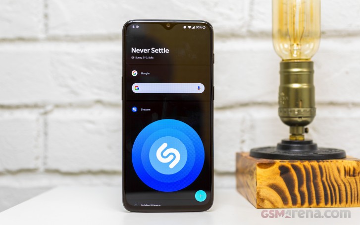
You can change the grid size for the home screen as well as use another icon pack, and on the home screen you can double tap on an empty area to lock the phone. And then there's the Shelf, sitting to the left of your leftmost home screen. This is where you'd find the Google Now/ Google Feed or whatever it's called this week if you had a Pixel. It's interesting that a lot of companies seem to consider it necessary to add something here, and we're still not sold on how useful things such as the OnePlus Shelf actually are. The good news is that you can disable it if you don't like it.
For us the only actually useful part of the Shelf for us was the loyalty cards section, which allows for quick access to those as long as they're stored in OnePlus' system. There are plenty of third party apps for this specific purpose, and if you live somewhere with Google Pay support then you can add those cards there. But if you don't, and don't want to go into an app for this, then the Shelf functionality is neat.
Additionally, the Shelf shows some info that is mostly redundant, like the entirety of the Toolbox area, the current amount of data used this month, the percentage of available storage, battery percentage, recent contacts. Recent apps in the Shelf is a nice touch but we assume most people would have their most used apps on a home screen anyway, so the benefit of this is marginal. The newly added Parking Location feature could save you a lot of time searching for your car, though. Finally, the memo writing function is easily accessible but you need to be okay with using OnePlus' Notes app for this purpose and not something like Google Keep (which syncs with any other device as well).

Speaking of apps, OnePlus has a bunch of its own preinstalled, but it's nowhere near the bloatware levels of most of its competitors. The File Manager is actually useful, the Community app will take you to the OnePlus forums where you can get support or ask a question about your device, Switch helps you transfer your data over from another device, while we assume Gallery is for those who dislike Google Photos and its free unlimited online storage for some reason. There's a simple audio recorder app too.
The Messages app - okay that counts as bloatware through and through, seemingly every device maker has to have its own messaging app preinstalled even though Google Messages (or whatever it's called this week) could've been there instead saving on some development costs and supporting RCS on respective carriers which offer it.
If you have multiple social media accounts, you can use the handy Parallel Apps function. This will let you install another copy of the app so you can be signed in to a different account on each.
The App locker lets you encrypt the contents of one or more apps and only access them with the PIN or passcode you use for unlocking the phone (or your fingerprint). We haven't used this but see how it could come in handy when you hand your phone to someone but don't want them prying in certain, more personal corners.
The fingerprint scanner has its own quick launch menu that you can use to start up apps without taking your finger off the screen - just keep pressing after it's unlocked and then slide to the desired app. This is one of those features that you might find neat but isn't turned on by default so it's not in your way if you're not into it.

Quick launch for the fingerprint sensor
Overall, OxygenOS right now is a really grown up variation of Android that can stand on its own with no issues whatsoever. We've encountered zero bugs in our use of the OnePlus 6T, and as covered in the performance section, it's very fast at all times. Design-wise it doesn't stray far from stock Android at all, and the added features aren't overwhelming but mostly nice to have.
Updates
The situation here is good if you compare OnePlus to, say, LG, but it's not great. The 6T launched running Android 9 Pie, so there hasn't yet been a big update to get through. The 6T has received a few updates since launch, but at the moment it's still stuck on the January 2019 security patch level, and that is anything but current. Interestingly, OnePlus' redesigned About page shows no info about the security patch level, unlike the one that's standard in Android, and we're not sure if this is a coincidence or the company's way of trying to sweep things under the rug. We've inferred that OnePlus aims at issuing quarterly security updates, but that's just not good enough, especially when you don't have dozens of different models to cater to.


Current software version and security patch level
Again, the comparison here shouldn't be with manufacturers who fare the worst - yes, OnePlus is definitely better than those. But it should really hold itself to a higher standard. HMD Global has sent out more timely security updates to mid-range Nokias, so in this respect OnePlus still has some work to do.
And when it comes to the big updates, OnePlus has in the past managed to get a new Android version (which Google launches in August) out by the end of the same year to at least one device, but that's usually the one that got released during that summer. Last year, it was the OnePlus 6. If the same logic continues to hold, then the OnePlus 7 might get Android Q by the end of 2019, but the 6T will have to wait some more months.
This is fine if as a company you're looking to appeal to buyers of Samsungs (since its update release timelines haven't been better), but if you want to position yourself as a more affordable alternative to Google's products, with great performance and a light software stack, then this is not enough. Then again, the price differential alone could make some people overlook such things.
Reader comments
- Ram
- 08 Sep 2024
- 7t}
Good phone without problem from 6 years. Hearing up is only problem, with fingers burning sensation. When not in much use also heating. Why
- Anonymous
- 23 Jul 2024
- r3c
Best phone ever since have been using phones in my entire life 😞
- Anonymous
- 05 Jun 2024
- nUv
great phone actually but i have tiktok burned in my screen for like 1 year of having tiktok


