Oppo F1s review: A second take
A second take

User interface
In typical Oppo fashion, the Oppo F1s is running the company's deeply customized ColorOS. Like the majority of platforms out of China, ColorOS is based on Android (in this case 5.1 Lollipop), which still allows it to take full advantage of Google's ever-growing ecosystem of apps and services, although it is becoming increasingly dated. The model to be sold outside China has the Google Play services pre-loaded, along with the full set of the search giant's apps.
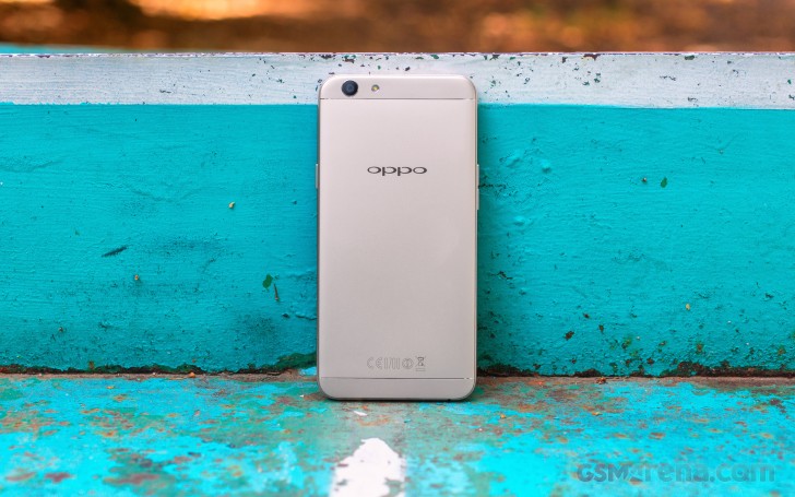
Yet this is about where any similarities with AOSP end. ColorOS has always had its own approach to Android, which more often than not is similar to the iOS approach to things. This fact is probably truer than ever with the new ColorOS V3.0.0i, powering the Oppo F1s. Its visuals are notably different than those of v2.1.0i which the original Oppo F1 was running when we reviewed it.
The UI is flat, vibrant and colorful. It's a playful look that we find fitting, but that certainly won't be to everyone's tastes.
The first thing that greets you when you pick it up is the stylish lock screen interface, which is never boring thanks to what Oppo calls Lockscreen magazine (we first saw that feature on Huawei's phones, and we love it). You get a new lockscreen image every time you wake up the phone. It sources the photos from an online database automatically, and you can pick your favorite categories of images from a list.
Scrolling left or right on the lock screen cycles through your current image feed, so you can always find that image you dismissed a bit too quick. You can also pin images so they will stay there until further notice.
The fingerprint reader integrated into the home button, provides an easy-to-use extra layer of security. It can be employed to limit access to certain apps or even files, but most people are typically going to use it for unlocking the phone.
Unfortunately, the reader on the Oppo F1s is not always on, so you have to tap the button before you can use the reader. Other than that, it works impressively fast and is quite accurate, and if you get into the habit of pressing it every time you need it to start reading, you won't even know its there. Oppo has also added the ability to map specific fingerprints to apps and launch them quickly. Neat!
Moving on to the Launcher we see once again Oppo has skipped the app drawer. You get a home screen with digital date and time near the top and a variable number of other screens to the right of it. You can use folders to group the apps on your home screen.


Default launcher with no app locker
And, if you fancy a new look, Oppo has included a powerful theming engine, that can tweak any part of the interface for you with many styles, which are available for download through the provided repository.
A swipe from the top shows the notification shade, which has two sideswipe-able tabs. The first showing the actual notifications, along a per-app notification management option, while the second is reserved for quick toggles.
There isn't much else going on in the home interface and probably for the better. ColorOS V3.0.0i offers a hassle-free, de-cluttered experience, which the majority of people will probably appreciate.
However, things get a bit weirder once you get to the Settings menu. Perhaps, in an effort to over-simplify things, Oppo might have made them rather chaotic. The thing we are referring to in particular is the large section of the settings menu dedicated to the Oppo stock apps. While having access to these settings is a good thing, most of them arguably belong within the settings of their corresponding apps. It is not convenient at all to lack access to things like viewer grids or location tags from withing the camera app and have to go to the setting menu to change it.
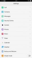


Settings interface and rather chaotic app settings placement
As with many other Oppo devices, the F1s is big on gesture controls. There is a vast array of things to choose from, including some industry standards, like taking screenshots, enabling one-handed mode or auto answer and flip to mute.
However, there is also a whole other section of swipe gestures that work when the screen is off. Here you can even define swipes of your own. Oppo has found a way to keep gestures going while the phone is asleep, which makes the fact that the fingerprint reader got no such treatment even more disappointing.


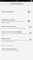
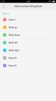
Extensive gesture functionality
The final thing worth mentioning is a power saving feature in this version of ColorOS, which works somewhat similarly to Doze. Unfortunately, it is far too aggressive and tends to suspend apps in the background, including messaging apps, which means you often miss your messages. It's not uncommon to open Hangouts or WhatsApp and get all your messages at once. There is an option in the Settings to freeze individual apps and not allow them to run in the background but even with it disabled the OS still heavily controls app's background activity. This does help the phone in the battery life department, but there is a tradeoff at hand.
Circling back to where we started, Oppo seems to have taken inspiration from iOS. It's not uncommon to see Chinese OEMs go down this route, but there's usually some originality whereas Oppo has chosen to copy quite slavishly and rather brazenly. The iOS influence can be seen everywhere in the UI - whether it is the iOS style homescreen layout, the default app icons, the multitasking app screen, the way you can swipe down on the homescreen to bring search (Google Search, in this case), the volume popups, the Settings app, the Camera app, the power-off dialogue, or even the wallpapers, it's certainly there for good or bad.
For Oppo's sake, however, the user experience after the last redesign is vastly improved over its previous versions of ColorOS and this version is significantly cleaner and easier to use, so from a user's perspective things are looking as good as ever.
Reader comments
- Doris
- 14 Feb 2025
- Nu6
Please update my opponent F1s I can't go to google play store app and my whatsapp is having verification code issues
- Momin
- 01 Jan 2025
- XND
Nice


