Oppo Reno13 review
Design and handling
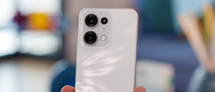
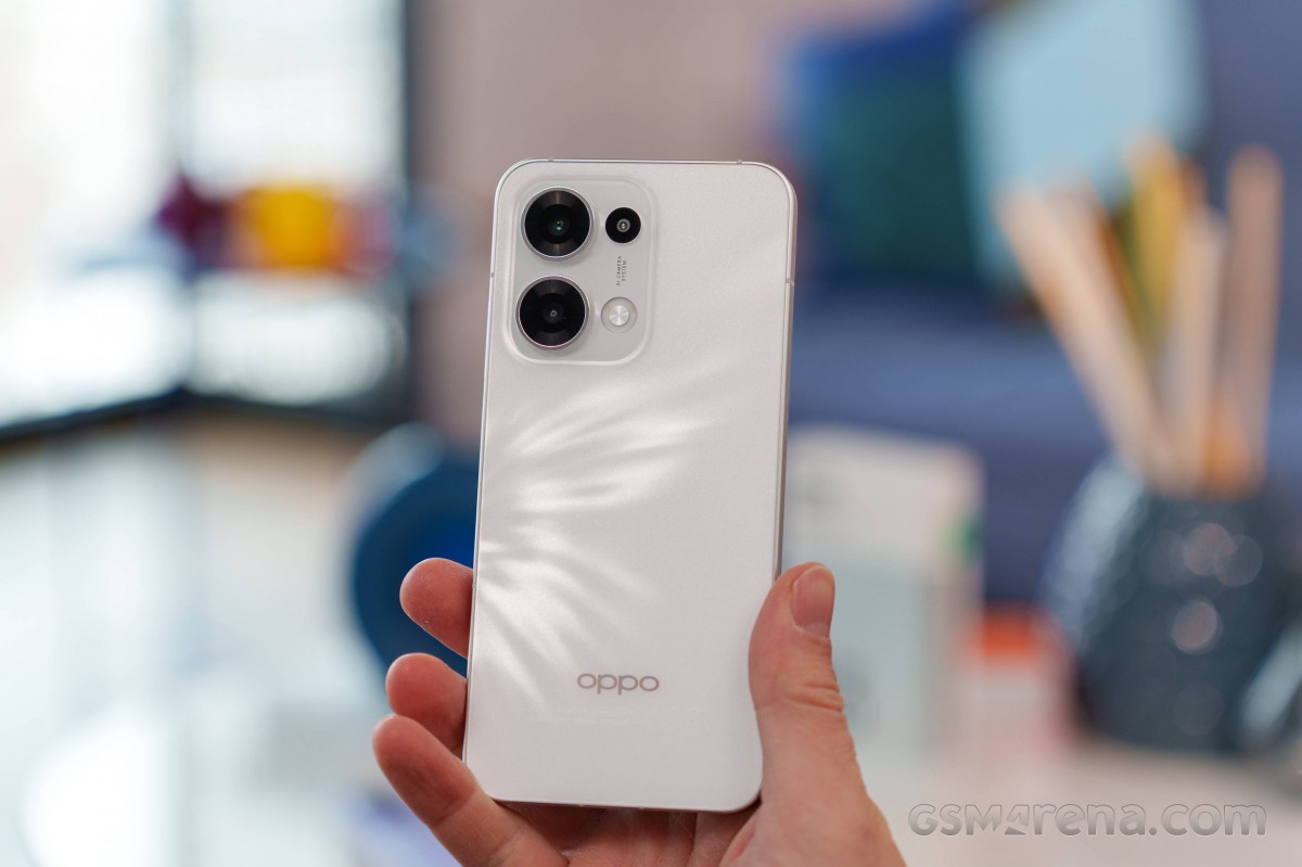
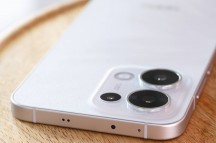
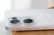
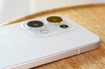
The Reno13's design takes a slightly different route. While previous generations had a slightly oval design, the Reno13 is more flat. The side frame is almost completely flat, and the front and back panels lack the curves as well.
Arguably, it's more aesthetically pleasing, but the sharp edges don't provide the same comfort as designs with curved panels and frames. To be frank, it looks and feels like an iPhone to some extent.
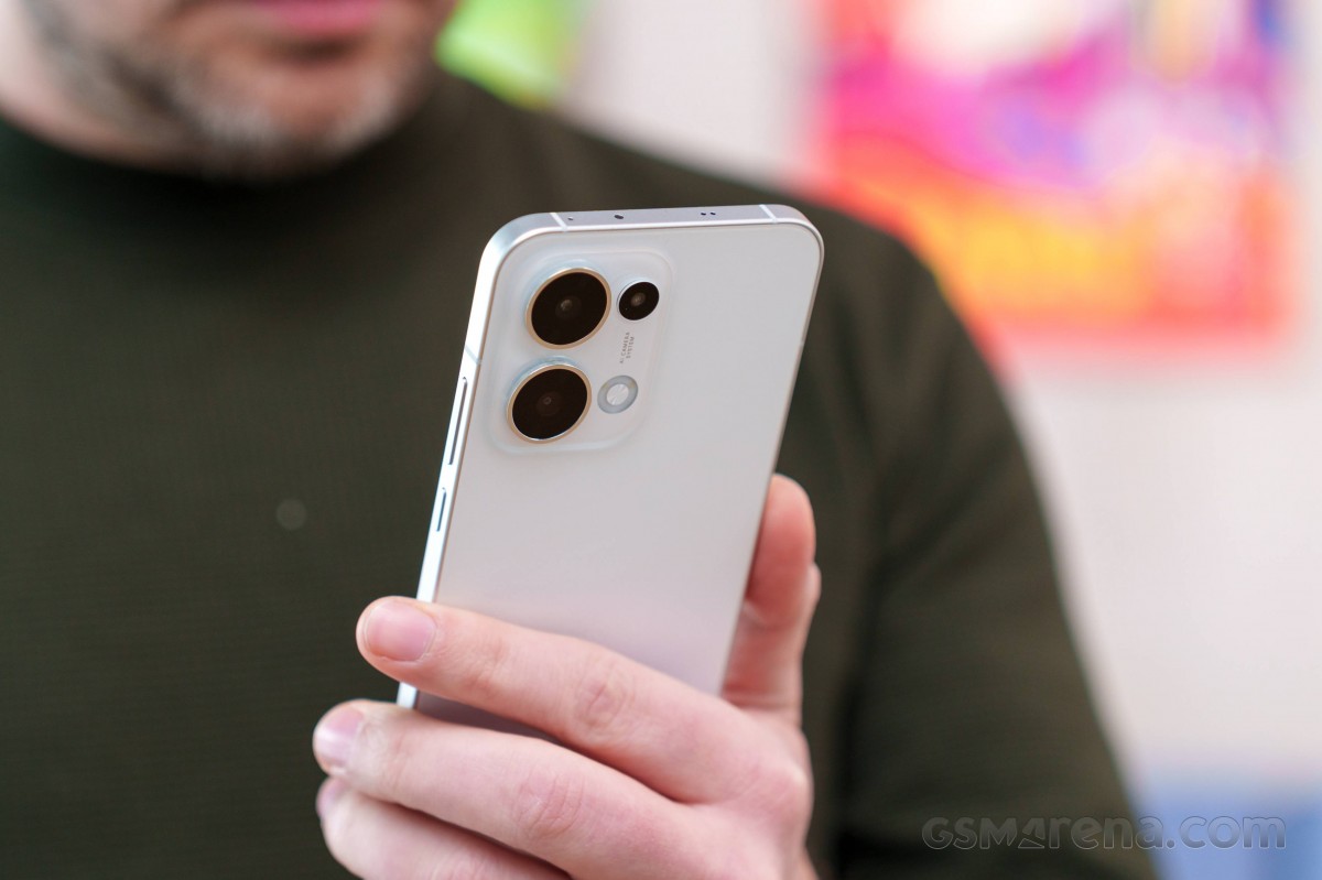
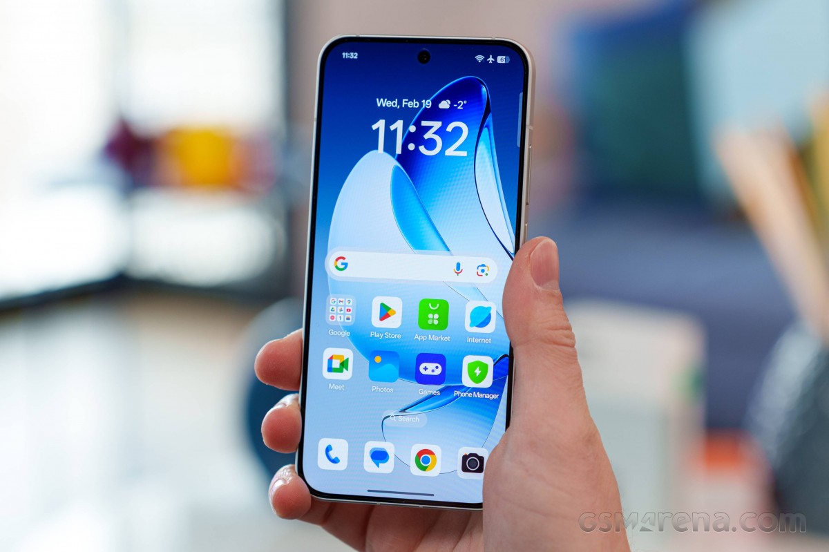
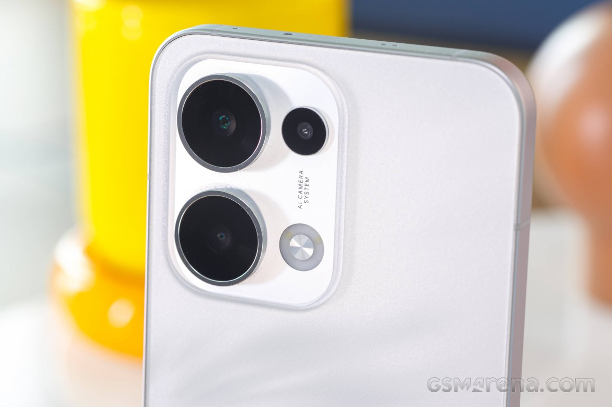
The Reno13's chassis is also a significant upgrade over its predecessor. The frame is now aluminum, while the back glass has been polished in 65 steps, creating that matte-like texture. The texture itself feels a lot like plastic, but the frame definitely adds to the premium feel. The display is protected by Gorilla Glass 7i.
Perhaps more importantly, the device is extremely lightweight and thin, measuring just over 7.2mm thick and tipping the scale at 181 grams. And even though it feels easy on the hand, it's very slippery. At least the glass back finish doesn't attract fingerprints.
Oppo Reno13
The available colors are Plume White and Luminous Blue. The former colorway has a subtle splash-like pattern that's visible under the right lighting and angle.
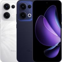
Plume White • Luminous Blue
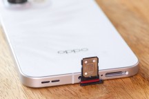
The Reno13 also boasts a higher ingress protection rating, now IP68/IP69, up from last year's IP65.
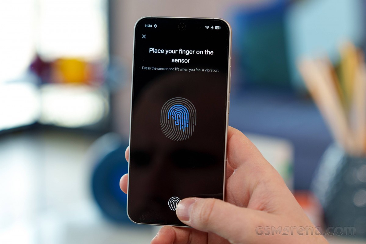
Button placement is convenient, but we can't say the same about the fingerprint reader position. It's placed a bit too low and close to the bottom edge. Otherwise, we found it to be fast, responsive and reliable.
All in all, the design is appealing, and the Reno13 incorporates premium materials that make the device very nice to the touch, but the blocky design gives the impression of handling a bigger phone. Also, the choice of materials and finish make it extremely slippery.
Reader comments
- Bubusana khwairakpam
- 04 May 2025
- CbB
Appo reno 13 network is very poor i cant play pubg/mllb/bgmi etc...i want to sell....
- Phone Geek
- 30 Apr 2025
- X$5
This review of GSMarena does not fit with all other reviews on the internet. They seem to undermine this phone despite it's pretty good features. They are saying Realme 14 pro plus has better camera but that is absolutely not true. Realme 14 pro...
- Anonymous
- 19 Apr 2025
- K1L
Reno 13, easy better OS, chipset and better camera's