Realme GT Master review
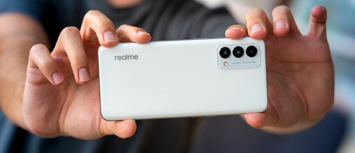
Design
For the GT Master and GT Explorer Master Realme partnered with Japanese designer Naoto Fukasawa, with whom the phone maker has somewhat of a history. This latest collaboration resulted in what they're calling Suitcase design - some versions of the GT M and GT EM have vegan leather backs finished to resemble a suitcase. An interesting source of inspiration, we must admit.
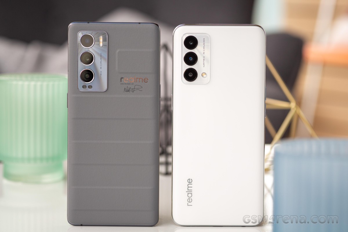 Realme GT Explorer Master in Voyager Gray (Suitcase design) next to the GT Master in Luna White
While the GT Master is, indeed, available in the same Voyager Gray as the GT Explorer Master above, our review sample is the Luna White version - so no leather-like material on the back. As best as we can tell, the GT Master is made mostly out of plastic, including the rear panel and the exposed part of the midframe.
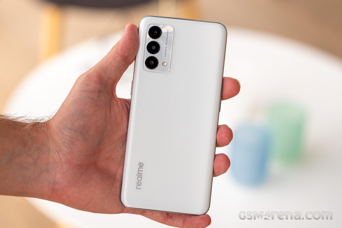
The back panel has a matte finish that, while happy to pick up fingerprints, hides them really well, and you can only see the smudges if you deliberately go looking for them at an angle into the light. It's a relatively grippy back as matte panels go - that is to say 'pretty slippery', but not as slippery as the worst.
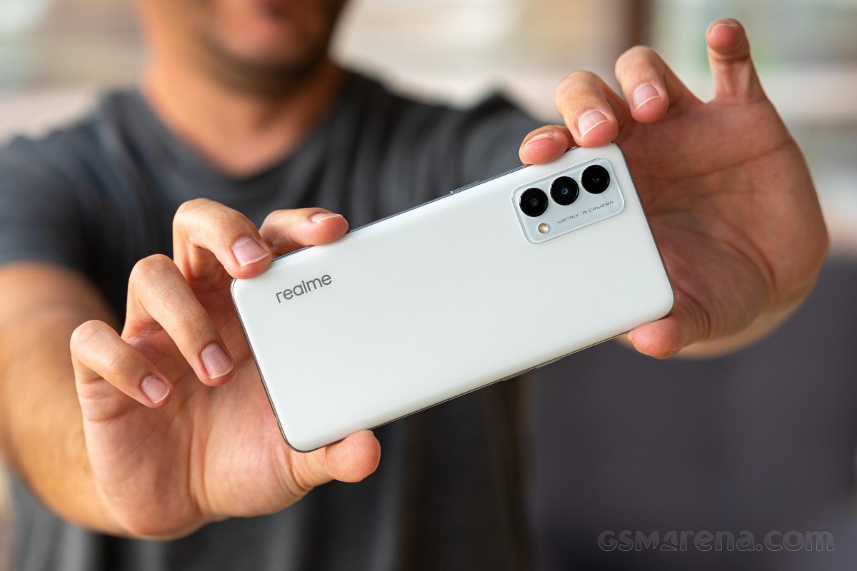
Naturally, the Voyager Gray provides improved grip thanks to the texture of the material itself and the raised ridges. Fingerprints aren't a thing with this one either.
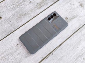
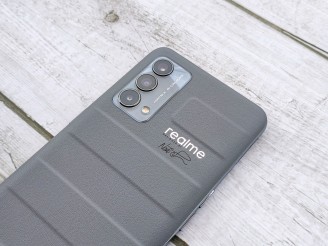
Realme GT Master in Voyager Gray
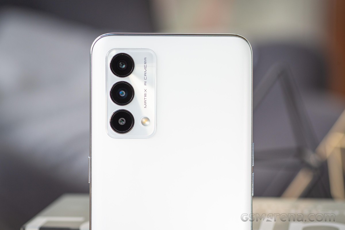
A fairly prominent camera island is placed in the top left corner, the oversized lens circles sticking out from it a little bit further still. A Matrix AI camera inscription is the only text found here, and it's a reasonably minimalistic design, we approve. The Voyager Gray variant has the designer's signature too, we'll allow it.
The whole camera assembly protrudes enough to make the phone wobble on a flat surface, but only barely - we don't think it'll bother anyone.
Realme is one of few makers to still persist with putting the power button and the volume controls on different sides of their phones. The GT Master has the power button on the right, a centimeter above the midpoint, while the volume buttons (two separate ones, as opposed to a rocker) are on the left. That's probably the most screenshot-capture-friendly configuration, though we imagine that's not been the driving factor behind the placement.
Also on the left is the card slot. It takes two nano SIMs and that's all - the GT Master does not support microSD cards for storage expansion.
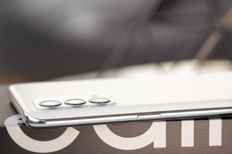
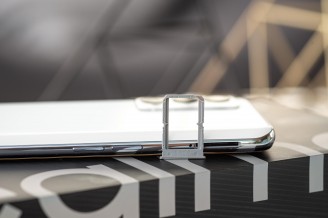
Power button on the right • Volume rocker and card slot on the left
On the bottom of the phone, you'll find the USB-C port in the middle. To one side is the loudspeaker behind three rounded openings, while on the other is the 3.5mm headphone jack and the primary mic. Up top, there's another mic.
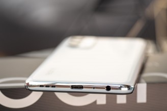

Bottom packed with features • A single mic up top
The face of the GT Master has little personality, but that's not its fault - there's only so many different spots to place a punch-hole selfie camera. The Master's is in the top left corner, eating a few pixels out of the 6.43-inch Super AMOLED display.
The earpiece is in the center, at the very edge where the display glass meets its plastic surround. To the right of the earpiece, you can spot the ambient light and proximity sensors, their location made more easily identifiable by the notch in the screen protector. Speaking of, there's no official information on what exactly glass Realme has used to cover the display of the GT Master.
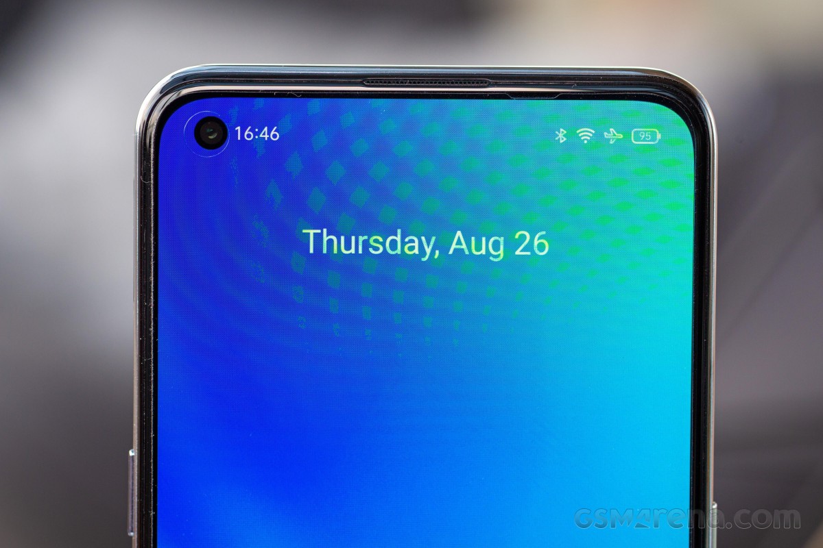
The GT Master's bezels are what we'd call standard - they don't strike us as too big, nor do we find them particularly slim. We're just at a point when even midrangers have acceptable-looking black borders around their displays.
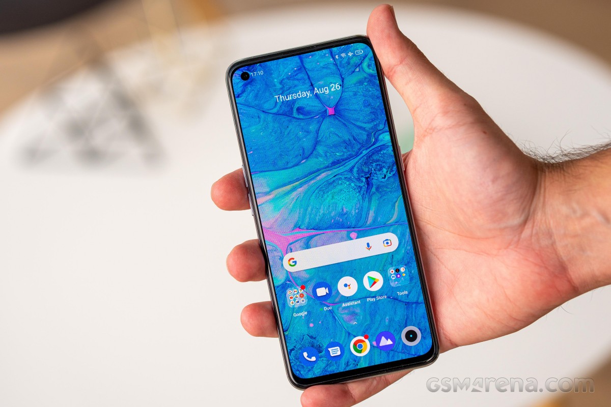
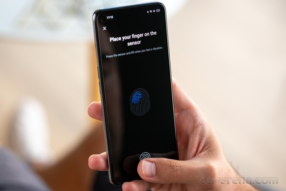
An optical fingerprint sensor is placed underneath the OLED display. It works reliably, there's no complaints about that, it's just that it's positioned too low for our liking. It's not something you won't get used to, but a few millimeters higher would have made the adjustment process easier.
The Realme GT Master measures 159.2x73.5mm in footprint and is either 8.7mm thick for the vegan leather option, or 8.0mm for the other ones. Similarly, there's a difference in weight, albeit less tangible - 180g for the Voyager Gray, 174g for the others. It's neither compact, nor unwieldy, when it comes to dimensions, and its weight is average, or just under, for its class. Physically, it's just a regular phone, is what we're saying.

Reader comments
- Eroxe
- 17 Apr 2025
- KI{
Worst phone I've used ever. It becomes so much hot when playing game on this device. Battery timing is very bad. Camera results are also not so good in this price. According to my opinion it is Not a good phone...
- The guy..huh
- 18 Jan 2025
- IV$
Very good, can withstand 4 whole years. Im using it right now :)
- Sale
- 20 Aug 2024
- swm
Gt Master screen protection is best ever ! New Realme are not so good anymore.