Samsung Galaxy Ace 3 review: Minor league
Minor league
Display
The Samsung Galaxy Ace 3 has a 4-inch screen of WVGA resolution (480 x 800 pixels). The screen is a bit larger than the 3.8-inch display on the Galaxy Ace 2, which results in a slightly worse pixel density (233 ppi), but makes operation so much easier since honestly, Android feels a bit cramped on anything less than a 4-inch WVGA screen. The larger screen allows for easier text input, for instance, as the keys of the virtual keyboard are not as small..
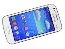
The Galaxy Ace 3's WVGA screen
The WVGA resolution does not get stretched significantly by the larger size either, and we'd say the slight sacrifice to pixel density is worth the extra screen estate. Otherwise, colors are good as is the brightness, and we didn't see much contrast shift in viewing angles either.
Overall, the contrast is not the best we've seen, but is good for its class.
| Display test | 50% brightness | 100% brightness | ||||
| Black, cd/m2 | White, cd/m2 | Black, cd/m2 | White, cd/m2 | |||
| Samsung Galaxy Ace 3 | 0.22 | 180 | 828 | 0.54 | 472 | 879 |
| LG Nexus 5 | 0.31 | 298 | 948 | 0.54 | 526 | 967 |
| LG G2 | 0.10 | 149 | 1522 | 0.45 | 667 | 1495 |
| LG Optimus G | 0.14 | 197 | 1445 | 0.33 | 417 | 1438 |
| Sony Xperia Z1 | - | - | - | 0.38 | 580 | 1513 |
| Samsung I9505 Galaxy S4 | 0 | 201 | ∞ | 0 | 404 | ∞ |
| HTC One | 0.13 | 205 | 1580 | 0.42 | 647 | 1541 |
| Oppo Find 5 | 0.17 | 176 | 1123 | 0.51 | 565 | 1107 |
Sunlight legibility is the same story - nothing spectacular, but still good for an entry level device.
Sunlight contrast ratio
-
Nokia 808 PureView
4.698 -
Apple iPhone 5
3.997 -
Samsung Galaxy Note 3
3.997 -
Samsung I9300 Galaxy S III
3.419 -
Nokia Lumia 925
3.402 -
Samsung I9505 Galaxy S4
3.352 -
Samsung Omnia W
3.301 -
Samsung Galaxy S
3.155 -
Samsung Galaxy S4 mini
3.127 -
Samsung Galaxy S4 zoom
3.118 -
Nokia N9
3.069 -
Samsung Galaxy Note
2.970 -
Sony Xperia Z1
2.950 -
HTC One S
2.901 -
BlackBerry Q10
2.856 -
Samsung Galaxy S II
2.832 -
Samsung Galaxy S II Plus
2.801 -
BlackBerry Z30
2.790 -
Huawei Ascend P1
2.655 -
Sony Xperia ZR
2.672 -
Nokia Lumia 900
2.562 -
HTC One Max
2.537 -
Nokia Lumia 720
2.512 -
HTC One
2.504 -
Sony Xperia Z
2.462 -
Samsung Galaxy S III mini
2.422 -
Motorola RAZR i
2.366 -
Samsung Galaxy Note II
2.307 -
Apple iPhone 4S
2.269 -
HTC Desire 600 dual sim
2.262 -
LG Nexus 5
2.228 -
HTC One X
2.158 -
Nokia N8
2.144 -
Oppo Find 5
2.088 -
BlackBerry Z10
2.051 -
Apple iPhone 4
2.016 -
HTC One mini
2.003 -
LG G2
1.976 -
Sony Ericsson Xperia ray
1.955 -
Samsung Galaxy Camera
1.938 -
HTC Butterfly
1.873 -
Huawei Ascend P6
1.865 -
Sony Xperia V
1.792 -
Sony Xperia U
1.758 -
Meizu MX3
1.754 -
LG Optimus 4X HD
1.691 -
HTC One V
1.685 -
BlackBerry Q5
1.682 -
LG Optimus Vu
1.680 -
LG Optimus GJ
1.666 -
HTC Desire V
1.646 -
Samsung Galaxy Ace 3
1.622 -
Sony Xperia Z Ultra
1.578 -
Samsung Galaxy Core
1.563 -
LG Optimus G Pro
1.552 -
LG Optimus 3D
1.542 -
Nokia Asha 302
1.537 -
Sony Xperia M
1.473 -
Nokia Lumia 610
1.432 -
Gigabyte GSmart G1355
1.361 -
HTC Desire C
1.300 -
Nokia Asha 501
1.270 -
LG Optimus L7
1.269 -
LG Optimus L9
1.227 -
Meizu MX
1.221 -
Sony Xperia E dual
1.203 -
Samsung Galaxy Pocket
1.180 -
Sony Xperia tipo
1.166 -
Samsung Galaxy mini 2
1.114
We also put the Samsung Galaxy Ace 3 screen under our microscope to show you its display matrix. It has the same inline RGB pixels as the Ace 2, although they're shaped differently and slightly tilted.
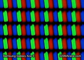
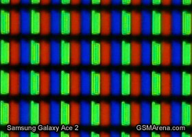
The screen matrix of the Galaxy Ace 3 next to the Galaxy Ace 2
Handling
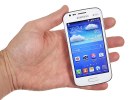
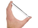
The Samsung Galaxy Ace 3 is really easy to handle with its curved back fitting nicely in the palm of your hand. Given the friendlier, compact size, the slippery finish is a lot less of an issue than some of the larger flagship and phablet offerings from Samsung. Single-handed operation is a breeze as well.
Our only complaint when it comes to the Ace 3 aesthetics is that the design language has been used by Samsung for almost two years now and it is already becoming a bit tiring and boring. Not to mention you would have a hard time distinguishing the Koreans' midrange smartphones apart just by looking at them. While this may be a certain advantage of driving sales (the affordable midrange phones look just like the company's much advertised flagship), the lack of product differentiating bears the danger of backfiring (making users look for an alternative smartphone that stands out elsewhere). Where's the fun in having your new phone look just the same as your old phone?
Reader comments
- Mary
- 02 Feb 2021
- LEi
Wow, I had this phone from 2016 to 2017, it was good for me at the time, it was affordable, I remember my father bought it for me to use it when I got into college, I was happy with it, resisted so many drops and never stopped working, camera was fu...
- Anonymous
- 17 Oct 2016
- LaT
My friend bought one new today from a small independent high street London shop.it is a very poor phone.the storage on it is diabolical.after just downloading 3.apps on to it.nothing else.it stated that we could not use those apps because there was n...
