Samsung Galaxy Nexus review: Opening new doors
Opening new doors
User interface
The Samsung Galaxy Nexus is the first phone to feature the latest major version of Android - 4.0 Ice Cream Sandwich (ICS). The interface is very much like the one in 3.0 Honeycomb, but parts of it have been revamped to work both on phones and on tablets.
We're dealing with the phone version here and there's barely any traces of Gingerbread left in it. Here's a video demonstration of ICS running on the Galaxy Nexus.
Let's start with the lockscreen. The unlock mechanism differs from both ICS and Gingerbread. There's a circle around a padlock icon at the bottom of the screen which can be dragged within the confines of a circle but only two positions actually unlock the phone - sliding to the right unlocks the phone, while sliding to the left unlocks it and starts the camera.
You don't have to be precise - just get the circle close enough to the unlocked padlock icon or the camera icon and it will snap to position.
This unlock isn't as flexible as some of the custom solutions we've seen - there are only two unlock actions that can't be customized and you can just tap anywhere and drag like you can on the Galaxy Note for instance.
Ice Cream Sandwich also brings the option to unlock the phone with your face - it's not the most secure way, but it's the fastest just point the camera at your face the phone will let you in.
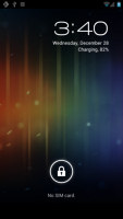
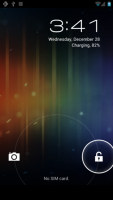
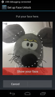
The new unlock screen • Face unlock
Past the lockscreen is a very different homescreen. It brings major changes to how Android's UI on phones works; the biggest change being that the interface is completely free of hardware buttons.
A row at the bottom has been reserved for three on-screen buttons - Back, Home and the Recent apps. Occasionally, a Menu icon button appears to the right of the Recent apps button, but only for apps that need it. This one is rather cramped and uncomfortable (the other three keys don't reposition to make more room), so we hope apps get redesigned quickly to use the new interface.

The on-screen keys in portrait and landscape
That row is always visible - even on the lockscreen (the icons disappear, but the black bar where they live stays). The icons will rotate as needed to match the screen's orientation, which one advantage over their hardware counterparts, but some prefer hardware buttons.
ICS can use hardware buttons too, if the device has them, but the Galaxy Nexus will probably be a trend-setter in the Android world, so hardware keys might become are rarity.
Anyway, above that row is a dock - called favorites tray - of four shortcuts with the app drawer shortcut sitting in the middle. The shortcuts are easily customizable (you can drag them like any other shortcut) and you can even dock folders here.
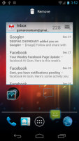
Docking a shortcut in the favorites tray
Another permanent fixture is the Google Search bar at the top of the screen. It stays in place as you scroll through the homescreens (so it's not just a widget).
The notification area is present also and it too has received a facelift - it shows you icons next to the notification, such as the picture of the person who called or messaged you. There's a Settings shortcut (similar to that in Honeycomb) to make up for the fact that you can't go Menu > Settings anymore (which was the quickest route to the full Settings menu).


The revamped notification area • You can dismiss items by swiping them off the screeen
Notifications can now be removed from the screen one at a time and all you have to do is swipe on them to remove them from the list.
There are five panes on the homescreen and you can neither add nor remove ones. They are populated with shortcuts, folders and widgets and the latter two have learned new tricks.
Widgets are resizable both vertically and horizontally (usually, some can be resized only in one direction). It's something we've seen in custom launchers before but is now part of the standard Android package.
To resize a widget, you tap and hold on it and then release it. Four handles will appear on its sides, allowing you to change the widget's size in the direction you want. Resizable widgets appear with a border around them in the app drawer (more on that later) to make them easier to spot.
Folders are different too - you create them by dropping a shortcut on top of another shortcut and you can name them by opening the folder and tapping the "Unnamed folder" label. Opening a folder expands it only as much as needed to fit the icons inside.
The folders themselves are circular with the shortcuts inside drawn as if they are in a line one behind the other and you're looking at them at an angle (complete with perspective). They are lined up in order, so the first shortcut in the folder will be the only one unobscured - the rest are harder to see, very hard to tell apart.
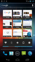
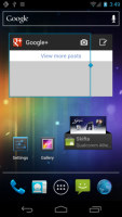
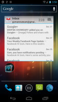
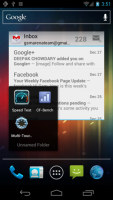
The homescreen • Resizing a widget • Folders
Live folders seem to be gone for good in this latest iteration of Android.
The app drawer is pretty much the same as it was in Honeycomb. It features two tabs - Apps and Widgets - that house side-scrollable pages. If you scroll past the available apps you move into the Widgets tab. There's also a Market shortcut next to the tabs, for quicker access to Android's app repository.
Apps and widgets are ordered alphabetically and there's no option to order them by something else or manually reorder them.
Putting a shortcut or widget works as you would expect - you press and hold to grab it and then position it somewhere on the homescreen. Two more options appear at the top of the screen while you're dragging - Uninstall (to quickly remove apps) and App info, which opens the application's entry from the Manage applications list. Drop the app or widget on either one to activate it.
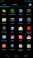
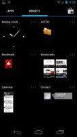
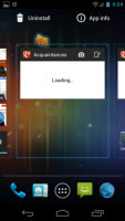
The app drawer houses both shortcuts and widgets • Placing a shortcut on the homescreen offers new options
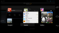
The Recent apps list is borrowed from Honeycomb - it displays thumbnails of the running application rather than its icon and it's a vertical, scrollable list. There's one enhancement - you can dismiss apps with a simple swipe to the side.
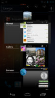
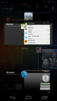
The Recent apps list • Dismissing an app
Google is using a new typeface on Ice Cream Sandwich, called Roboto, which replaces the original Droid typeface found on previous versions of Android. There are also some new animations and transition effects and a new swipe gesture that works across the OS and lets you remove items from a list simply by swiping on it horizontally.
Synthetic benchmarks
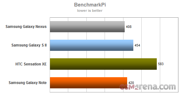
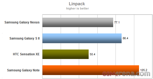
The Samsung Galaxy Nexus packs two Cortex-A9 cores running at 1.2GHz inside its TI OMAP 4460 chipset, so in terms of CPU performance we expect to see it somewhere around the Galaxy S II (which uses two Cortex-A9@1.2GHz cores too), save for any optimizations brought about by the new OS.
And the first benchmark, BenchmarkPi, shows a promising result - the Galaxy Nexus bested the Galaxy Note (1.4GHz). But then, in Linpack the Galaxy Nexus fell behind the S II. Overall, the Galaxy Nexus is a strong performer in CPU performance, among the best, though it doesn’t leave current dual-cores in the dust.
The graphics performance is another matter - OMAP 4460 packs a PowerVR SGX540 GPU, which is quite old (it was used in the original Galaxy S) and there's almost 720p worth of pixels to push to the screen.
"Almost" because the bar with the on-screen keys is visible even when running a 3D game and it will be like that for a while (current games weren’t designed for ICS).
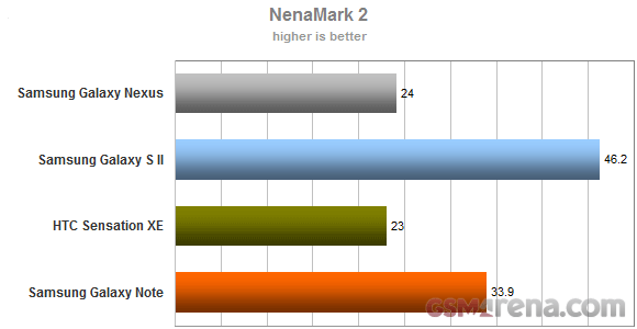
Anyway, NenaMark 2 posted a score of 24 frames per second, which isn't stellar but should be good enough. We've seen slower performers and game devs need to take them into account as well, so the Galaxy Nexus should have no problem playing games.
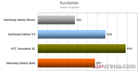
The Android browser has received a lot of updates for Ice Cream Sandwich, let's see if that includes JavaScript engine updates. And it does - the Galaxy Nexus breezed through SunSpider making the current crop of smartphones look like a bunch of slowpokes. It's the fastest score for a mobile device yet (yes, even the iPhone 4S) by a healthy margin.
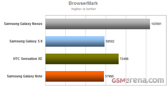
BrowserMark, which adds HTML5 tests to the mix, also pointed to the ICS-running Galaxy Nexus as the fastest mobile device for web browsing by a sizable margin over the competition.
The good news here is that it's not the CPU, it's the browser engine - and all phones that get Ice Cream Sandwich will enjoy a major boost to web browsing performance.
Reader comments
- Paul mbugua kamau
- 03 Jul 2018
- NYp
How could I find Samsung google phone shop on sh
- AnonD-346267
- 29 Dec 2014
- LaA
Hello! I have a question for anyone who can help me out. I have a samsung galaxy nexus 9250l and my problem is that from a while it begins to shut him self out and then restart again by it self. I was wondering if some one can give me a advice or...
- Anonymous
- 20 Aug 2013
- pqZ
Not true,you can select an option that makes all calls from a certain contact divert directly to your voicemail / answering machine and it doesn't even ring. If that person sends you an SMS/MMS you don't get the notification ,however it does show in ...