Samsung Galaxy Note20 Ultra long-term review
Design, handling, build quality
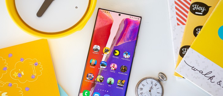
The Note20 Ultra is, in this reviewer's very subjective opinion, the best-looking smartphone ever made. It's also among the best feeling thanks to the back glass' satin-like finish, which additionally has the advantage of not showing fingerprints almost at all. It's still slippery, though, which is why it doesn't take the cake for "the absolute best feeling" because you can still get some anxiety about possibly dropping it.
The good news is that the new Gorilla Glass Victus that adorns both the front and the back is the most shatter-proof material ever put on an Android phone, and throughout two unwitting tests we can confirm that. We dropped the Note20 Ultra both on tiles from about 1m and on a carpet from around the same height with absolutely zero marks anywhere. That was a very nice surprise.
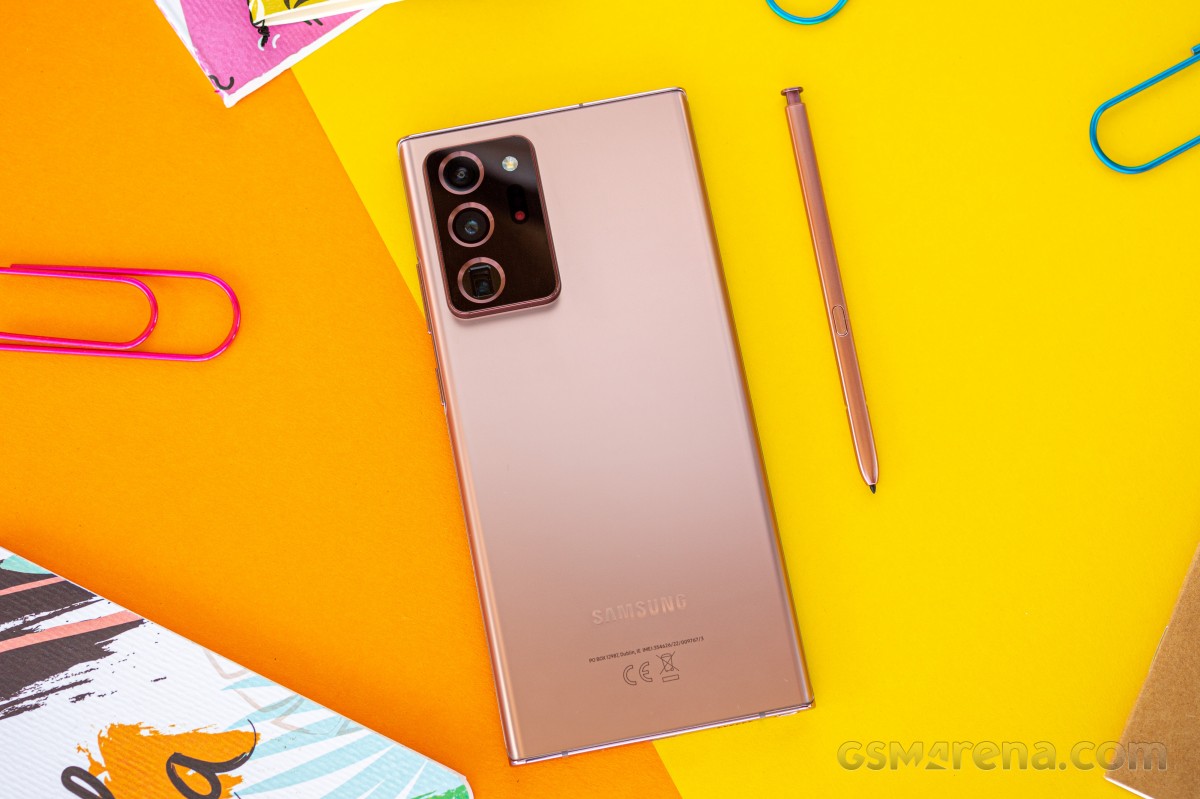
You are welcome to disagree, of course, but there's something about how it all comes together in the Note20 Ultra's design that is just extraordinary. Countless times so far we had thought we'd seen it all when it comes to the now traditional metal and glass slab design, and yet something always seems to come by to force us to realign our beliefs.
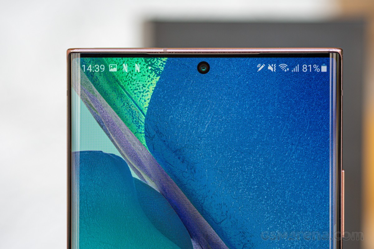
Take the screen bezels. We've seen small bezels a lot, but these are tinier. Take the screen curves. We've seen a lot of curved screens before, but the way this display 'turns' into the frame is second to none, and that's mostly thanks to the radius of the curvature, combined with the fact that the frame corners aren't rounded. The back glass curves at a very similar radius, and while the frame itself isn't exactly 'in the middle' between the two sheets, it's close enough that it does sort of give off a vibe of symmetry.
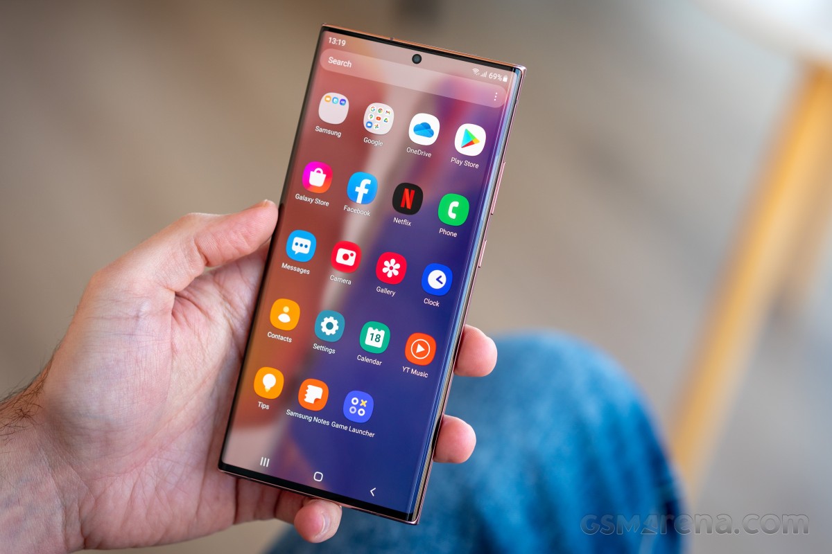
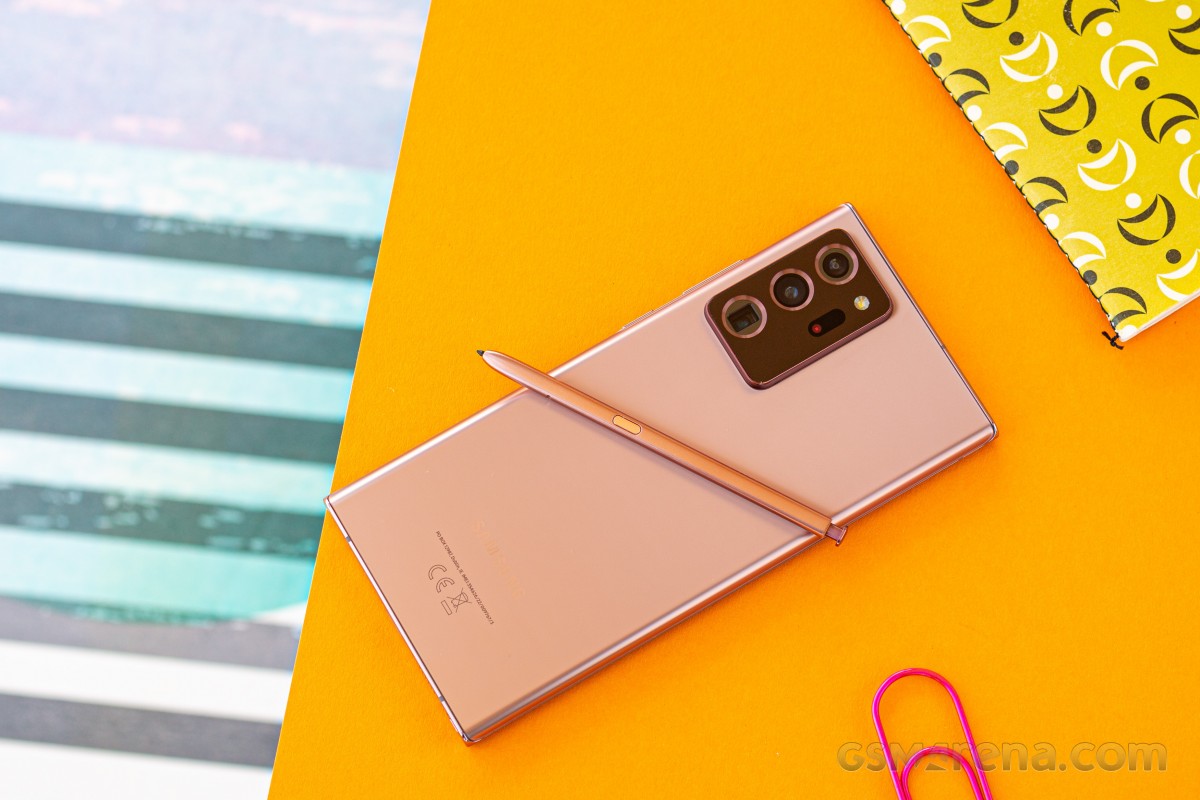
The flat top and bottom sides are a stroke of brilliance, as at their ends they get rounded to nicely showcase the aforementioned glass curvature. Funnily enough, the camera hump being so big basically ensures that you won't be able to 'sit' the Note20 up on its top side, while the S Pen converges to not let that happen for the bottom, so it's not about that, it's just about how aesthetically pleasing the flatness is.
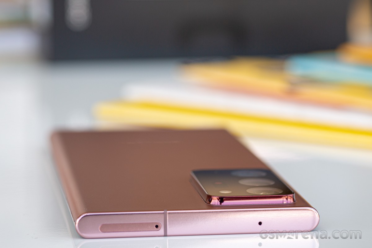
The back glass feels like satin to the touch, but also somewhat like a metal that has been satin-ified, not glass. And the humongous camera hump feels self-assertive in its hugeness, it doesn't want to hide itself under two-tone finishes or anything like that. The sensor cutouts are exaggerated but to a great effect, and we think this Samsung design team went in a good direction - that is, making the best of the situation.
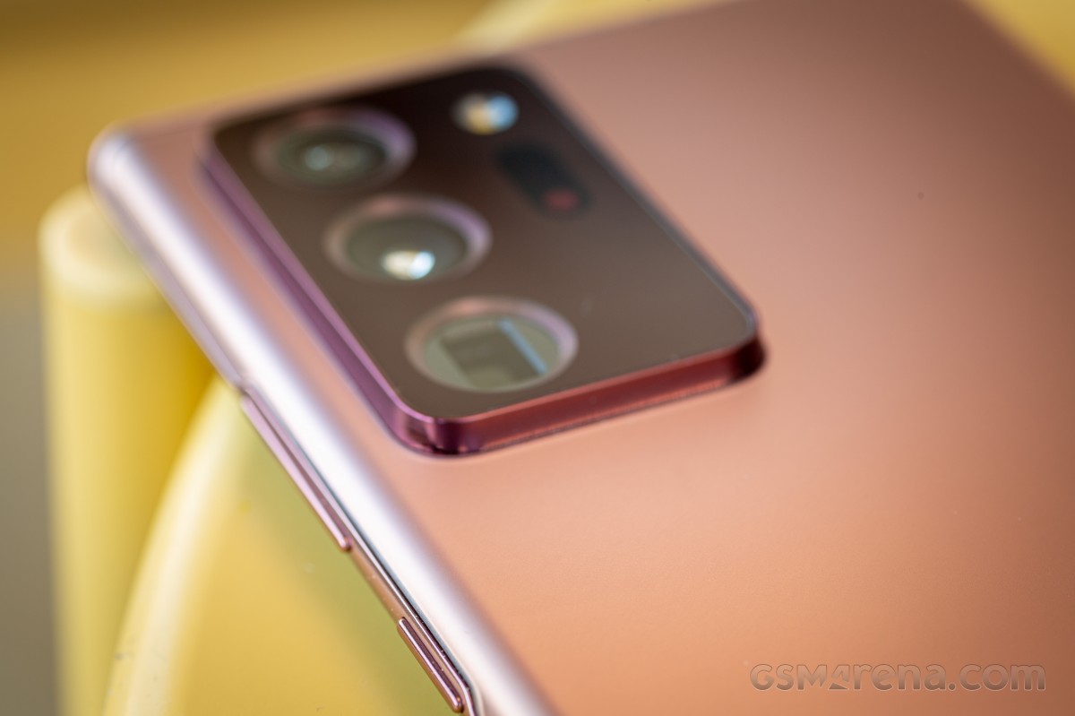
The hump is also instantly recognizable and iconic, although for that to take any hold in the public conscience the company would have to stick with it for another generation, which is not very Samsung-like (but has constantly benefited Apple as a strategy over the years).
The Note20 Ultra owns its hump, and while being unapologetic about it, it's not shouty or, dare we say it, ugly. There is, after all, a whole lot of tech hiding there, and that's not something to try to hide.
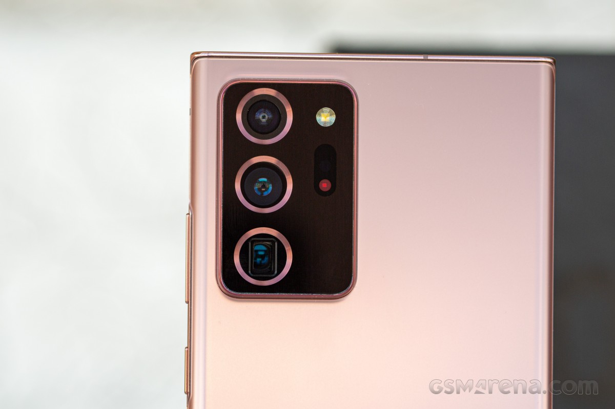
Build quality is as good or better than any top of the line smartphone ever made, the Note20 Ultra feels like one solid entity, and that perception is helped by its weight. It's not light by any stretch of the imagination, but it's not horribly heavy either (for its size). It's just about hefty enough that it feels like you're holding a bit of premium tech. It's also not likely to go unnoticed in a pocket, and that's down to the weight combined with its rather unique shape.
While not as boxy as some Sony smartphones, the Note20 Ultra is much boxier than any other mainstream flagship device, and that is one more thing that makes it unique looking. The corners of the display have only the tiniest of curvatures, and this makes it feel like the screen is even bigger than it actually is. It also means that holding the Note20 Ultra for an extended amount of time with one of the corners 'digging' into your palm is going to be a different experience than it would be with a curvier handset.
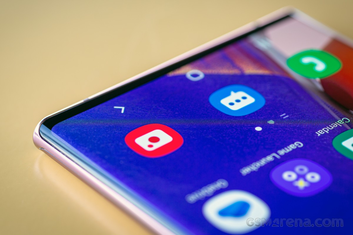
This one will make its presence felt, you never forget it's there, but while that can get annoying, it also has the opposite effect, which is of you constantly being reminded that you are using this uniquely shaped, amazing looking bit of high-end technology.
Width-wise, it's definitely at the edge of what this reviewer would call usable with one hand, and if you have smaller hands it's probably over that edge. However, if you're an S Pen fanatic, then two-handed use is a must anyway, so this might be a moot point.
We want to take a second here to celebrate the fact that Samsung has managed to eek out the absolute maximum screen size it could in this form factor - the bezels, the tiny corner curves, the side curves - all of those work in concert to deliver what subjectively feels like by far the biggest screen-to-body ratio ever. And that's a rather magical thing to look at every day.
Speakers, vibration
The Note20 Ultra's stereo speakers are easily among the best this reviewer has ever heard. Even if the earpiece is pulling double duty as one of the channels and there isn't a dedicated speaker up top like we've seen in some other phones, the results here are truly outstanding. The quality is great for something coming from a phone, and there's plenty of volume too. In fact, we'd rate these as the loudest (subjectively) we've ever heard, while in quality the Mi 10 Pro seems to still have a slight upper hand. The differences are minute, however.
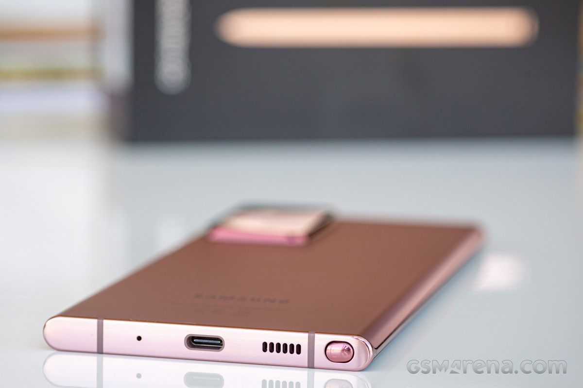
Quick note about the earpiece, though: it seems to have a much wider dynamic range at the top end than any other we've tried, which is great on paper but also means that you're being exposed to many more high pitched sounds than when using another phone, so if you are sensitive to such noises, some calls (especially where the person you're speaking to has a lot of random noise around them) can become grueling.
The vibration motor on the Note20 Ultra is solidly among the Top 3 best ever put inside a smartphone, but compared to what Xiaomi has been doing for its flagships in MIUI 12, we feel like it's underused. There are a lot of interactions with the UI that could benefit from a gentle vibration here and there, and yet they don't. And then the fingerprint sensor could have some haptic feedback when unlocking, like every other phone with an in-display unit, but Samsung is still not willing to go there for whatever reason.
Anyway, where the vibration motor is used, you'll be very happy. The experience of typing with haptic feedback is excellent, for example, and the motor is strong enough that ringing vibration patterns are both very deep (so you can feel them) but quite loud too (so you can also hear them). This may irk some people, but if the point is not to miss a call no matter what, the job here is being done admirably.
S Pen
Here's an unpopular opinion: the S Pen is too small, too short, too narrow, too light, too flimsy, too hard to get out of its slot, too hard to put back in, and for most people on Earth (who are right-handed), it's also in the wrong position. So why does it exist again? For Samsung to get away with launching two flagship smartphones per year, every year? Remember when Sony tried the exact same strategy and everyone was put off by it? Well, if only Sony gave one of its two yearly flagships a 'differentiating feature' like the S Pen, perhaps the story would've been different.
Had the S Pen been bigger, thicker, heftier, and easier to pull out and put back in, there would possibly be a higher number of people demanding styluses for their smartphones. But there aren't, because if the S Pen is the epitome of the stylus, then most people, for most things, don't actually have any need for a stylus for their smartphone. So maybe a case is the way to go - like the S21 Ultra that supports the S Pen, but without a slot to house it. Instead, you can get a special case that also stores the stylus. Such an arrangement could enable bigger styluses, which would then instantly become more usable.
This is not to say that the S Pen as it is isn't useful. It definitely is - sometimes. Think of it as a tablet. It's nice to have, but not necessary per se, unless you're in a job (or have hobbies) that requires you to use it constantly. We'd assume not a lot of people are in such a position, though, judging by the sales of the Note line over the years compared to the S line. For everyone else, the S Pen is a good feature that doesn't make or break the experience of using the Note20 Ultra. We'll be honest - aside from using it intentionally in order to be able to write about it here, we only pulled out the S Pen 'naturally', without thinking about it, two or three times over our extended period of using the Note20 Ultra as our one and only smartphone.
Let's face it, right now the S Pen is the only thing making a Note a Note anymore, as big screens are everywhere - even Apple gave in to that trend because it had to. People like larger screen areas, and seem to be mostly meh about styluses. But, if you do get a Note20 Ultra, you'll be happy to know that the S Pen's latency has been cut down to just 9ms, which makes its interactions with the screen near-instant. You can definitely feel that improvement in use compared to previous Notes and their 42ms latency, these aren't just marketing numbers.
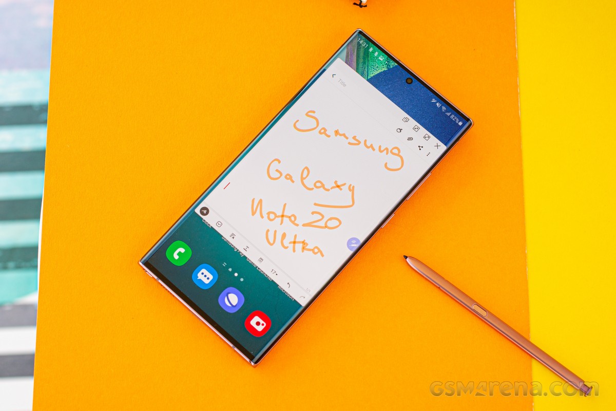
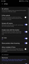
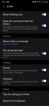
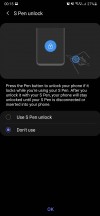
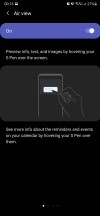
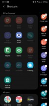
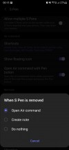
All of the traditional S Pen features are here. You have Screen-off memo which is self-descriptive, and when you pull out the stylus with the phone unlocked you're shown the Air command menu of quick actions. The shortcuts are customizable of course (this is a Samsung, after all), and you can turn off Air command entirely if it annoys you. Screenshot taking is heavily improved by using the S Pen, there isn't a thing you would want to do to a screenshot that you can't do here. And with Air view, you can do stuff by simply hovering with the S Pen above the screen (think scrolling up and down, enlarging image previews, seeing calendar details, that type of thing).
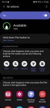
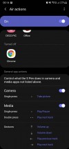
Additionally for the Note20 Ultra there are Anywhere actions, which is a way to use the S Pen to trigger actions on the phone from further away. This seems like a great idea for the Camera app so you can remotely snap photos, and some will definitely enjoy the ability to control PowerPoint slides from a distance.
You can also now use the S Pen to go Home or Back or to Recents, if for some reason you have the stylus in hand but can't or don't want to touch your phone for navigation through its UI. You can also assign Anywhere actions to start up any app of your choosing, and all of this seems nice on paper, but most times it's much easier to just use your phone to do things on your phone.
Reader comments
- ee
- 24 Dec 2024
- KAp
its the stabilization camera noise
- Eburner
- 17 Jun 2024
- IbI
How can the Pic 📸 quality not surpass the Note 9? That sounds pathetic to me, and Samsung aught to give a discount to every Note 20 Ultra. ☹️😠
- LM93
- 27 Oct 2023
- Xyb
I have had a P30 Lite since 2016 and haven't had a problem with it, however, I am now considering upgrading to a Note 20 Ultra as it has recently become available at one of the service providers in SA. Considering that it has Recieved its final ...
