Samsung Galaxy Note9 review
Design and 360-degree spin
It's not universally pretty, the Galaxy Note9. There's simply too much stuff that needs to fit on the back and there's hardly a good-looking way to do it.
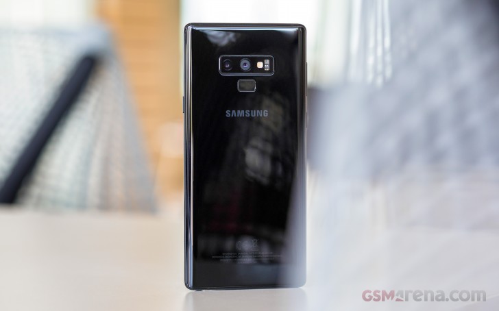
The Note8 looked half-reasonable, but certainly didn't get it remotely right in terms of usability with its off-axis fingerprint reader - a pain point Samsung addressed on the Galaxy S9+, with a vertical camera arrangement and a fingerprint reader below it.
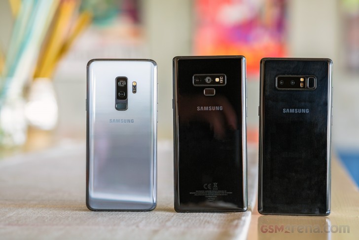
It's a different layout on the Note9 - the side-by-side cameras are back, flash LED and heart-rate sensor to their right, fingerprint sensor along the central axis under the cameras. Why not the same as on the S9+? The S Pen silo takes up space on the side, the battery can't be as wide and needs to be taller than in the S9+, hence it pushes the sensor higher. Or at least that's how we reason it.
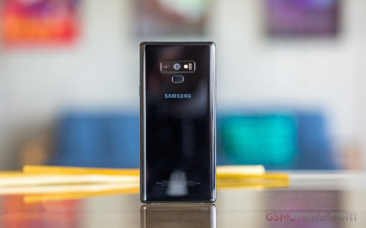
There's two things we find wrong here, to varying degrees. Okay, maybe not wrong, but less than ideal. Number one, the main camera is ever so slightly offset from the central axis - by about a millimeter, but it's visible and will irk a particular type of person (a bunch of them here at GSMArena HQ). We get that Samsung aimed to center the camera/flash/sensor window, and placing the elements within it came secondary, but still.
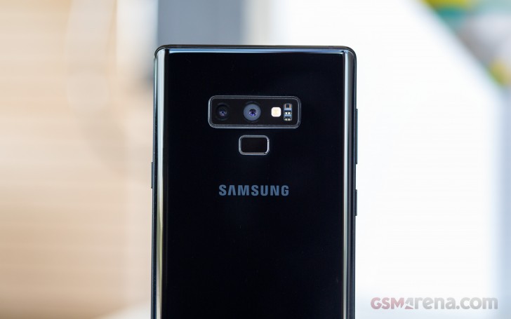
Then there's the fingerprint reader position once again. This could be us overanalyzing it (it's happened before), but it still feels a bit too high. As in, not Note8 high and uncomfortable, but still inconvenient. You do get used to it, and the fact that you're stretching up and approaching it from below, means you're likely to feel it and unlock the phone before actually touching and smudging the camera.
But since we have to (collectively) be that guy - it's also the primary camera that's in immediate proximity to the sensor instead of the supposedly less frequently used telephoto one, like it's on the S9+. It's always a good idea to wipe your lenses clean before a critical shot, is what we're saying.
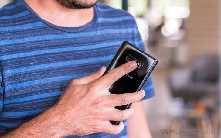
Over on the front, the 6.4-inch Super AMOLED takes center stage, now even more than before. The chin is noticeably slimmer, the forehead is perhaps identical to the Note8's and in effect the phone is physically shorter despite the minor increase in display diagonal.
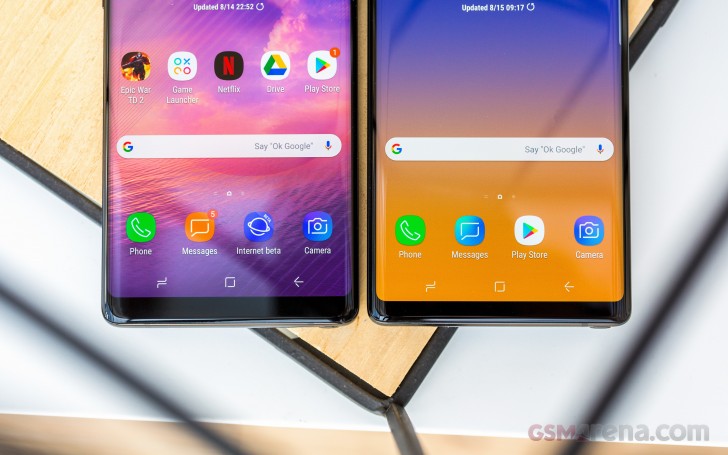
The top bezel still houses the entire array of sensors and lights and more pedestrian stuff - and like the S9+ does it in a somewhat more concealed manner than the S8/Note8. There's no hiding the earpiece - it's dead center and also doubles as a speaker. To its right is the selfie camera, the actual one for taking photos, and next to it - the iris scanner.
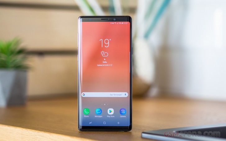
To the left of the earpiece are the proximity and ambient light sensors, followed by the IR illuminator, and an RGB status LED. So no, AlwaysOn displays don't render status LEDs redundant, and we're happy Samsung's with us on this one. One LED that's missing is a flash - there are mid-range Galaxies with front-facing flashes, but no flagships. Or is that a 6.4-inch AMOLED flash in disguise?
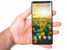
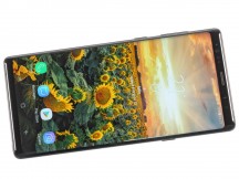
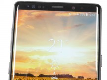
6.4-inch Super AMOLED in the hand • ...and on the table • An array of sensors above it
The sides of that... um... flash are a hair thicker, and with the panel being marginally wider too, the Note9 is slightly wider than the old model. We're talking 1.6mm wider.
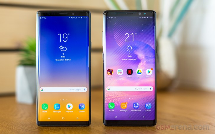
The aluminum frame has a sturdier and more technical look and feel than both the Note8 and the S9+'s, accented by chamfers front and back. The Note8's polished finish was already gone on the S9, and the Note9's frame is matte as well, with the chamfers slightly shinier. Out went the calipers, and we read 3.5mm on the side of the Note9 and 3.0mm on the Note8, so the increase in thickness is not just subjective.
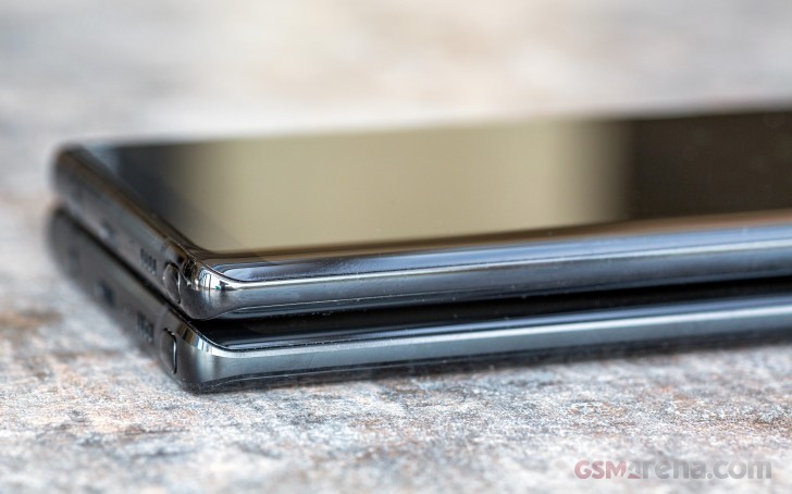
The Power button is on the right side of the frame, directly opposite the gap between the Bixby button (below) and the volume rocker on the left.
The first few attempts at taking a screenshot (power+volume down key combo) will likely result in summoning Bixby unless you're coming from another recent high-end Galaxy. You will eventually learn that lesson. For what it's worth, all the buttons click precisely and have good travel.
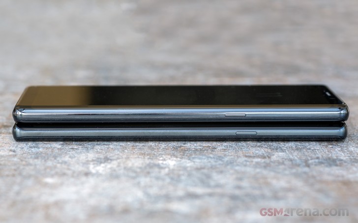
Samsung's insistence to force Bixby's presence upon you by fitting a hardware key that can't be set to do anything else still perplexes us. That seems to be the general consensus, yet we're not sure it really matters - will you not buy a Galaxy specifically because of the Bixby button?
Anyway, the card slot is located on the top of the phone, and our dual SIM variant takes two nano SIMs, or a nano SIM and a microSD card. Towards the other end of the top plate there's a pin hole for a secondary mic.
The primary mic is on the bottom, to the right of the USB-C port. Further to the right is the loudspeaker, while the 3.5mm jack is on the left.
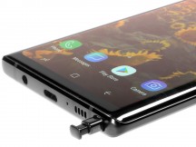
Volume rocker and Bixby on the right • Dual SIM slot with hybrid action • S Pen in the bottom right
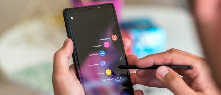
The S Pen. It's got the clicky mechanism on its tail end that Samsung introduced with the Note5, and, aside from a slightly smaller button on the side, looks and feels very much the same as the one on the Note8. And the Note7 before it. And the Note5.
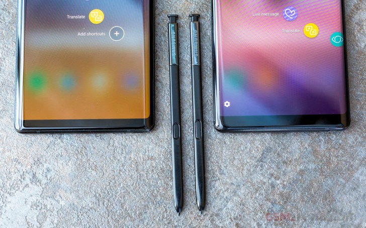
It's quite a bit more useful, though. Packing a supercapacitor inside, it can power a Bluetooth module to connect to the phone, which lets it perform as a remote.
The most obvious use case is taking photos and videos with the phone across the room, but it could also come in handy, for example, if you're doing a presentation straight out of your phone. Or scroll through the gallery, or play/pause/skip media, or whatever app devs come up with later on.
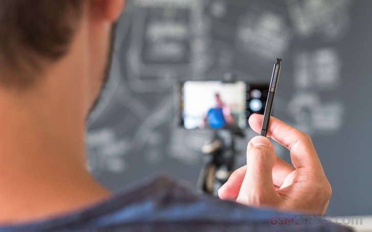
Three actions are recognized - long press, single press, and double press, and they can be configured to do different things. So far, the long press can only be used to launch a particular app (camera is the default), while the other two actions are available inside apps.
The capacitor charges in a matter of 40 seconds inside the phone, and should be good for about 30mins or 200 clicks - sounds plenty. When the power does run out, there's nothing stopping the active S Pen from being just a passive S Pen, though with that recharge time you'd be up and running in... well... seconds.
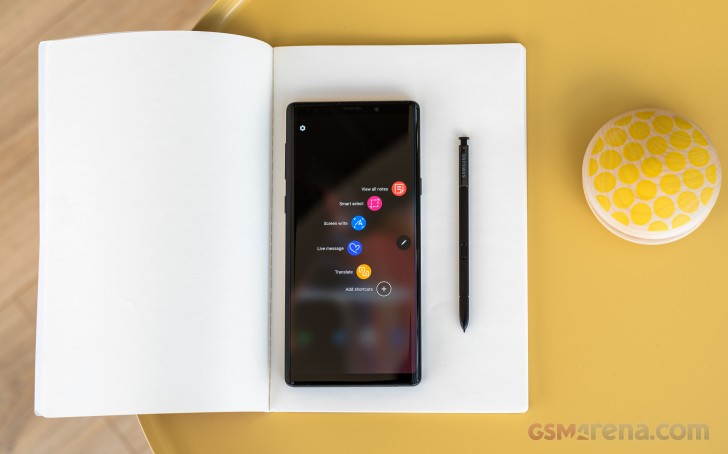
The S Pen, as the one on the Note8, is IP68 certified, just as the entire phone itself for that matter. You could say we're already taking that for granted.
Let's get all the numbers in one place - the Note9 measures 161.9x76.4x8.8mm and weighs 201g. Compare that to the Note8's 162.5x74.8x8.6mm and its 195g and you'll see that the minor bump in display diagonal and the much more significant battery capacity increase hasn't impacted the phone's physical size. The S9+ isn't meaningfully more compact either with its 158.1x73.8x8.5mm and 189g.
Reader comments
- Bjorn
- 22 Dec 2024
- 3I{
Still use my Note9, superior phone
- Anonymous
- 29 Nov 2024
- ter
Still using the note 9..... Will give 5 stars
- derrr
- 14 Nov 2024
- 8aX
Nice feedback however in my experience there is one downside with the mobile and Samsungs "wisdom?" as they decided to remove Pro-mode in video and despite calls to re-introduce it they ignored the calls but re-introduced it it the next mod...