Samsung Galaxy S20+ review
Design
The Galaxy S20 family's design story is one of polishing and fine-tuning. Once Samsung was all settled on glass and aluminum with the S6, it became a matter of refinement and iterating on different display and back panel curves, frame thickness and finish, button placement, the lot. The S20s then should be nearing perfection.
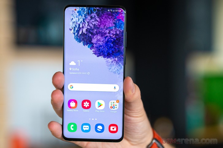
Now, a case could be made that the ever slimming bezels are detrimental to handling, with the almost nonexistent chin leaving no room to rest a thumb. If you're of that general predisposition, you'll probably appreciate that this generation has the subtlest of display curves we've seen on a Samsung flagship in a while - display curves have typically been a thorn in the side of more conservative folk who prefer the good old days.
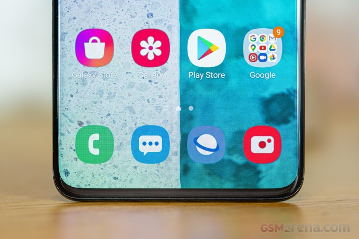
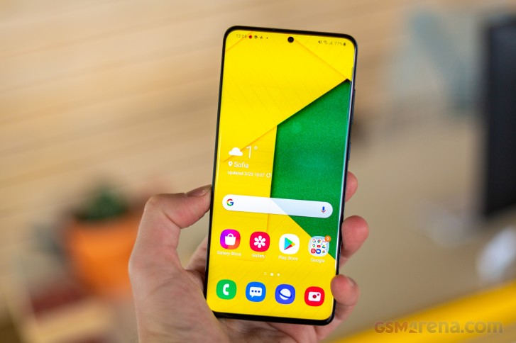
What we're trying to get at, is that Samsung's nailed the S20's design to be closer to universally likable than more extreme efforts of the past. Bezelless, without being too curvy, what's not to like?
Having said that, we doubt you'd able to just slap any glass screen protector on your Galaxy S20+ - there's still enough of slope to make it a tricky affair. A minor silver lining is that the phone comes with a pre-applied plastic sheet, though you'll grow to hate it instantly if you opt for the gesture navigations. Every swipe in from the sides to go Back will mean scratching your thumb - a gentle scratch, of course, but still unpleasant. Call us petty, but we're just saying it the way we're feeling it. You can always remove the protector and put your trust in the Gorilla Glass 6, that's what it's there for.
There's another sheet of that on the back too - both sides of the phone are protected by Corning's latest. The innards should be safe from harm as well - there's an IP68 rating on the Galaxy S20+ to attest to that.
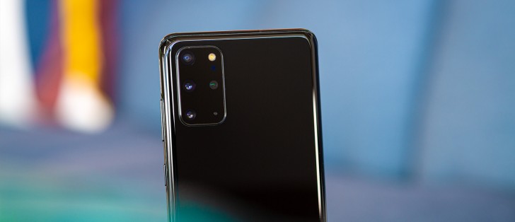
The Galaxy S20+ we have for review is in the Cosmic Black color scheme. We'd normally avoid boring black paintjobs for our own phones, but this colorway in particular makes the S20+'s camera assembly disappear and that's the only relatively unsightly bit about the otherwise good-looking handset.
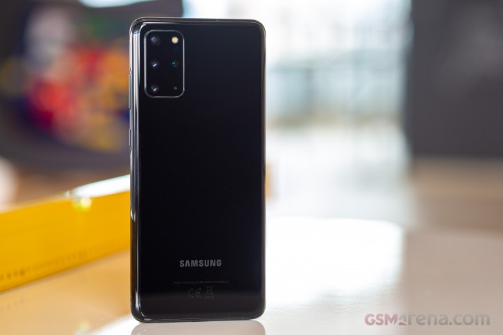
If you don't mind the camera bump's black plaque standing out, you'll have a choice of four more colors for your S20+ - Cosmic Grey, Cloud Blue, Cloud White, and Aura Red. It's a much better selection than the Ultra's two shades of boredom (Cosmic Grey, Cosmic Black) but it's very likely that not all options will be available across all markets.
Mind you, that camera cluster isn't all that bad to look at, certainly not the monstrosity that the S20 Ultra has. Samsung's done what it could to make it as symmetrical as possible, fitting the three actual cameras on the left and the flash and ToF pair on the right. A mic also had to go in there.
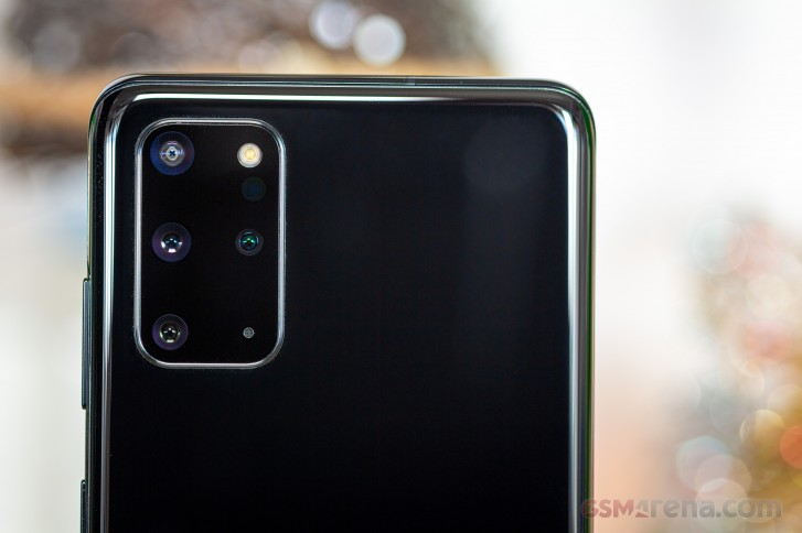
It's one of three mics. Looking at the top of the phone, we see another mic, way off from the card slot, so you don't poke it accidentally trying to get your cards out. The card tray will hold a nano-SIM and a microSD card on single-SIM models, while dual SIM version will have a shared slot for the second SIM and the microSD - not ideal, but that's how it's usually been.
On the bottom of the phone, we find the primary mic for voice calls (3 out of 3). The USB-C port is centered here, with the main loudspeaker to the opposite side of the mic.
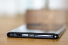
Power button and volume rocker on the right • Card slot up top • Bottom plate arrangement
Another loudspeaker is up top on the front - as per Samsung's arrangement since the S9, the earpiece also serves as a second channel for loudspeaker purposes.
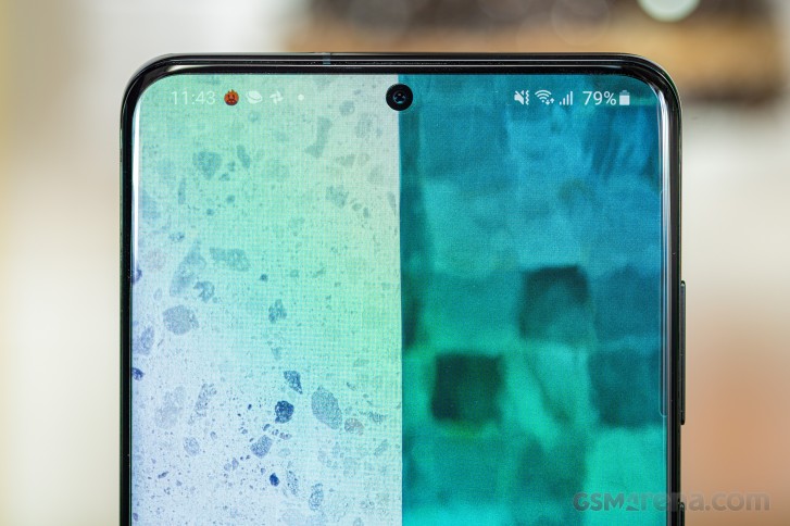
Where the Plus in the Galaxy S20+ has the greatest significance is physical size. It measures 161.9x73.7x7.8mm - a full centimeter taller than the vanilla S20. It is somewhat closer to the Ultra in this respect, that one being 5mm taller still. The S20+ does manage to keep a slim waistline - the S20 is, in fact, a fraction of a mil thicker, which goes up to a full millimeter when comparing S20+ to S20 Ultra.
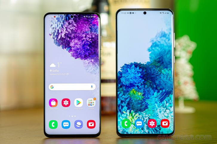
What's likely the closest competitor, the iPhone 11 Pro Max, is some 4mm shorter than the Galaxy S20+ but is also wider by as much. The iPhone is also quite the chunk with its 226 grams, actually more than even the Ultra. Meanwhile, the S20+ weighs a very reasonable 186g, even less than the iPhone 11 Pro non-Max, and it's lighter than the Galaxy Note10+ by 10g, though it's still an increase over last year's model.
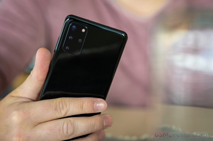
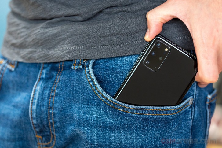
We really don't mind it, though. It's nowhere near what you'd call a hefty phone, particularly when you consider the battery capacity you're getting. The 7.8mm thickness barely makes a bulge in a pocket and makes for a really comfortable hold. It is tall, that much we'll give it, but that's where the trend is going.
Reader comments
- fkyshow
- 18 Mar 2025
- XBA
I guess iit's because of the verticval green lines that crop up randomly. Mine now has 6