Samsung Galaxy Z Flip3 long-term review
Resolution, brightness, display quality
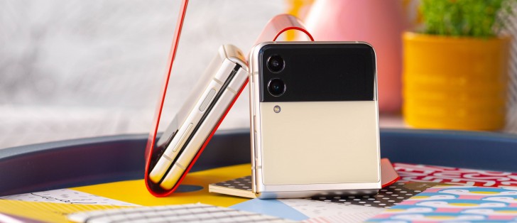
Like most foldable phones, the Flip3 has two displays. But unlike most foldable phones, you can only use one of them to do most of the things you'd want to use your phone for. We'll get to the outer screen in a bit, but let's start with the main display, the one that folds.
The Flip3's inner screen has a slightly taller aspect ratio than most mainstream slab phones, but it's not so much taller than it's ever an issue in day-to-day use (unlike the outer screen of the Fold3, for example). And we assume most people wouldn't even notice that it's taller, unless they had a different 'normal' smartphone around to visually compare to.
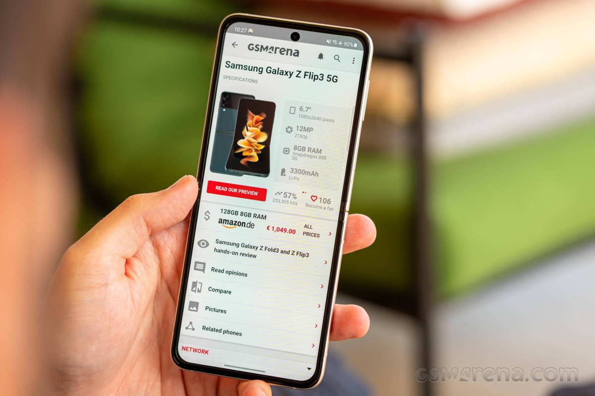
It's 'just' 1080p, so it doesn't quite match the top-of-the-line mainstream alternatives with their QHD panels, but it's highly debatable whether most people would actually be able to perceive the pixel density delta in real life use case scenarios. We were certainly not left wanting a higher-res panel for what it's worth.
The main screen is also very visible outdoors, even on the sunniest of days. Its perceived brightness doesn't quite match the likes of the Galaxy S22 Ultra (nor the S21 Ultra), but it's better in this regard than most phones out there, and you'll definitely not have any issues with visibility. The panel also gets sufficiently dim on the lowest brightness setting that you won't feel like it wants to destroy your retinas when you use the phone at night in a dark room.
The auto brightness curve isn't among the best we've seen in the past couple of years, but it's definitely in the top 25%. We did have to manually adjust a number of times, but not so much that it became annoying, and of course, the adjustments were then remembered and applied the next time the device encountered the same amount of ambient light. Brightness changes are also quick enough when ambient light changes, and overall our experience with auto brightness was good but not perfect.
The screen quality is top notch, as is always the case for high-end Samsungs; it didn't disappoint. As usual, you can pick between two modes, where Vivid is accurate for P3 content, and Natural is intended to cover the sRGB space. We like our AMOLEDs vivid, so we went with the eponymous mode but bumped up the warmth slider since the default seems to prefer whites that are a bit too bluish for our taste. You can definitely find a specific setting for your heart's content, no worries about that.
Refresh rate
The 120 Hz refresh rate is pretty much standard across high-end devices nowadays, and the Flip3 offers the same. It's the usual quirky Samsung way of choosing, though, with Adaptive basically never actually fixing the rate at 120 Hz, but varying it depending on what you're doing. This definitely saves some battery, and we're fine with the setup because, as you'll see in the Battery life section, this phone definitely needs all the help it can get in that regard.
The switching between rates isn't as dynamic as on LTPO2 panels, but it is much more dynamic than a simple choice of 120 Hz or 60 Hz. And this is implemented very well; we never in our use felt that the refresh rate chosen was too low. Basically, in use, it feels like it's at 120 Hz all the time, even though it isn't, and that's some magic that Samsung needs to be commended for.
The crease and the screen protector
Less commendable is the very obvious horizontal crease that runs through the middle of the display. This is never not noticeable, and even after months of using the phone, we didn't stop seeing it. It's always there, and while constantly seeing it is a tad annoying, constantly touching it is even worse.
See, its position turns out to be smack dab in the middle of where we usually scroll vertically. And since most mobile apps these days seem to be built around that vertical scrolling gesture, needless to say we do a lot of it every day. And every single time, for every single scroll, your finger will meet the crease. It's just unavoidable, and because the crease is pronounced, you will never not feel it, and it will never not be a nuisance.
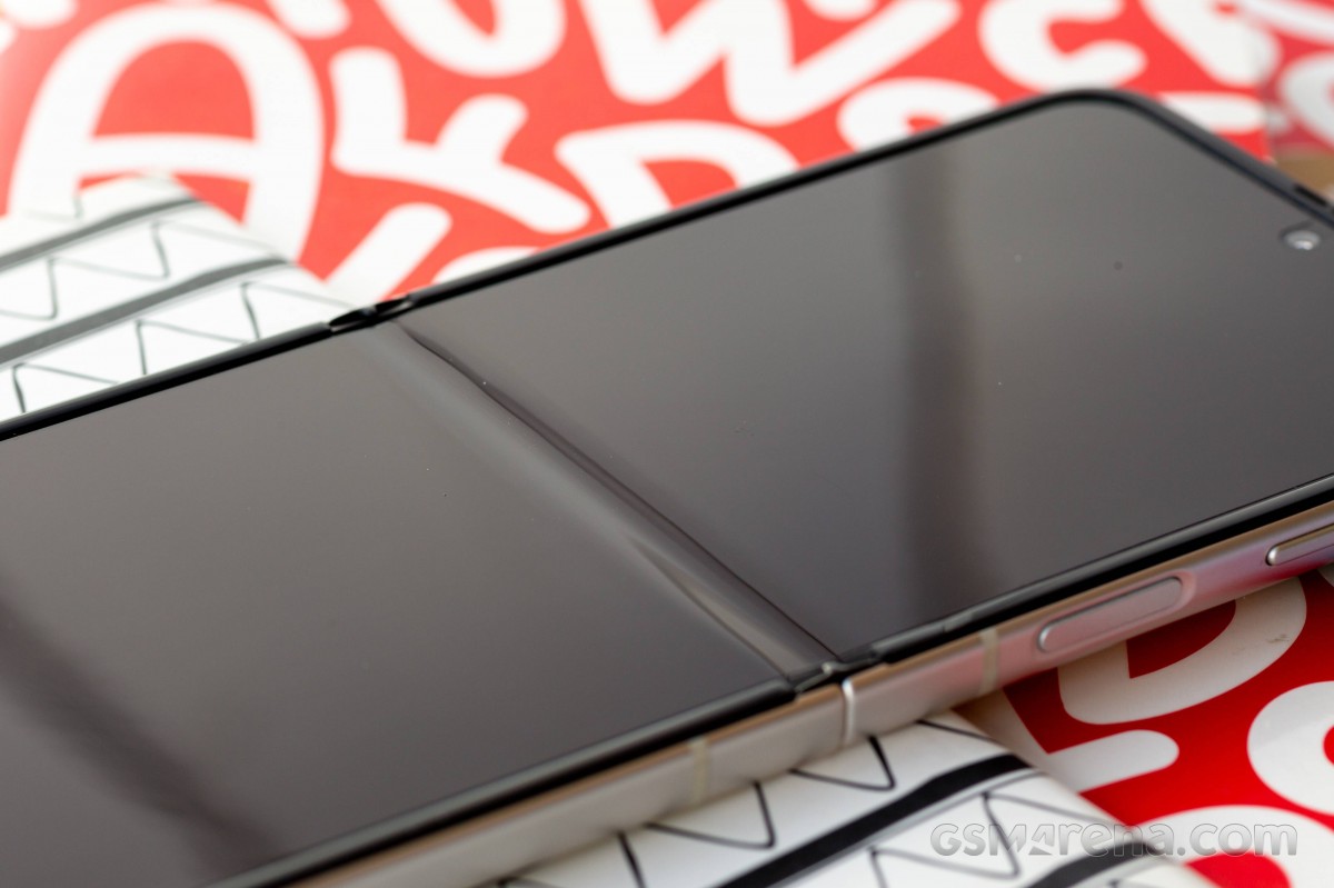
That said, it's not a deal breaker in any way. It's just something to keep in mind. There are sometimes quirks of a phone that you quickly get over after a few days of use once you're familiar with them. This isn't one of those things. And so we're hoping the next Flip takes some inspiration from some of Samsung's competitors (including Oppo, whose Find N we've already reviewed long-term) and gives us a much more subtle crease.
To end with our niggles regarding the screen, we have to mention the factory-applied screen protector that is necessary for the entire display assembly to work (seriously, do not remove it!). Because this is a foldable screen, this layer needs to be plastic, even though there is some ultra-thin glass underneath. That's fine, but it also means that you're constantly touching plastic when you're using the phone. Not just that, but this is very fingerprint-prone plastic, which looks dirty after just a few minutes of use. You might end up carrying a microfiber cloth with you everywhere.
It actually reminds us of those poor quality pre-applied plastic screen protectors you get on some lower-midrange devices, which we instantly take off when we review such phones because they make the experience of using them much worse than if we would directly be touching the glass underneath. Alas, there's no such option here, because removing this layer will render the screen dead, so you're stuck with it.
We know it's a small price to pay for the wonders of a folding phone, but we also have to mention that the inner screen of the Fold3 has a top layer that feels ever so slightly better to the touch, as does the Oppo Find N. So perhaps this can be improved for the next generation of the Flip. We hope it will be, as the inner screen is the main way you interact with this device after all.
Blue light filter and Always On Display
It's 2022, so the screen has a blue light filter function, which Samsung calls Eye comfort shield. It has the standard feature set, but nothing more: you can schedule it, pick the color temperature with a slider, and have the software adjust the intensity automatically based on the time of day. You don't get a black and white mode, or a 'light colors' mode, or textured backgrounds like in MIUI, though, which is why MIUI's blue light filter still reigns supreme in the mobile world to this day.
It's a similar story with the Always On Display. You can have it be always on, or only show up on tap, or on a schedule. It's there, it's customizable, but not as customizable as MIUI's - unless you have access to Samsung's GoodLock app, which is regionally limited. There are a bunch of clock styles to pick from, and you can even have the AOD show in landscape mode if that's your thing. Auto brightness can be toggled on, as can the display of music information when you're playing something. All of these are nice features to have, but it's debatable how much you'd end up using the AOD on a foldable phone on the inner screen.
Theoretically, you could just leave your Flip3 unfolded most of the time when you're not on the go, and that's where the AOD comes in very handy. But if you're the type of person to always fold the phone back after use, then this is rather pointless.
Outer display
One of the Flip3's primary improvements compared to its predecessor is undoubtedly the much bigger and thus more usable external display. The original Flip and Flip 5G both had laughably small outer screens, and this one is greatly improved comparatively. That's the key word here: comparatively. Because while it's more usable, it's not very usable for anything other than glancing at the clock, controlling media playback, and quickly looking at notifications. Although even for notifications, it's most useful for just checking their titles if you want to go in depth, the experience of tapping and reading and scrolling on such a small surface is far from ideal, and we'd recommend you just open the phone up and use the main screen instead.
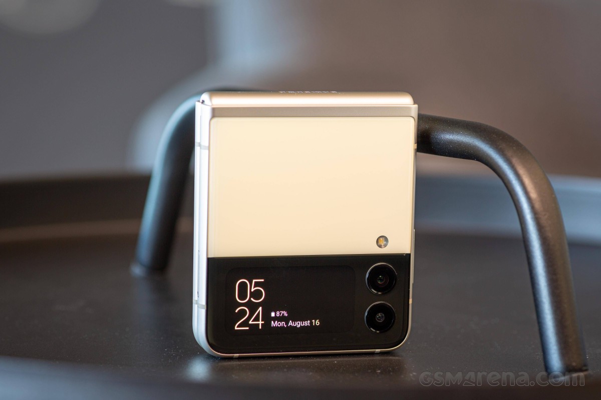
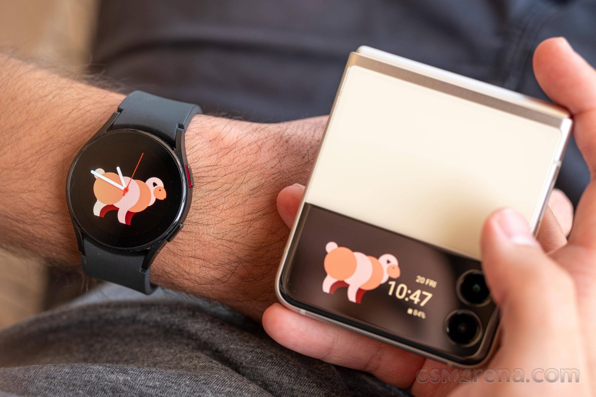
So this outer display basically acts like a glorified notification window, which is fine, but that's all it is. For all intents and purposes, this handset has one actual screen and then a 'window' into the notification panel, including media controls. It gets these jobs done well, but you can't really expect more from it. Weird as it may sound, perhaps the best way to think about this screen in terms of functionality is as if it's a smartwatch affixed to the outside of your phone (without the health tracking, of course, and also without an app store). There's a limited amount of stuff it provides, but sometimes for quick glances, it's fine. Most times, however, you'll probably end up opening the phone up.
In terms of outer displays, Motorola's not very popular Razr 5G definitely takes the cake for this folding device form factor, with a bigger screen that can even be used for apps - not that it's ideal for most, but it's an intriguing prospect for sure. There's no such flexibility on offer on the Flip3, nor would we have wanted to see it because of the dimensions of the canvas here.
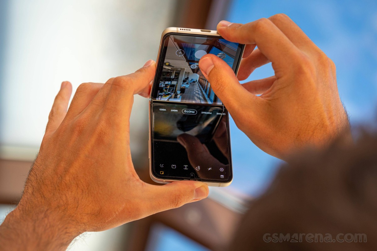
There are some settings relating to what you see on it, you can choose between different style clocks like for the Always-on Display, set brightness individually for it (although auto-brightness doesn't appear to be an option, which is disappointing but probably means there's only one ambient light sensor on this phone and it's on the inside screen), and pick from a list of 'widgets' you can get to by swiping left or right (we're getting smartwatch vibes again). These can be reordered too, but the list consists of exactly seven of these 'widgets'. Finally, you can choose if you want notifications to turn this screen on, and you can also use it as a viewfinder for the camera if you want to take selfies with the main sensors. That's literally it. A fully functional display, this one is definitely not.
We got used to it being the way it is, and yet we can't help but feel that the next Flip should get an even bigger outer panel with more functions. We sort of think the original Flip's tiny outer screen somehow made more sense, as it was clearly not intended as anything more than a glorified notification LED - the implication was that you'll obviously unfold the phone to do anything. Now on the Flip3, the size of the outer panel puts us in a very strange middle ground where it's big enough that you may think you can do a lot of stuff on it, but it's not actually big enough for that to be practical.
Reader comments
- Anonymous
- 13 Apr 2023
- XBx
The fold cannot be protected thus the screen gets damages and ink spills . It cost over £370 to replace the screen and its likely to happen again ..
- Linzi
- 02 Nov 2022
- gKa
Couldn't take screen shots after approx 8 months of owning the phone. Then massive dark line across the fold line. Wouldn't switch off. Then completely black screen, lost all my photos & everything else. Been sent to service provider &a...
- .
- 17 Oct 2022
- g%Q
Amazing phone but I Wouldn't Recommend it for people Who are clumsy this phone is pretty easy to Break its a huge upgrade from The flip 1 and 2 the battery life last for about the hole day I'd give it a 8/10 The back screen is pret...


