Samsung Galaxy Z Fold3 long-term review
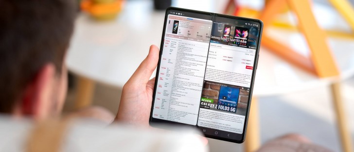
Refresh rate, brightness, quality, settings
As you may know, the Fold3 has two screens, and they're both 120 Hz which is refreshing to see (excuse the pun). Unsurprisingly, the refresh rate is adaptive, and the software is doing a lot of adapting, but you wouldn't necessarily notice that in day-to-day use. Everything feels like it's at 120 Hz all the time, even though it's not, and that's a great achievement on Samsung's part - it gets to save some battery while not sacrificing any perceived smoothness in operation. So kudos for that.


Display and refresh rate settings
Both screens are high-quality, as you'd expect from any device costing this much, and they're both legible outdoors on sunny days, but don't expect too much here. Neither of these competes with the panel in a Galaxy S22 Ultra, for example, but the cover display does hold its own against anything that isn't a current-gen flagship device, which is impressive. The internal, foldable screen trails it somewhat in brightness, which is to be expected since, you know, it folds! It is even usable outdoors if you don't let the sun shine directly onto it. Brightness is not an area we'd say the Fold3 struggles in, for sure.
The same is true at the other end of the scale; when you are in pitch dark environments, the screens go dim enough so that they don't sear your retinas. We never found ourselves wanting to go even dimmer, but we do have to note that adjusting the brightness slider at its leftmost extremity could have been smoother.
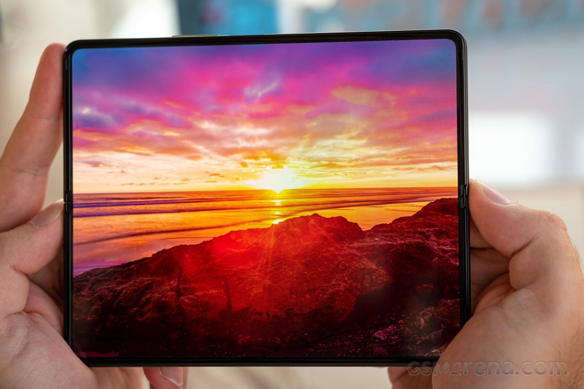
That said, the auto-brightness curve on the Fold3 was very good during our time with it, for both screens. We did find ourselves manually adjusting the brightness from time to time, but not so much so that it became a nuisance. For some reason, even in total darkness, the slider was antsy about going all the way down sometimes - but definitely not always.
Likewise, on cloudy days outdoors, we generally needed to pump up the brightness somewhat, but these were only minor adjustments as the built-in system worked well. Not among the best we've seen, but not very far from that either.
As usual with recent Samsung devices, you can play around with color settings. The standard two options return: Vivid is the default one and targets the DCI-P3 color space, while Natural is tuned to sRGB. Accuracy is good, especially in Natural mode, if not as good as on other high-end Samsung panels. The Vivid mode also comes with manual color sliders and color temperature adjustment for those who simply must tinker with everything in as manual a fashion as possible. Both screens have very similar color reproduction, which is quite the technical feat to pull off.
As on any modern smartphone, there's a blue light filter on offer here too, which Samsung calls Eye comfort shield. It's not as customizable as others we've seen, only letting you pick a schedule (or let it automatically adapt based on time of day), and choose the color temperature with a slider. That said, it does work, and it works well, so no complaints other than the lack of a black and white mode, or any textures, or a 'light colors' mode or anything like that. Weirdly enough, this is one area where other skins outshine Samsung's in customizability. That's not necessarily something we thought we'd ever get to write, but here we are.
Always On Display functionality is unsurprisingly also present on the Fold3, and you can pick from a selection of clocks and even add stickers, AR Emoji, Bitmoji, and images from the Gallery. That's quite a bit of customizability on offer, and of course, you can also schedule the AOD to only turn on between set times, have it actually always on, or have it only show up when you tap the screen, or when you get a new notification.
Interestingly enough, you can even pick its orientation to be portrait or landscape, there's a toggle for auto brightness, and you can have it show currently playing music information too. That's... a lot, and in this regard, Samsung is definitely still Samsung, customizability being the name of the game here.
Cover display
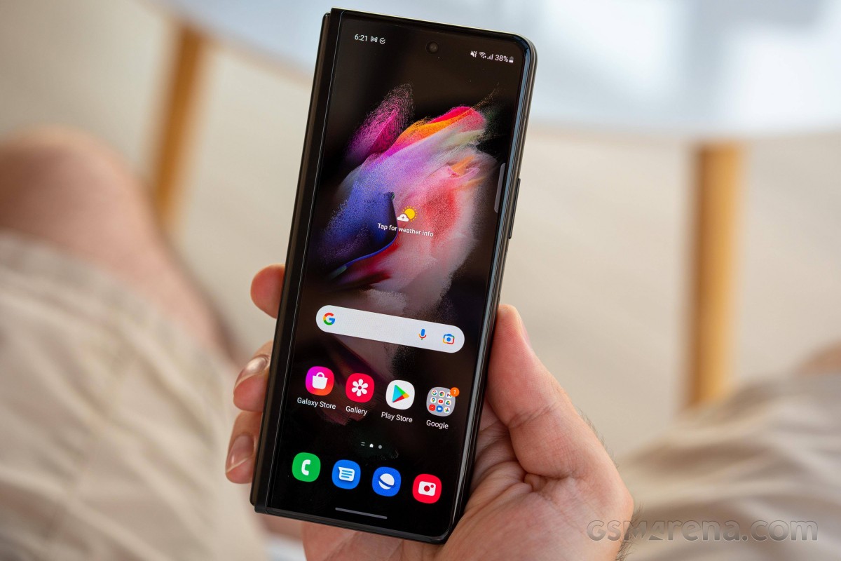
Now that the basics are out of the way regarding the displays and their settings, let's turn our attention to what Samsung likes to call the Cover display, and we'll probably just end up referring to the outer screen. This nicely covers (get it?) almost the entire half of the phone, which we appreciate. There's an inherent lack of symmetry created by the presence of the hinge on the left - so the display 'ends' sooner on that side than it does on the right. This isn't a big deal, even if you are prone to bouts of OCD from time to time.
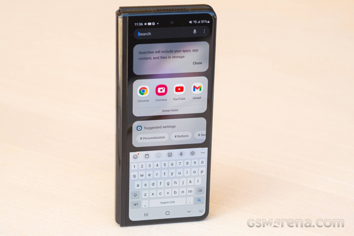
The main issue with the cover display is actually the same trait that makes the phone very easy to hold with one hand when it's closed - and that's how tall the screen is. The aspect ratio is very far from anything we'd call mainstream, even Sony's 21:9 displays are less tall than this one. That's great in theory for scrolling through feed-heavy apps like Instagram, Facebook, Twitter, and the likes, but it creates a real problem when typing, because the keyboard is more cramped on this screen than on any other phone we've ever used.
Long story short: get ready for a lot of text corrections, as even autocorrect will struggle to interpret what you're trying to write.
Throughout our time with the Fold3, we found that we'd need to manually go back and correct words about 60% of the time, with the other 40% being covered by a combination of accuracy and autocorrect doing its magic. This is obviously not ideal, especially if you don't want to keep opening the phone up for typing.
For everything else, the tall aspect ratio does look weird, but you get used to it. Well, perhaps with one other exception, and that's watching videos in landscape mode. It's so wide that you either get stuck with huge black bars on both sides or, for apps that allow this (like YouTube) you can crop in so that the entire screen is covered but then you're missing huge chunks of whatever is going on at the top and bottom. Neither solution really works very well in practice.
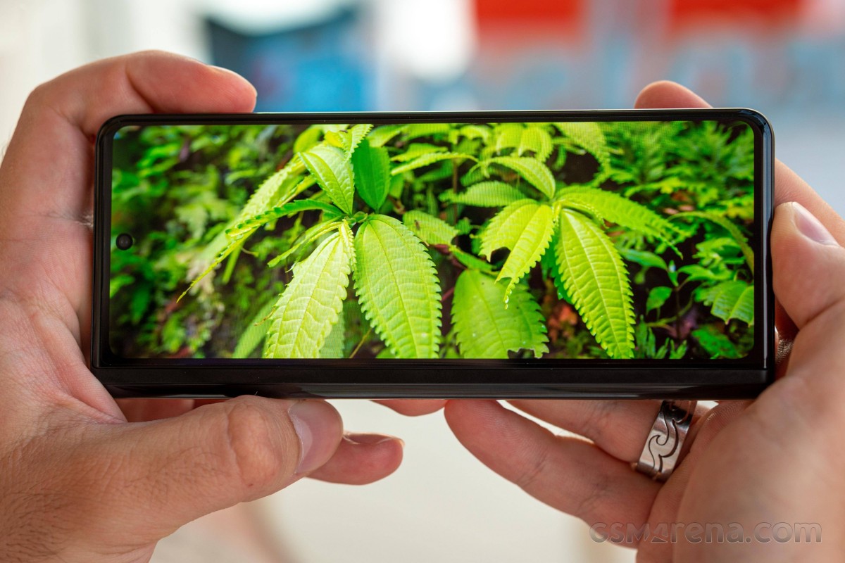
Funnily enough, if you only use the inner screen for watching stuff, you sort of run into a similar problem, but in reverse - while the outer display is too rectangular, the inner one is too square, so you're going to have to do the same dance again - picking between black bars and a pretty substantive crop.
The solution to all this is kind of obvious - if the cover display would be wider, all of these issues would be mitigated somewhat. We don't necessarily mean 16:9 wide, like Oppo did for the Find N (although maybe Samsung could explore that form factor too in the future), but even something like 21:9 would be an improvement. The 25:9 ratio that the Fold3 presents is just too narrow or too tall, depending on how you want to look at it.
This is one of those things that we immediately imagined would be problematic going into this review, and unfortunately, our expectations were confirmed. It's not by any means a dealbreaker in our book, but it is a slight annoyance you'll have to put up with every single day.
Main (folding) screen
And why would you want to put up with the cover display's imperfections, you ask? Well, because the same phone also gives you a large folding screen that is still quite a sight to behold even today, years after the first Fold came out. The magic of unfolding the phone to reveal that inner screen still can't be overstated, and as we mentioned above, the quality of the folding panel is very high.
That said, it's not all roses. First off, while there is a layer of ultra-thin glass in the display assembly, what you're actually touching day after day is a layer of plastic on top of that (don't take it off though - that will ruin the display!). And while this one is nowhere near as cheap feeling and smudge-prone as the one in the Flip3, it's still not great either - at least not compared to real glass, even glass from a glass screen protector. This is still one of the inevitable tradeoffs when going the foldable route, but we think there's room for improvement here with future Samsung foldables. After all, the Oppo Find N has a top plastic layer that feels slightly better to the touch, so it can be done.
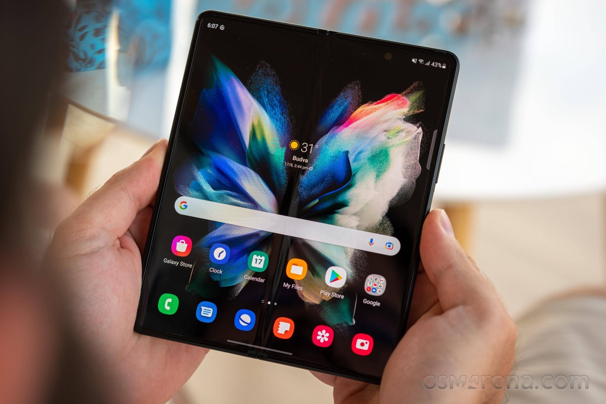
Like we said, you don't get the same 'cheap plastic screen protector' feeling here that you get on the Flip3, but you will still constantly need to wipe your fingerprints off of it, and the contrast with the glass adorning the cover display is rather stark every single time you go from one to the other.
Also stark is the crease at the middle, and how pronounced it is. Not only can you definitely feel this one every time your finger reaches it, but you can also see it from almost every angle - and it has this annoying tendency to reflect glare at you too. That's yet another aspect that Samsung can and definitely should fix for the next Fold, as Chinese companies have shown how you can have a crease that's barely noticeable.
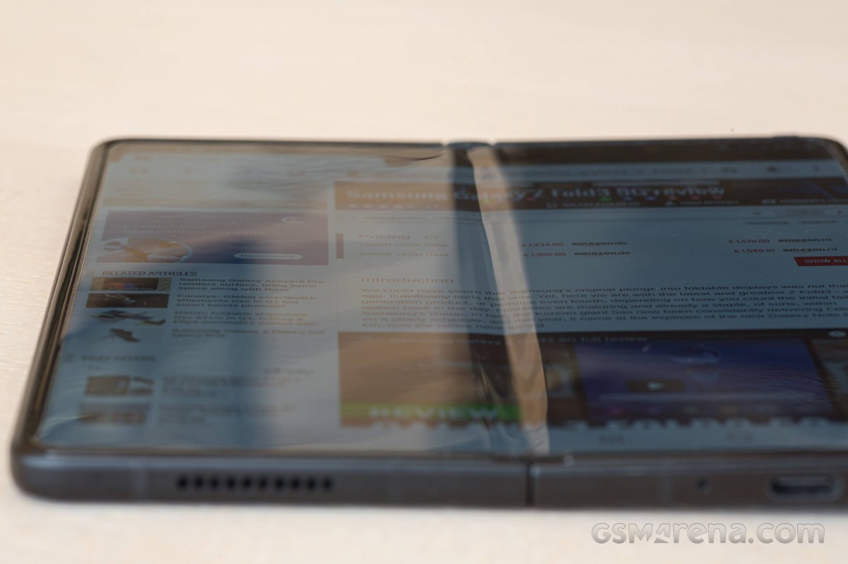
In what is becoming a theme of this review, things are actually better than they were in the Flip3, at least they are if you use the phone, when opened, in 'portrait' mode - where the crease is vertical. For most scroll-heavy apps, this means you can safely interact with the software without ever reaching the crease. Flip the phone over, though, so that it's in 'landscape' (with the crease now being horizontal), and every single time you scroll you'll feel it. Can you get used to this? Yes, no doubt about that, but it's still a bit off putting even after a long time of use.
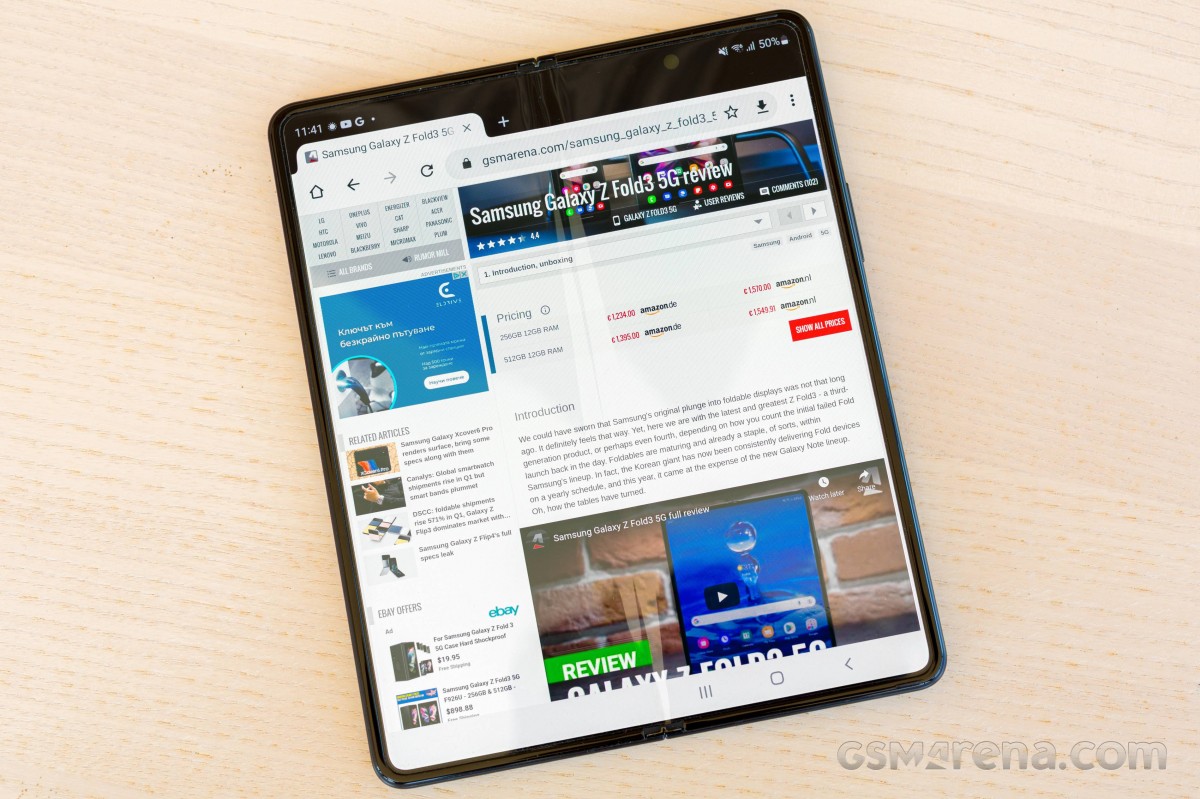
If you're used to slab-type smartphones with their curved glass on the sides, the fact that the inner screen's tiny bezels are somewhat raised may throw you at first, but we had no issues getting used to this - and this reviewer is actually a huge fan of curved displays, and this is the furthest away from that you can go. The 'lip' surrounding the screen is there to protect it of course, and it does a good job as far as we can tell. It feels sturdy too, like it's part of the frame and not just an added plastic bit on top.
Under-display camera
On the main, folding screen of the Fold3 sits an under-display camera, and we'll just say this outright: it's a gimmick. We don't notice it in day-to-day use, but then again, we wouldn't have noticed it if it was just a simple hole-punch cutout either. If you go searching for it, you'll see it no matter under what conditions: with the screen off it's probably most visible and looks the most like a regular punch-hole, but even with the screen on, if you pixel peep, you will see that the area of the screen that sits directly on top of the camera is way lower-res than the rest - and that's necessary in order to let some light pass through.
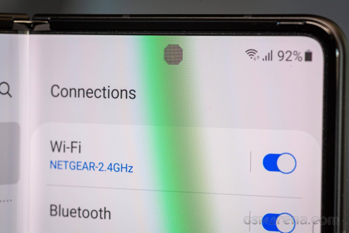
So, if you were hoping for the under-display camera to stay magically hidden at all times - it doesn't. If you feel like seeing it will impede your use of the phone in any way - don't worry, it won't. We do want to point out that the position of the camera is weird. We get why it can't be centered (as it would need to sit on top of the hinge), but why not have it in either the left or right corner? It would've been more 'invisible' in practical experience over there with a classic hole-punch than it's ever going to be in this position, nevermind all the fancy under-display shenanigans. Sometimes complicated solutions to simple problems are just that.
Reader comments
- Sampath
- 18 Jul 2024
- IWT
Don't buy this phone because repair centre is not doing there repair free of charge In my phone I faced trouble in my back screen appeared one green line according to my knowledge it is common fault in Samsung phones but when I discuss with re...
- Shiwantha
- 18 Jul 2024
- IWT
I have one z fold 3 phone I bought it before 2 years suddenly yesterday it was appear green line on back screen I have heard Samsung company is doing free repair it so I discuss with repair centre but they told it can't apply for this phone I d...
- Wale
- 05 Jul 2024
- XBA
I can no longer make video recording on phone,it indicates "you can't make videos during calls" even though I'm not on calls.pls can you help


