Samsung S5260 Star II review: In the making
In the making
User interface – feature phone TouchWiz
TouchWiz really has grown over the years – in its dumbphone incarnation it offers features and flexibility to match much of what smartphones can do. In fact, inexperienced users will be hard pressed to tell the difference between this and Bada.
Here it is on video:
Smartphones have much bigger catalogs of apps but the choice of Java apps for feature phones is quite good: Opera Mini Google Maps, and so on – there’s even games. Samsung Apps will come in handy here, but we’ll cover that later on.
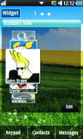
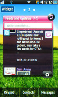
The TouchWiz homescreen is widget-based and you can place as many widgets as you can fit without overlapping. When you run out of space, you can Tilt the phone sideways while in edit mode, and you can add (or remove) homescreens and rearrange existing ones.
Tapping the Widget button lets you pull out more widgets (or stash some away) from the tray at the bottom. If there isn't enough room on the current screen, it will automatically scroll to an empty one.

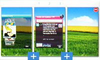
Adding new widgets • adding and rearranging homescreens
There are 14 widgets preinstalled but you can download more from Samsung Apps.
At the bottom of the homescreen there are three virtual buttons – Keypad, Contacts and Messages. They are visible in the main menu too, and can’t be reassigned.
The main menu stretches over several different screens (up to ten), which are sweep-scrollable sideways. Only native apps can be put in the menu, though – being able to put shortcuts to Java apps would have been better.
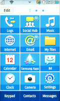
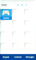
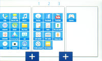
The main menu • Editing the main menu
Anyway, each page in the main menu consists of a 3x4 shortcuts. The shortcuts are big and easily thumbable. Tilting the phone sideways in edit mode lets you add/remove and rearrange menu pages (just like with the homescreen panes).
The S5260 Star II features multitasking complete with a task manager. As usual, you press and hold the menu key to bring up the task manager and you can switch between and terminate apps (both native and Java).
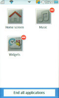
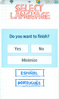
The task manager • The Exit/Minimize menu doesn’t show up on all apps
To minimize an app, you hit the menu key. The End key is a little inconsistent – it will exit some apps straight away, while in others it will bring up a dialog prompting you to exit, resume or minimize.
An Android-inspired feature is the panel on the top of the screen – you open and close it with taps (no pulling) to check missed events or toggle Wi-Fi, Bluetooth and silent mode on or off.
The music player and radio controls also appear there when the respective app is active. This way you can control playback from almost anywhere (the panel is accessible throughout the phone interface except Java apps).
The lock screen is the typical Samsung “sweep to unlock” variety. In the event of a missed call, a puzzle piece is displayed. Dragging it on the appropriate place will unlock the phone and open up the call log.
The other thing you’re likely to see on the lock screen is the CD icon on top. It appears when the music player (or radio) is playing or paused and shows the track info along with the previous, next and play/pause buttons.
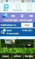
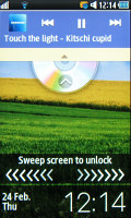
The notification area • The lock screen
Some main menu entries also show a number in their top right corner – like the number of missed calls, unread emails and so on.
The Samsung S5260 Star II packs an accelerometer, which does the two usual tricks – screen rotation and turn to mute – but there’s a handy shortcut with it too. A double tap can launch one of the phone apps – browser, contacts, music player, or anything else from the main menu really.
The speed and responsiveness of the software is far from stellar and we also saw “Insufficient memory” errors more often than we would have liked. A restart would typically fix the problem, for it to only to re-appear.
After so many iterations Samsung should have ironed out such issues.
A social phonebook
The phonebook can show contacts from the SIM card, phone memory or both. For each contact you can store a variety of information including multiple phone numbers, contact photo, personal ringtones and so on. There’s an option to copy contacts to and from the SIM card too.
The phonebook is tabbed, the first tab showing the contact list and the other two handling Groups and Favorites.
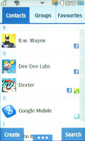
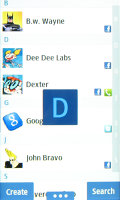
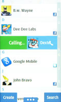
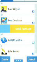
The Samsung 5260 Star II phonebook • Alphabet scroll • Swipe calling
There is alphabet scroll to help you find contacts easier and search by gradual typing (which doesn’t support text prediction, so you have to use regular multitap).
A cool TouchWiz feature is enabled on the Star II whereby a right swipe on a contacts name will call the person, while a left swipe will bring up the SMS composer.
The phonebook also features social network integration: Facebook, Twitter, MySpace. Once you add your account (one for each network) you can link contacts. Merging phone and Facebook details is a feature we’re used to seeing mostly on smartphones.
The info for each contact is organized into four tabs. The first, called Info, shows all phone numbers, emails and other details of the contact with shortcuts for SMS and social networking messages.
The second one, History, is basically a call log for that contact. After that is Activities, which lists recent SNS updates from the contact, and finally there’s the media tab, which shows the contact’s online albums.


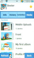

The phonebook has extensive SNS integration
An important note here is that you can’t edit the SNS details of a contact, just the contact info that is stored on the phone.
Reader comments
- Anonymous
- 26 Nov 2021
- fmL
Type 0000 to open
- grayworm
- 17 Dec 2020
- PYC
It was my first phone, basic, small and sleek, loved to charge it once every two days. Got it almost new from my mom, she was very careful with it, nice touch screen, with that camera the photos were not that bad on daylight time, I managed myself to...
- Julde
- 17 Jul 2020
- Nue
My sister is using SG 5260 now it is requesting for a pin no when it is switched on pls how do I go about it even if it is to hard boot it thanks in advance.
