Sony Ericsson Xperia neo V review: Five to go
Five to go
Android 2.3.4 lands on the Neo
The Sony Ericsson Xperia neo V runs the latest Gingerbread version 2.3.4 of Android. It is already available for the entire Xperia 2011 lineup, including the first Neo - or what's left of it in stores. Let's once again go over the new stuff in the latest Gingerbread release:
- Sony 3D sweep panos: panorama shots that can be rendered on compatible 3D TVs
- Screen capture - grab a screenshot anywhere on your Xperia
- Enhanced Facebook integration
- Swipe text input - works just like the popular Swype, but it's T9 Trace
- USB on-the-go functionality (requires Sony Ericsson LiveDock)
We have a video demo of the user interface too.
As usual the Xperia neo V has a five pane homescreen (you can't add or delete panes), with four docked shortcuts (two on either side of the launcher shortcut). Those are visible on all five homescreen panes and are user configurable: they can be either single icons or folders with multiple items in them.
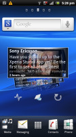
The Sony Ericsson Xperia neo V UI
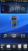
The homescreen also does a neat trick called Overview mode. Pinch to zoom out on any of the 5 homescreen panes and a new screen opens up with a cool transition. All your widgets gather there and you can click the one you want and go to its screen.
In terms of functionality, it’s similar to the HTC Leap view or what Samsung do in TouchWiz. However widgets here are not crammed in small hard-to-read screens. Instead, they’re all shuffled on a single screen, so they can better use the space and remain as big as possible.
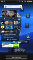
The Overview mode helps you find the widget you are looking for
The Xperia neo V has some custom-made Sony Ericsson widgets in addition to the standard set. Those include the Timescape widget (there's a dedicated app too) and a Mediascape-like widget for photos and videos (the actual app isn't there anymore, the standard gallery is back).
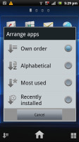
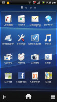
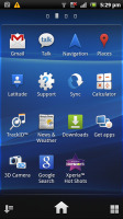
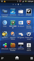
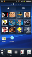
The app launcher puts shortcuts in the bottom corners. They let you sort your icons within the grid. You can either go for the automatic options (alphabetical, most used or recently installed) or you can manually shuffle the icons.
Creating folders is simple, using the iOS logic (and visual layout). You drag one icon over another and a pop-up prompts you to select an icon and a name for the folder you’re about to set up.
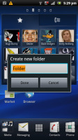
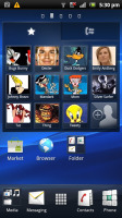
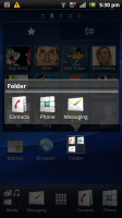
Creating folders is possible too
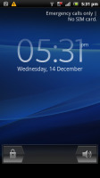
The lockscreen is standard Xperia fare. Which means you get notifications for Facebook events too. The standard notification area and task switcher are of course present and accounted for.


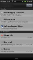
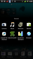
The lockscreen features Facebook integration • The standard notification area and task switcher
There is one more thing worth mentioning - the Take Screenshot shortcut. It's found in the power settings and you need to press and hold on the Power/Lock key to access it. It would have been better if Sony Ericsson has made it with a combination of two keys (like the iOS's Home+Lock combo) rather than a virtual shortcut, but at least it's there.
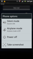
The Take a screenshot shortcut
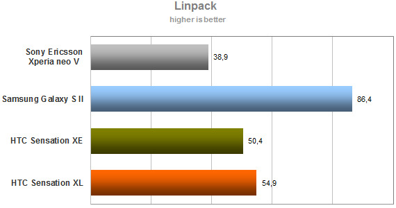
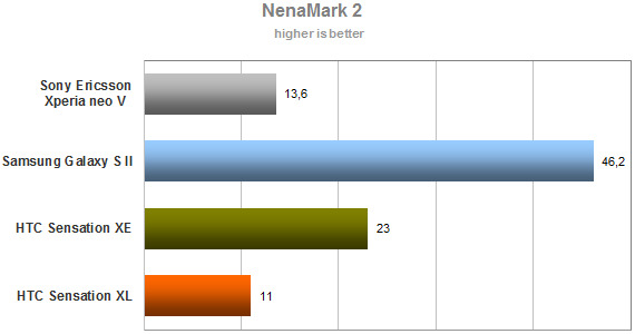
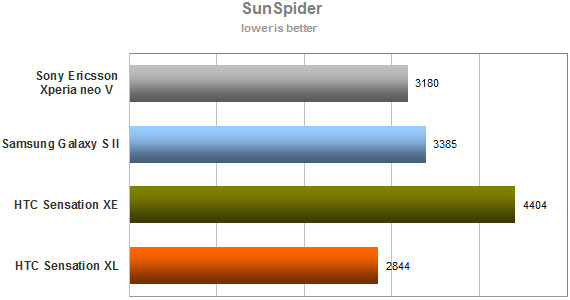
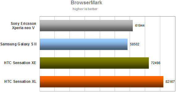
Synthetic benchmarks
The Snapdragon chipset has been around for a while and we know what to expect from it in terms of performance.
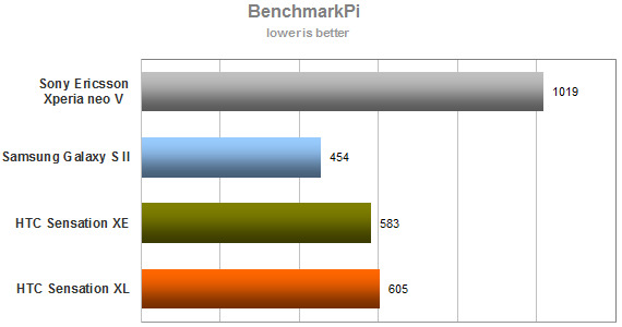
Sony Ericsson already used this chipset in most of its latest smartphones. As we suspected the Xperia neo V showed similar results on the synthetic benchmarks as the Xperia ray and lower than the Sensation XL's results.
Reader comments
- Subhash
- 31 Jan 2021
- 7tM
I have that mobile
- Sthandwa
- 05 Apr 2019
- CA3
I want to know where can i find this phone i want so bad
- Bamb
- 05 Apr 2016
- tDR
Help me to upgrade versi 4.0
