Sony Xperia 5 III review
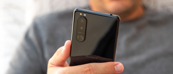
Design
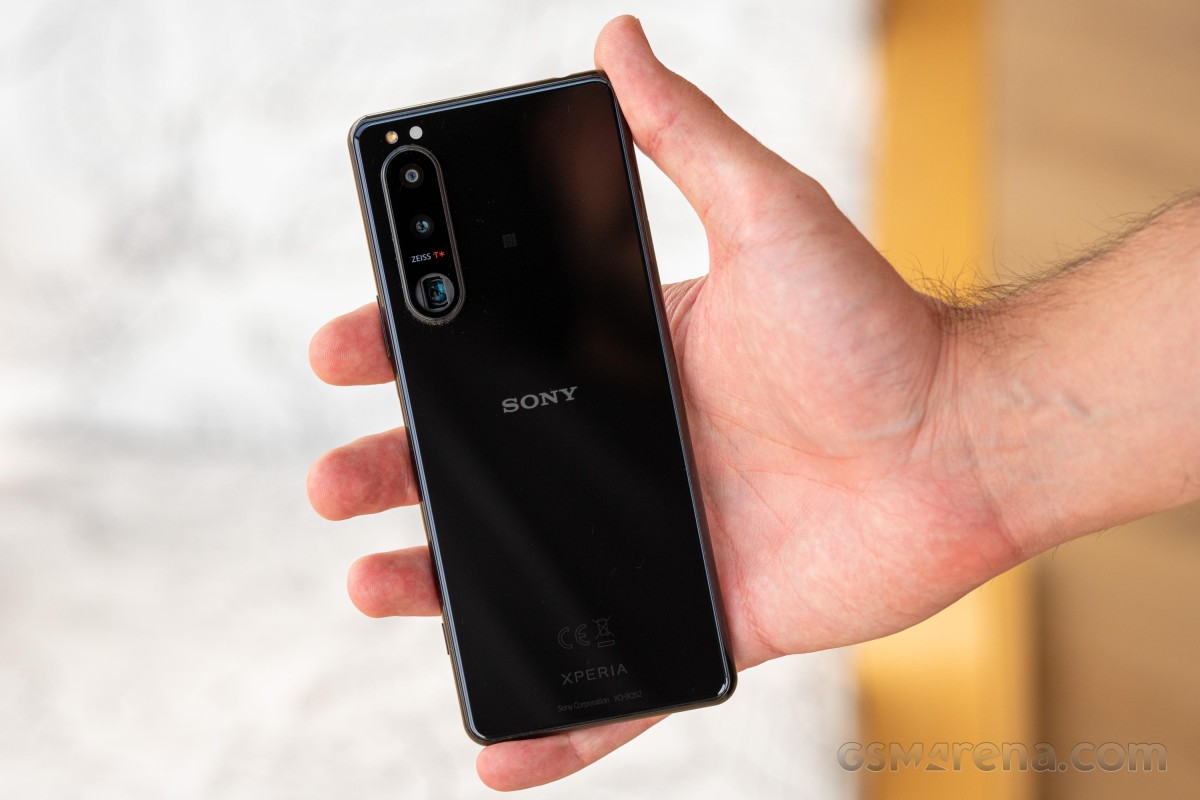
We won't hold it against you if you can't tell the Xperia 5 III apart from the Mark 2 - it takes more than a casual glance to spot the differences. And if you've read here before that this is simply Sony's way of doing design, that's because we've written than on numerous occasions.
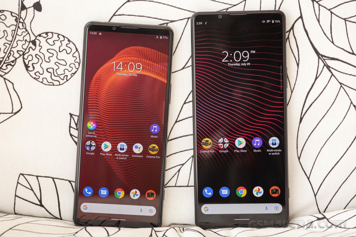
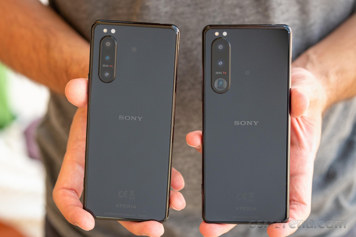 Xperia 5 II (left) next to Xperia 5 III
The one thing that makes the new-gen Xperia 5 recognizable from the previous one is the rectangular-ish opening for the periscope lens - Mark 2 has a conventional circular one. That's hardly a design decision, but more of a form following function type of outcome.
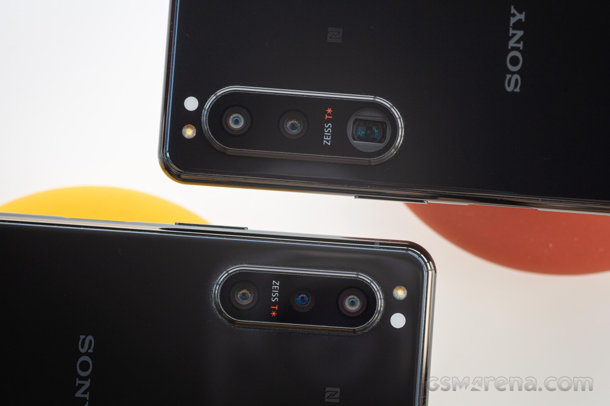 Xperia 5 III on top, 5 II below
That's in contrast with the Xperia 1 III, which does switch things up a bit, coming from the 1 II. Hardly a dramatic change, the move to a matte back panel does make the new phone look and feel different than the old one. No such thing on the 5.
That's a good place to mention that Sony is sticking with the rounded frame on the Xperia 5 III, while the 1 adopted flat sides from Mark 2 on. Perhaps a flat design here would have made for a more consistent look between the two models, but if the back is different within the same generation, they might as well keep the frame different too.
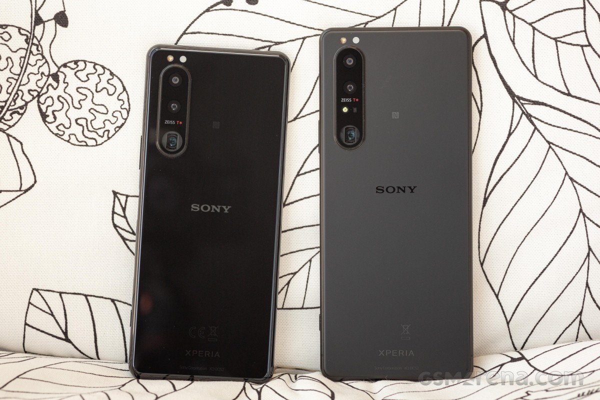 Glossy Xperia 5 III (left) next to matte Xperia 1 III
The back of the Xperia 5 III is made of Gorilla Glass 6, same as the 1 III's, even if they're finished differently. The frame, too, is aluminum on both handsets.
Similarly, both feature an IP65/IP68 rating, so your Xperia should be fine with submersion up to 1.5m, as well as water jets if your phone was to encounter water jets for whatever reason.
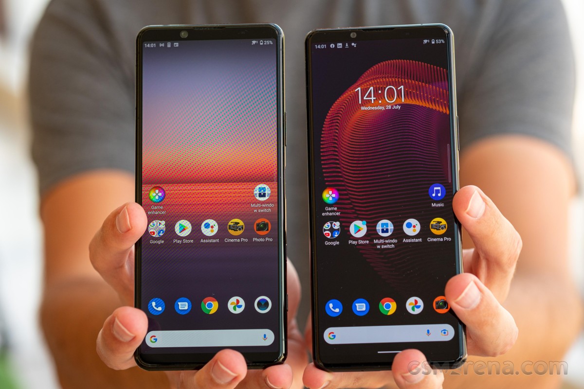
The front of the phone is protected by Gorilla Glass 6 too, and that's one area where the 5 III is trailing the 1 III - the bigger phone has Gorilla Glass Victus.
 GG6 on the front of the Xperia 5 III (left), Victus on the 1 III
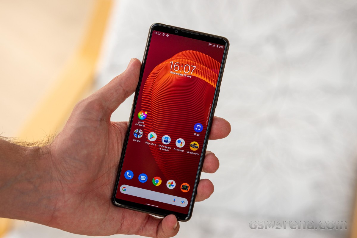
The 6.1-inch display of the 5 III has been carried over from the previous generation, and the face you'll be looking at on a daily basis is no different either. You get symmetrical bezels top and bottom - hardly minimal, but... acceptable, let's call them. Official specs list the Mark 3 as being 1mm shorter than Mark 2, but it's not something you can see in real life.
The space above the display is home to a lot of functional bits. That includes the selfie camera, earpiece (itself also the left channel loudspeaker), ambient light and proximity sensors, and even an RGB status/notification LED.
The bottom bezel doesn't have all that much going for it in terms of hardware, but the front-firing bottom speaker and the symmetry argument do make its size well warranted.
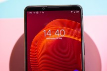
Front-firing bottom speaker • Earpiece and a bunch of other things up top
The control layout on the Xperia 5 III is the same as on the 5 II, and that's one area where the 1 III played catch up this year. The 5 III has a lot of buttons - top to bottom, there's the volume rocker, power button/fingerprint reader, Google Assistant key, and two-stage shutter release button.
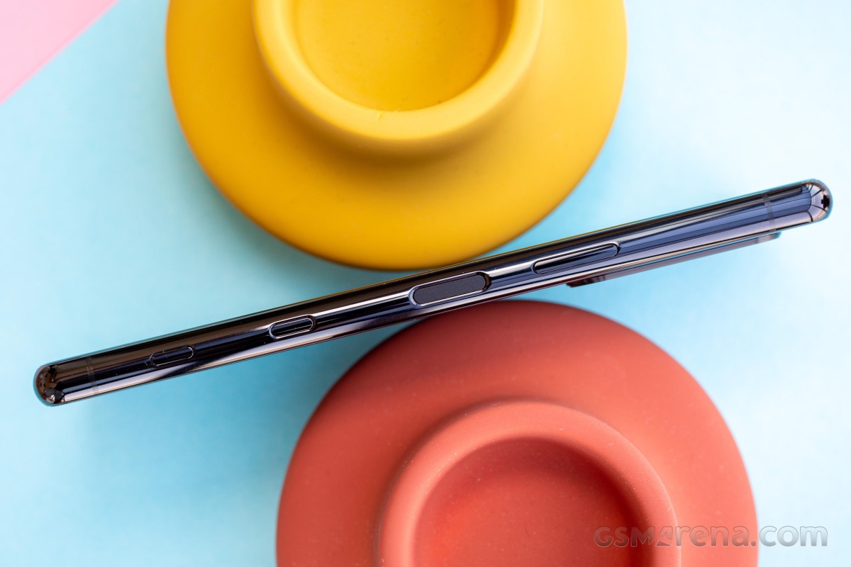
The fingerprint reader comes with the usual caveat for a side-mounted unit - you may be activating it inadvertently with any skin that touches it while handling the phone, so when you finally attempt to use it, you will frequently find its unsuccessful attempt limit maxed out. Sony doesn't offer an option to require a press to engage the reader instead, so you have no way of circumventing the issue.
That perk aside, the sensor worked very well, and it unlocked quickly and reliably without discriminating between the left index finger and right thumb. The location of the button/sensor is also equally convenient for either digit.
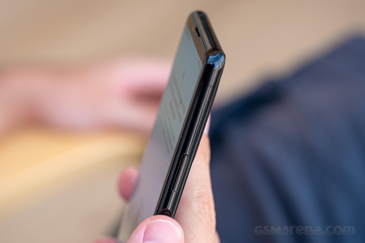
The tour of the frame continues with the card slot on the left - a classic Sony no-pin-required tray that you pry out with a fingernail.
The Xperia 5 III we reviewed has dual nano-SIM support, and the second slot can alternatively be used for a microSD card, but you can't have all three inside at the same time. A single SIM variant of the phone also exists.
With the bottom being free from loudspeaker duty, it's only home to the USB-C port and the primary mic.
The top, on the other hand, features another mic and the 3.5mm headphone jack.

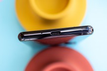
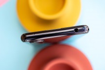
Card slot on the left • USB-C port and a mic on the bottom • Another mic and 3.5mm jack up top
One of the Xperia 5 III's main claims to fame is its relatively compact size - it measures 157x68x8.2mm. While that's no Xperia Compact like we had a few years ago, it's 3mm narrower than a Galaxy S21 5G and that makes it easier to reach across with your thumb, though the height of the 5 III (5mm taller than the Galaxy) means there's no way you'll be accessing the top without using your other hand or applying finger gymnastics of some sort.
The Zenfone 8, meanwhile, is as narrow as an Xperia 5 III and even shorter than a Galaxy S21 5G, so if you're eyeing the Xperia for its perceived pocketability, perhaps a look at the Zenfone is a good idea.
Reader comments
- francisloves
- 12 Jan 2025
- K7i
5 Series? I really would like to have this, the problem is the Green Line Issue.
- Arief
- 28 Dec 2024
- tDU
X5 V the best. But not the price
- Syuser
- 09 Oct 2022
- nD%
If you want an amazing pocket camera, this is the one. If you want a faster CPU and better battery life try 5IV, if you want top battery life for a fast and good camera coupled device 10IV. Xperia is trully LIKE.NO.OTHER!