Sony Xperia XZ3 long-term review
Design
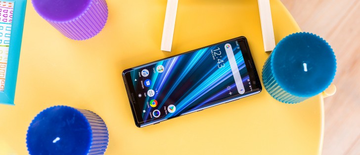
The Japanese company's products are instantly recognizable when compared to any other manufacturer's. As a theoretical concept, such brand recognition is a dream come true for any business. However, in the case of the Xperia XZ3, you know it's a Sony because of how dated its looks are in today's very fast paced mobile world.
You get bezels, and you get bezels, and everybody gets bezels, top and bottom. Sony wants to woo you with a curved screen so maybe you won't notice the bezels so much, but we're not sure that strategy works. On the plus side, at least there's no notch, and the bottom bezel also houses a speaker, which works in tandem with the earpiece at the top to create a stereo effect.
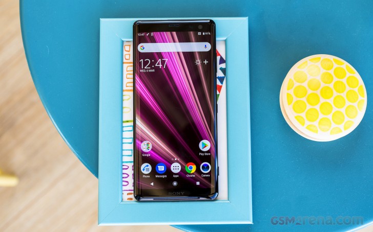
That's refreshing to see in a world where most manufacturers have settled for downward-facing speakers, and this positioning helps your enjoyment of media on the phone tremendously, because there's less chance of you covering up the speaker while you're holding the phone. On the other hand, the bottom bezel clearly also holds the connectors for the screen, so its existence can't just be blamed on the speaker.
Moving on to the back, things get worse. There's no getting around the fact that the fingerprint sensor is in the wrong position. It's too low and your finger needs to bend in order to reach it every single time. To add insult to injury, the camera lens is actually in the perfect spot to always be confused with the fingerprint scanner when you're trying to unlock the phone. Cue smudges and frustration, which you will suffer from many times each day. In time you might stop trying to use the camera for unlocking, but getting used to avoiding something that's bad doesn't make it any better.
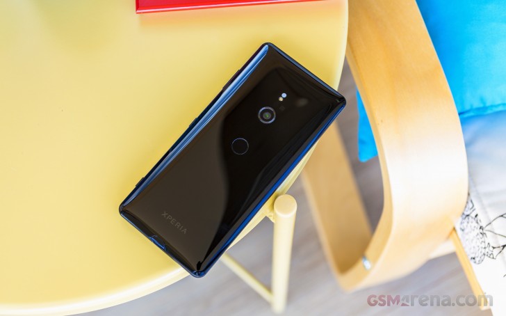
On the other hand, the XZ3 doesn't disappoint in the materials department - this is a glass sandwich. It's also got IP68 water and dust resistance and wireless charging. The build quality is extremely good, as you'd expect from a flagship. The phone feels reassuringly solid and there are unsurprisingly no creaks whatsoever.
It is slippery though, and the bulge and lack of camera bump don't help with that - if you're using the phone without a case, note that it really enjoys randomly falling off couches or beds.
We're very happy that Sony still hasn't gotten rid of the dedicated camera button on the right side, even if the need for it is slightly fading now that most competitors allow you to double press either the power key or the volume down button to launch the camera app.
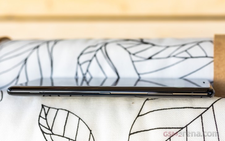
The power button in the XZ3 is placed too low and it sort of mirrors the situation with the fingerprint sensor on the back - your finger will never naturally rest around the area where it's at, so bending is required to get to it. It seems to be very symmetrically placed at the middle of the right side, but usability once again takes a hit because of Sony's weird priorities. And while we do enjoy symmetric design, this is ruined overall on the right side of the frame because the volume rocker and camera button aren't symmetrically placed away from the power key anyway.
Display
Look, it's a Sony with an OLED! Not only that, but it's curved on both sides too. It's nice to see Sony finally jumping on the OLED bandwagon, because nowadays when you think "flagship smartphone" you kind of assume that's the display technology it employs. So it's all good from that point of view, and the curves add the stylish look that Samsung has been milking for years.
Additionally, if you're a notch hater you will love the fact that the XZ3 hasn't got one. On the other hand, you will have to live with bezels, pretty substantial ones for this day and age both at the top and the bottom. The panel's resolution is ample enough that you won't spot individual pixels at any point, but the 18:9 aspect ratio has quickly been getting old in the mobile world. Even Sony itself seems to have noticed, and so its next flagship already comes with a record-breakingly tall 21:9 screen.
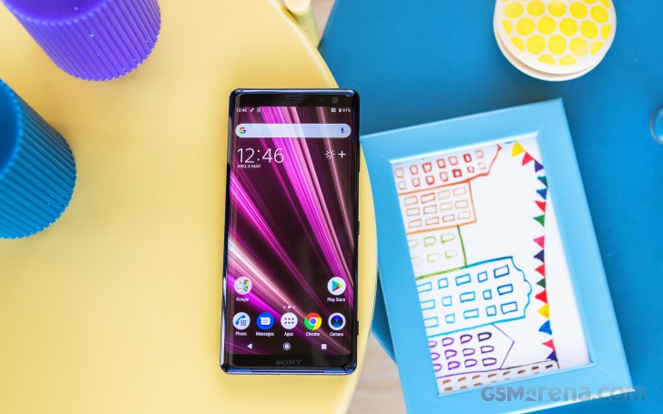
That said, the XZ3's panel is definitely good, and a joy to look at. It's perfectly visible in even the most demanding of lighting conditions, but it will still pale next to a recent iPhone or Samsung flagship. On the other hand, it gets bright enough that you can use the phone even on a sunny day.
The curves aren't everyone's cup of tea, and for understandable reasons that have to do with weird glare coming from them depending on the angle at which you're holding the device. This problem is similar to what you'd encounter on a recent Galaxy S or Note, so in the end it comes down to whether you can live with that just to get the very nice looks that the curved panels make possible.
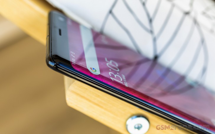
Palm rejection on the XZ3 is perfect, we've never had an instance of accidental touches being registered while holding the handset, and the way the screen curves into the metal frame means it's really satisfying to swipe from or to either side.
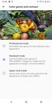
Out of the box the screen is vivid but you can tweak that if you don't necessarily like the default look - we chose to stick with the Standard mode in the Color gamut and contrast setting, because we thought it achieves the best compromise between color accuracy and pop. But if you just need more vivid colors and sharper contrast in your life, you can pick Super-vivid mode which does what it says on the tin.
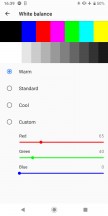
The custom white point adjustment works in tandem with that to let you achieve the exact degree of warmth or coldness you'd like. The default settings seem to go overboard on making whites bluish, which is definitely a trend in the mobile world right now, but tweaking things to get warmer colors is easy in case you are into that.
Overall this is a very good screen that comes with enough customization options that you probably won't be disappointed no matter what your requirements are. It doesn't feel like it's the best smartphone display out there, but for most people it's probably going to be close enough that it doesn't matter. It also supports HDR video, which is nice to have but still more about future-proofing than anything else. And yet there are more and more HDR video content sources available, so having this certification is definitely becoming more useful with each day that goes by.
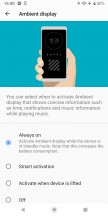
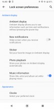
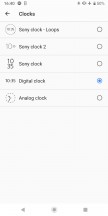
The XZ3 has an Always On Display too, which Sony calls Ambient Display. This function paired with the OLED panel means you aren't going to get more than a tiny penalty in battery life, and it is incredibly welcome as it shows you the clock and date at all times, notification icons as they come in, and even album art and artist/track title info when you're playing music.
This is one of the most user-tweakable AOD implementations out there and it works very well.
Reader comments
- Fakhir
- 04 Aug 2022
- yVt
Why version 11 or 12 is to late for this mobile
- fre
- 13 Mar 2019
- t{t
As Sony user cant be so happy have different type of phone among other million people using the same one.
