Wear OS by Google Developer Preview 2 is live
Today at I/O, Google has released the second Developer Preview of Wear OS. The first release based on the upcoming Android P went out in March. Wear OS by Google is the new name for what was previously known as Android Wear, since the company is leaning more and more towards using its own brand on its various initiatives.
The second Developer Preview of Wear OS based on Android P comes with support for Actions on Google. The Google Assistant on your wrist will be able to show you visual cards, follow-on suggestions, and it will also do text-to-speech. Actions on Google is actually being rolled out to all Wear 2.0 users and does not depend on the Android P base in the new Developer Preview.
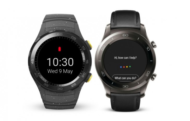
What is confined to the latest experimental build is the new enhanced battery saver mode. When the watch is in this mode, it will show a power efficient watch face and will turn off radios, the touchscreen, and the tilt to wake functionality. If you want to see the time you'll have to press the side button, while a long press will let you switch back to a fully operational mode if you need to perform tasks that can't be done in that extreme battery saving mode.
The initial Developer Preview would not connect to Wi-Fi when disconnected from Bluetooth, as a power saving feature apparently. Google has listened to feedback and decided to revert this change with DP2, however.
Smart Reply has been enabled for bridged notifications for a while now, but with Wear OS DP2 these are also available in simplified Chinese. That's about it, as usual Google's wearable OS doesn't get a lot of shiny new features.
If you're interested in flashing Wear OS DP2 on your watch, the release notes can be found here and the images are available here. Note that these only work on the Huawei Watch 2 and Huawei Watch 2 Classic.
Related
Reader comments
- Jor'El
- 10 May 2018
- B{f
If only the anoying status icon could disappear from the screen when disconected ,just like Samsung did whith the latest update.Now you can enjoy the watchface not the stupid status icon on 12 o'clock as Android Wear forces you to do.
- Anonymous
- 10 May 2018
- F9r
is it just me or do the 4 dots not look like there aligned right, looks like they've slowly sloped up from left to right. think this may just be a poor Photoshop attempt and not a working version.
- Kiyasuriin
- 10 May 2018
- nYT
It needs a refinement to have support on circular screens. That's for sure. o.o




 Samsung
 Xiaomi
 Xiaomi
 Samsung
 Xiaomi