ZTE unveils a redesigned logo and new company philosophy
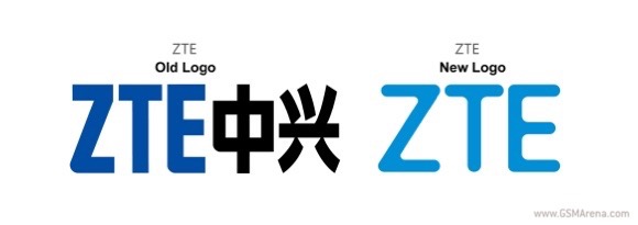
The Chinese tech giant ZTE unveiled a redesigned logo. The new branding presents a new corporate identity, which falls in line with the company’s focus on innovating in the M-ICT field. The latter stands for Media Information Communications Technology.

ZTE’s new logo is noticeably sleeker than the one its replaces - it embodies that company’s new Cool-Green-Open philosophy. Going forward, the company will focus on products that are “dynamic, youthful and compelling to users, sustainable and environmentally responsible, as well as open-minded and collaborative.”

The Chinese manufacturer has a CES press conference scheduled for Monday, January 5. We will be covering it live, so be sure to tune in to find out what ZTE has in store for 2015.
Reader comments
- HaHaHa
- 31 Dec 2014
- jQt
You guys should not surprise about this stupid logo redesign. The most of ZTE's top managements are idiots now.
- Anonymous
- 31 Dec 2014
- pw7
Was it designed by the bloke who designs "new" Samsung phones?
- Naren
- 31 Dec 2014
- XNt
Evidently a lot of hard-headed thinking has gone into it. Way to go!


 Samsung
 Samsung
 Apple
Apple Apple
Apple


