Flashback: Palm Pre showed us the way to the future then faded to obscurity
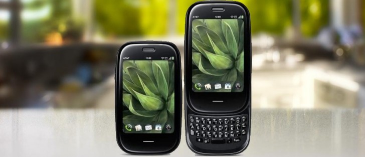
How the mighty have fallen – before it was acquired and snuffed out by HP, Palm was known for popularizing Personal Digital Assistant (PDA), an ancestor to the modern smartphone. And before webOS was the software powering LG TVs, it was the best touch operating system for smartphones.
The Palm Pre and webOS made their debut in June of 2009 when iOS and Android were still relatively young. Both the phone and its platform introduced features that are still in use today, even if people rarely remember the pioneers.
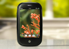
The pebble-shaped handset was fairly compact and ergonomic. Instead of a touch-only design, Palm opted for a slide-out QWERTY keyboard that echoed Treo devices from before. There was no virtual keyboard, typing was done exclusively on the hardware keyboard.
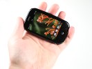
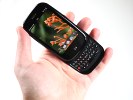
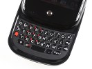
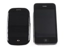
Palm Pre in our hands • The QWERTY keyboard • The phone was properly tiny
That freed up the 3.1” screen with 320 x 480px resolution to focus on touch-based multitasking. The touch sensitive area actually extended beyond the screen, creating a gesture area just below it.
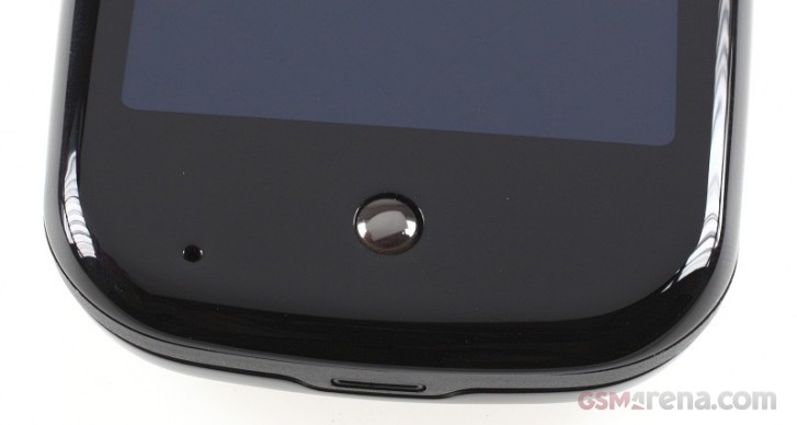 The gesture area below the screen and the Home button
webOS presented running apps as cards and allowed you to manipulate them as such. Swipe left or right to rifle through the cards, up to “throw away” a card. If you pushed it up (but not far enough for it to go off screen), you got an overview of running apps instead. You could re-arrange cards and as of v2.0, you could even stack them.
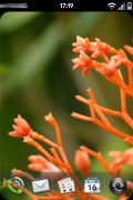
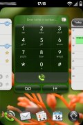
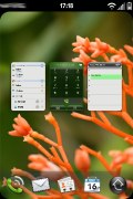
Palm Pre's card-based multitasking interface
These gestures should be familiar to modern iOS and Android users – they reserve the bottom of the screen as a sort of gesture area. Swipe up from there to close an app, sideways to switch to another app.
Another neat trick was that in landscape orientation the gesture area could be used to scroll through a web page or a document. That was handy when editing a document, but “meta-taps” were even better.
Essentially, if you touch the gesture area with one finger, you could use another to access keyboard shortcuts: press C to Copy, V to Paste, X to Cut, A to select All, you know how it goes. The gesture area acted like a sort of Ctrl key. On iOS and Android, the only way to copy and paste is to long press and pick out of a dropdown menu.
The app cards even had rounded corners. That was no coincidence as the phone’s screen had rounded corners years before it became the norm.
The App Catalog (as it was called) was pretty barren with only 800 or so apps at the time we reviewed the phone. We should mention that these apps were based on Web technologies (hence the name of the OS), and they could be resized freely to fit any screen – or just to shrink temporarily to make room for an incoming notification. If you’ve tried desktop mode on Android you would know that some apps still have troubles with resizing.
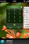
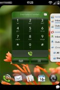
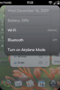
Incoming notification • Quick toggles
It was this flexibility that has allowed webOS to power devices with wildly different screen sizes – from smartwatches to TVs (and even some printers when HP was in charge).
The Pre’s computing hardware was nothing stellar even for 2009 – a single core Cortex-A8 CPU with 256MB of RAM isn’t much. And yet, at one point we managed to run 28 apps at the same time. Another time, we only got up to 12, but that’s still more than you might think would fit in just 256MB of RAM.
Note that despite appearing similar on the outside, Android and iOS app switchers show recent apps - not running apps. webOS showed running apps. This means that Android and iOS can pause apps if they need to free up RAM (in fact, that's all iOS did before it got proper multitasking) while webOS works more like your PC does.
This phone also pioneered wireless charging – the company was selling the optional Touchstone charger for $70, allowing you to live the wire-free life years before anyone else. This charger even fixed an issue that is still a problem for other phones today, alignment.
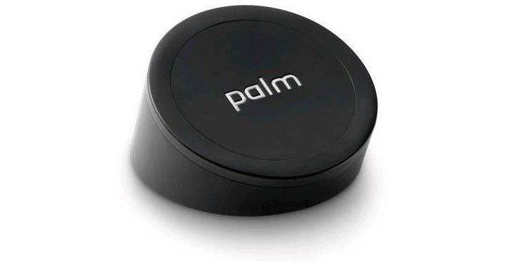
The Touchstone had strong magnets that held the phone in place (the charger was sloped, angling the screen towards you, rather than letting the phone lie flat). These magnets also helped guide the phone to the right position for the wireless charging to work.
Unfortunately, despite the prescient hardware and software features, the Palm Pre failed to attract consumers. And those who did buy the phone were soon faced with a number of issues. They ranged from cosmetic (the plastic shell was pretty brittle) to more serious.
Slider mechanisms always had a reputation for being unreliable and this one was no exception. Many reported that the mechanism on the Pre became loose and the two halves would wiggle when the phone was opened – a problem that was given the deceptively delicious name of “Oreo Twist”.
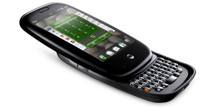
The Palm Pre did become the fastest selling phone on Sprint – Palm’s exclusive partner in the US – though that’s more a reflection of the carrier’s popularity than the phone’s true performance.
Bonus geeky fact: one way to activate developer mode on the Pre was to enter the Konami code.
PS. a new Palm device came out recently, but the it has little to do with the Pre other than the brand. It's made by a startup backed by TCL.
Related
Reader comments
- AnonD-1046991
- 18 Jun 2022
- G}R
Are you sure about that!?
- Anonymous
- 15 Mar 2021
- iUk
Do you know if you can still connect a palm pre to a phone carrier in the US. I still have mine and would love to be able to use it as a regular phone.
- Anonymous
- 19 Jan 2021
- YgL
Still Have mine sitting right here next to my desk. along with the hp pad. this was the closest anybody ever came to "the Iphone Killer" I installed Android on the hp pad when Cyngomod was supporting but never on the pre.

 Samsung
 Xiaomi
 Samsung
 Sony
Sony Xiaomi