Samsung Galaxy Note9 review
Samsung Experience 9.5 on top of Android 8.1 Oreo
The Galaxy Note9 runs Samsung Experience 9.5 over Android 8.1 Oreo. You'd then be getting 0.5 units newer experience than on the S9 and S9+ which are at 9.0, and a marginally newer version of the OS too (8.0 on the S9s). While it would undoubtedly have been great for the Note9 to launch on Android Pie, seeing as how the new OS version is already out, only the most naive would have expected that to happen. We like to think we aren't.
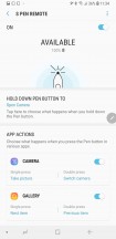
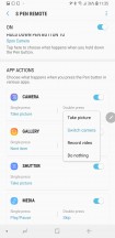
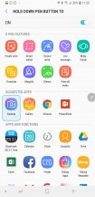
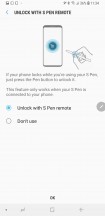
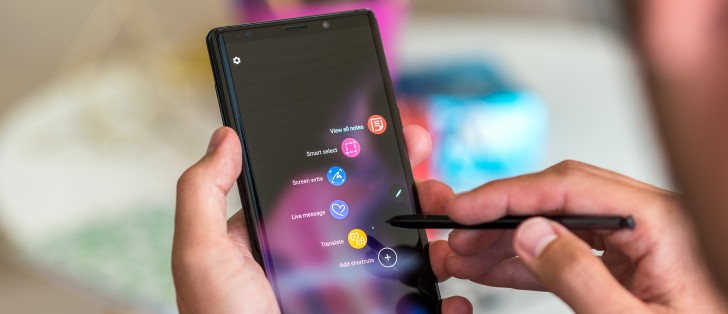
Since this a Note, let's go ahead and start with the S Pen. With the stylus now active, there's a bunch of new stuff you can do with it. The menu option is called S Pen remote, and that's where you can go to assign the long press action to launch an app, and to specify what the single and the double press will do inside that app and other apps. As it is, the long press can only be set to launch an app and not control anything inside one.
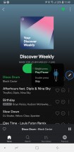
The default is long press to launch camera, single press to take a photo, and double press to switch between cameras. Within the Gallery a single press advances to the next item, the double press goes back, and the same logic applies in Powerpoint. In the music player, a press is play/pause, double press skips a song. It does work in Google Play Music and Spotify, even though they don't show up in the S Pen remote menu.
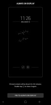
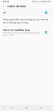
As before, if you just pull out the S Pen from its housing (without waking up the phone from standby), you can go right ahead and write a note, which you can then pin to the always on display or just save. There's an option in setting to 'Use S Pen signature color' - meaning you'd be writing in yellow on the Ocean Blue Note9, purple-ish on the Lavender Purple, and copper? on the Metallic Copper version.
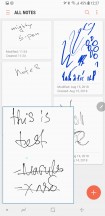
Samsung Notes is your go-to place for scribbling stuff. Your notes are listed chronologically, but you can also categorize them (by default there's a category for the screen-off memos), and you can see an expanded preview if you hover over a note with the S Pen (that's part of Air view, which needs to be enabled in settings). Each note can contain typed text, written text, doodles, images and voice recordings.
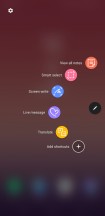
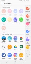
It's one of many ways to use the S Pen, though. When you pull out the stylus with the phone unlocked, the Air command menu appears (though that's a setting that can be turned off, or set to create a note straight away). You can have up to 10 shortcuts there, and those can be either S-Pen features or shortcuts to apps. You can't just put a contact there, that's for the Edge panels, though it's hardly practical to pull out the S Pen to call someone.
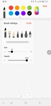
Advanced screenshot capture is one of the areas where the S Pen shines. Smart select allows you to take differently shaped screenshots, extract text from them, or pin them on the screen. Alternatively, you can create short GIF animations. Then there's Screen write that takes a fullscreen snap that you can write on with the full set of different pens and brushes (and then crop, if you will).
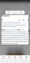
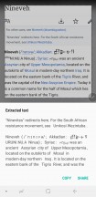
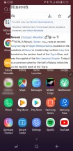
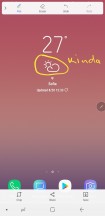

Screenshots are the S Pen's forte
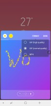
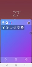
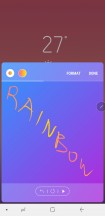
Live message was introduced on the Note8 and is here on the Note9 as well. You can record a GIF animation of your act of drawing, so that the other party can feel extra special by watching the message unravel before their eyes. Penup was pre-installed on the Note8, but it's missing in our build of the Note9's software. It offers a coloring book with a ton of drawing outlines for you to fill in and share (or not). If you're a better artist than that, you can go ahead and draw your artwork and share it on the Penup network. The app is still available in the Play Store.
There's a magnifier tool with a number of different magnification ratios. Meanwhile, Glance lets you have a tiny thumb of an app on the bottom of the screen, which you hover to evoke the full-size app. Translate does just what it says on the tin - it uses Google translate to give you quick translations when you point at a word. There's a toggle that switches between single-word translations and translating a block of text.
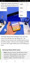
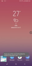
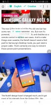
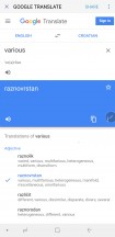
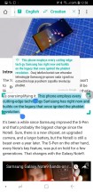
Magnify • Glance • Translate single word • Expand to Google Translate • Translate selection
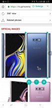
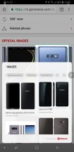
There's also Bixby vision for the S Pen. You point at an object on the screen, and Bixby does its magic of selecting what it thinks you're trying to select and then gives you the option to either look for similar images or do actions with the text if there is any.
There are numerous other smaller use cases for the S-Pen. For, example, you can hover over an image in the gallery for an enlarged preview, or over a calendar entry for more details. You can also scroll up and down by hovering the S-Pen over the edge of the screen.
Also, if you prefer writing input for form filling, you can set up a tooltip to appear when you hover above a field. Tap on that, and you'll go into writing mode.
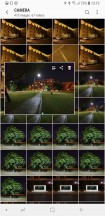
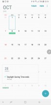
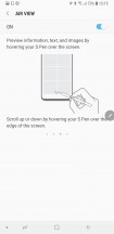
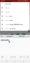
Preview on hover • Same in the calendar • Hover scroll • Direct pen input
Set the S Pen aside, and the Note9's software is almost entirely identical to what you can find on the S9+, complete with the reworked menu structure we weren't strictly fond of (still aren't, just gotten used to it).
The AOD and its clock styles are in separate places, mainly because you can have clock styles for the lockscreen as well as the AOD itself. All the new designs from the S9+ are here too.
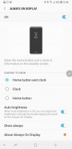
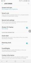
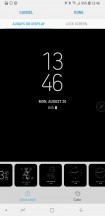
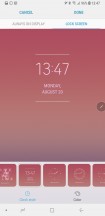
AOD settings • Lockscreen settings • Clocks styles are here
The lockscreen has the normal camera and dialler shortcuts (which you can reassign to any app), but in our experience, the lockscreen gets ignored altogether. The biometric unlock options (fingerprint unlock, or face, or iris, or the new Intelligent combination of all of those) are just too quick to get you to the homescreen.
Enrolling a fingerprint can be done in a single swipe, though you can tap if that's your thing. Unlocking is pretty fast, but, as usual, Samsungs aren't record-holders for speed. Iris unlock is better than both face and Intelligent for the more privacy-conscious as Intelligent will work with your eyes closed - when it can't find irises it looks for a whole mug.
You can, of course, have fingerprints enabled too, with either face, iris, or Intelligent Scan on at the same time. PIN, password, and pattern are also options, and you'll need one of them as a backup for the biometrics anyway. A simple swipe is there for those that just don't care.
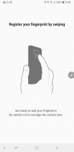
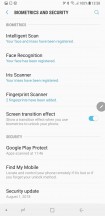
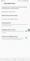
Swipe to enroll • All types of locks • Intelligent scan
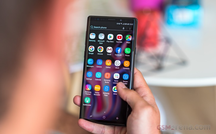
Experience v.9 builds on v.8's iconography with a new color for the Messages app, and a gradient for the Gallery icon, and that's about it on the surface. Folders still open fullscreen sending the apps up and away from immediate reach - some wouldn't even notice, but if you're coming from a Pixel, it's a bit of an annoyance.
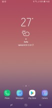
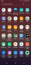
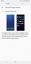
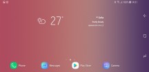
Homescreen • App drawer • ...or no app drawer • Landscape view
The notification shade hasn't changed either and the task switcher has the list view option, potentially saving yourself some scrolling if you like to keep a ton of apps open.
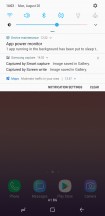
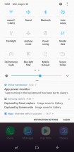
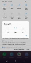
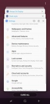
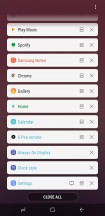
Notifications • Toggles • Toggle grid options • Task switcher: Thumbnail view • List view
Samsung's multi-window implementation has long been the best on the market (we remember the times it was the only one on the market). You can resize the windows to just about any ratio, you can swap them, and you can even have pop-up apps on top of the two ones that are in multi-window. Snap window is also available - you crop a small strip of an app, cutting away unneeded interface elements, and have it docked to the top or bottom of the display so you can have it always visible.
App pairs are here too in case you often use two specific apps together in a split screen view.
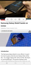
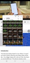
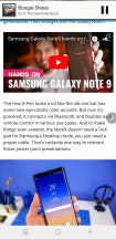
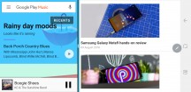
Split-screen multi-window • Pop-up view • Snap window • Multi-window in landscape
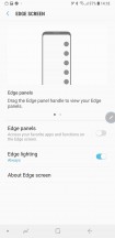
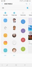
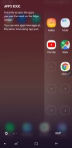
Edge panels, of course, are too as well - a set of panes slides in from the side with shortcuts to contacts, apps, tasks, tools or whatnot. Perhaps someone somewhere uses them. For that person, there's now even a task switcher of sorts - for the edge panels.
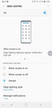
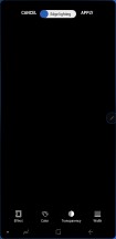
Edge lighting has gotten a redesigned interface for customizations - color, width, transparency, plus a couple of effects have been added. You could do most of it on the S8 too, but it was a little more obscure.
A bunch of familiar gestures and the likes are available just as on the S9 and S9+. To name a few, you can swipe the fingerprint reader to access the notification shade (was there on the S8, but with that fingerprint placement - no thanks), you can go into a shrunken-down one-handed more (either triple press home, or swipe in from a bottom corner), and you can launch the camera with a double press of the power button. Meanwhile, Smart Stay will use the front camera to determine whether you're looking at the phone so it won't go to standby if you're staring blankly at the screen for a long time. All of these can be switched off.
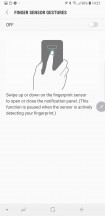
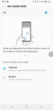
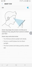
Notification access from the back • One-handed mode • Smart stay
The set of standard Samsung features present on the Note9 includes Secure Folder. It's where you can keep files, memos, and apps away from prying eyes. It's locked independently from the lockscreen - one can use a fingerprint, the other an iris. You can also install two copies of an app - one in plain sight and another one in the Secure folder. And you can hide the folder too, so people can snoop all they want and will not find anything suspicious.
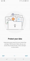
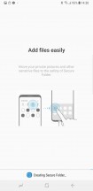
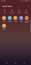
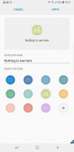
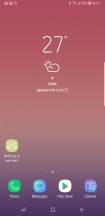
Secure folder: Intro • Creating in process • Inside it • Icon can be customized
Reader comments
- Bjorn
- 22 Dec 2024
- 3I{
Still use my Note9, superior phone
- Anonymous
- 29 Nov 2024
- ter
Still using the note 9..... Will give 5 stars
- derrr
- 14 Nov 2024
- 8aX
Nice feedback however in my experience there is one downside with the mobile and Samsungs "wisdom?" as they decided to remove Pro-mode in video and despite calls to re-introduce it they ignored the calls but re-introduced it it the next mod...
