Samsung Galaxy S8+ review: Infinity and beyond
Infinity and beyond
Unboxing
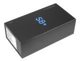
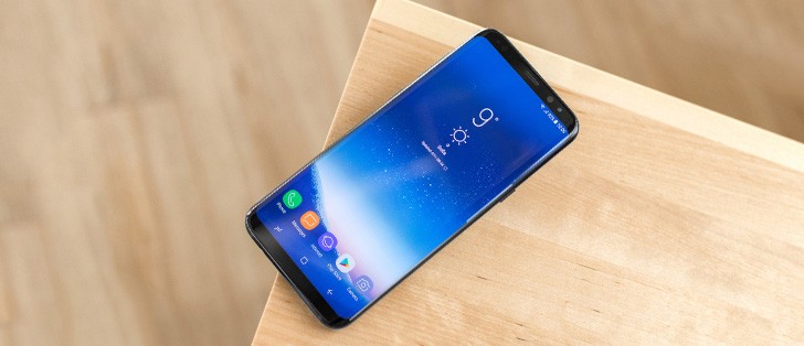
The Galaxy S8+ comes in a fairly standard black box with the name of the device on it. No fancy opening mechanism or special materials in sight and frankly, we would take exciting contents over a flashy presentation any day of the week. Plus, you don't really want to, or need to draw any attention away from the Galaxy S8+ that greets you as soon as you open the box. Even with a sticker on top for protection, the impressive curves and screen proportions still become instantly apparent.
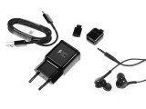
The S8+ comes with a USB 3.1 Type-C to Type A cable for data transfer and charging. Type-C is finally settling in Samsung's ranks, but that could require some transition. To facilitate it, there are a pair of rather odd adapters included in the box.
The bundled wall charger is the all too familiar affair. It's one of Samsung's Adaptive Fast chargers, rated at 5V at 2A or 9V at 1.67A. Interestingly enough, the same charger can also power the DeX dock. It, however, is rated for 12V of input and refused to work with a simple 5V/2A charger. There is also a SIM ejector thrown in the mix.
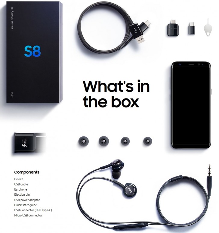
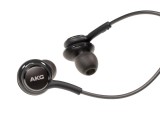
Samsung also decided to sweeten the deal by including a pair of wired earbuds in the box. These come courtesy of AKG and have a retail value of $99 on their own. But pricing is not really indicative of quality and we are happy to report the headphones sound really good - we got deep bass and nice and clear mids.
There are actually two drivers per bud - one 8mm and one 11mm. You also have a microphone, so you can make and receive calls.
Samsung Galaxy S8+ 360-degree spin
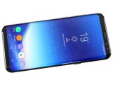
Once you manage to take your eyes off the seemingly endless 6.2" screen and take a look around the S8+, it becomes apparent that there is a lot more to its design. The symmetry is almost perfect all-around. The back curvature mirrors the front, to boost both the looks and handling.
The camera is almost perfectly flat on the S8+, eliminating any noticeable hump on that end as well. Good grip and comfort also benefit from the curve.
Size and proportions are one of the hot topics surrounding the Galaxy S8 and especially the S8+. 6.2 inches really sound like a lot. This is quite understandable, since 16:9 screens are all we were getting these past few years so we often forget to factor in the aspect ratio difference. Yet the new approach to bigger screens is to make them taller, 18.5:9 in this particular case. This all adds up to a phablet with an overall footprint of 159.5 x 73.4 x 8.1mm - quite close to the Galaxy S7 edge, with its 150.9 x 72.6 x 7.7mm. Sure, there is a small bump in both thickness and width, but nothing to really stand in the way of comfortable handling.

Samsung Galaxy S8 and S8+ • Galaxy S7 and S8+
So with the difference in proportions, diagonals are not directly comparable across the S7 and S8 generations. You'd be much better off thinking of the Galaxy S8+ as the spiritual successor to the S7 edge with some extra screen top and bottom than a dramatically bigger phone.


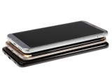
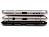
Galaxy S8+ next to Galaxy S7 edge and LG G6
Still, there is nearly a centimeter of added height, which combined with the slippery glass finish means you need to be extra careful to not let the handset slip in certain scenarios. The extra height means you will need to readjust your grip to a less secure one if you want to be able to reach all the way to top and bottom at the same time.
Circling back to the Galaxy S8+ design - its build and finish are nothing short of excellent. There is a polished aluminum frame all around and Gorilla Glass 5 on both the back and front. The IP68 water and dust resistance was achieved without any flaps to ruin the great impression the exquisite craftsmanship makes.
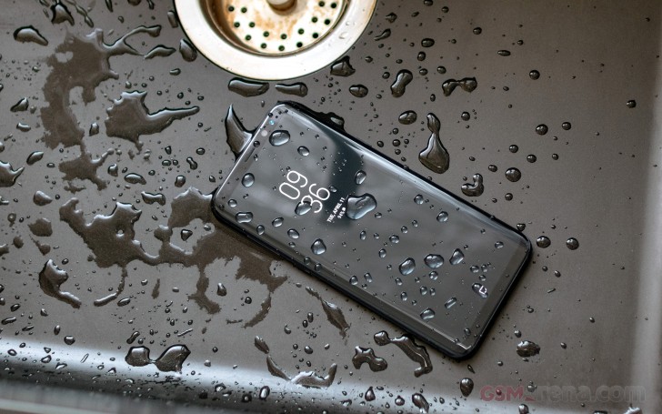
In terms of colors, you get a choice of Arctic Silver, Orchid Grey, Black Sky, Maple Gold, and Coral Blue - all pretty eye-catching. We also appreciate the subtle glitter effects, courtesy of the glass finish, even if it's nothing really new. The front of the S8+ is all black, regardless of the paint job chosen. This was definitely a good call on Samsung's end, considering there are a whopping six "cutouts" for various sensors on the top bezel of the device. French cheese would probably be the first thing to come to mind with any other choice of color.
Hardware overview
Speaking of the top bezel, the six holes (not counting the earpiece) are a veritable "who's who" of cutting edge mobile tech. On the far left, there is a dedicated RGB status LED, so even if you don't like Samsung's AOD solution, you can still know when your attention is required. Right next to that is the illuminator for the Iris scanner. The scanner itself is on the far right of the bezel. This dual setup is necessary, since this biometric sensor operates with IR light - invisible to the naked eye, but necessary for capturing the retina pattern. The Galaxy Note7 used the exact same arrangement.
Going back to the left side of the earpiece, we also find a traditional proximity sensor and an ambient light detector. Last is the 8MP selfie camera, which also powers the new facial recognition system.
The bottom bezel (or the tiny bit that's left of it) holds absolutely nothing. We presume Samsung still needed to reserve some space underneath for some components. Plus, the home button and navigation keys are low enough as it is. Home button? Yes, definitely!
In the absence of a traditional physical key, Samsung has turned to on-screen navigation controls for the S8 and S8+. The nice side effect is that you can swap the back and menu keys the way you like it.
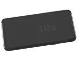
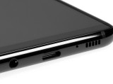
There is almost no bottom bezel left
As for the home button, it now has a special status and is fixed in the middle. Samsung didn't want to skip on tactile feedback entirely. There are some dedicated pressure sensors underneath it, so it continues to function even when the screen is off. Plus, a taptic engine gives off a nice little vibration on every press. It is pretty convincing and doesn't feel like the front of the phone is giving in - somewhat of a problem on recent Apple devices. We did find the force sensitivity a little low out of the box, but Samsung lets you adjust that.
The only real problem we have with the new navigation scheme, combined with the tall body of the S8+ is that it leaves the main controls sitting pretty low, relative to the whole device. Chances are you will naturally tend towards holding the S8+ higher up to take advantage of the extra vertical screen real estate. That, however, means your thumb needs to do plenty of stretching to reach the bottom left or right corners of the screen (depending on which hand you use).
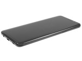
A lonely power button on the right-hand side
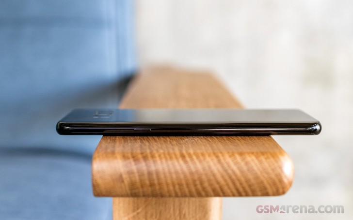
The sides of the Galaxy S8+ actually hold little surprises. A solitary power button sits pretty high up on the right.
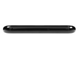
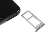
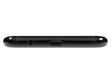
The top and bottom parts of the Galaxy S8+ frame are noticeably wider than its sides. This works well for housing the SIM card slot and a second noise-canceling mic on top. On the bottom, we find a USB Type-C port, the good old 3.5mm audio jack (phew, it's still here) and a single speaker.
It is disappointing that the S8+ has no stereo speakers - maybe understandable, given all the size constraints, but a Huawei-style hybrid setup, using the earpiece might have still been possible.
Finally, we have the left hand side, which houses the standard volume rocker and the all new Bixby button. In case you haven't heard already, it fires up Samsung's virtual assistant. Having a dedicated button is easily justifiable, since Bixby is intended as a constant helper all throughout the Galaxy S8+ user experience. Samsung's goal was to make it truly versatile, so it can take an active part in your interactions with the phone. It's an ambitious project for sure and we'll examine it in more detail in the software section.
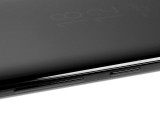
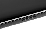
The new Bixby button is right underneath the volume rocker
By the way the modding community already has plans for the new hardware control. Samsung won't be offering any custom mapping functions for the button, but there are third-party apps that turn it into a fully customizable key akin to BlackBerry's convenience key of old. At least for the time being, that is. Samsung is reportedly implementing extra software measures to hide the Bixby button from modders. So, it's hard to say how things will play out in the long run.
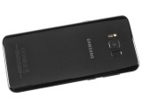
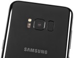
Before we complete the hardware tour there's something else about the back of the S8+ we have to mention. We already covered the fine selection of colors, nice and convenient curvature and the sturdy Gorilla Glass 5 finish. We won't really fixate too much on the single 12MP Dual Pixel camera, as it's mostly identical to the one found on the S7. We will, however, point out that Samsung's positioning of the fingerprint reader is less than ideal.
It is way too high up, off-center and right next to the camera lens. Guess what you'll constantly be tapping by accident while searching for the sensor. Samsung itself seems aware that this is an issue and has even added a notification in the camera UI, reminding you to keep the lens clean and smudge-free from time to time.
Still, if you opt for one of the S8+'s biometric unlock methods, you won't have to deal with the inconvenience too frequently. We guess that offers at least a little bit of consolation. Another little detail worth mentioning is that the single LED flash and heart-rate monitor no longer have dedicated cut-outs. Instead, they are positioned directly underneath the Gorilla Glass surface. Neat!
Reader comments
- Anonymous
- 18 Dec 2024
- x{6
Replace battery
- James
- 11 Nov 2024
- rrY
Nope im using the s8 plis in 2024 with the lattest android for s8 plus (android 9)and it does not have may be downloading third party apps might do the trick
- Anonymous
- 18 Sep 2024
- P%v
Does s8 plus have the network speed indicator feature
