Samsung Galaxy S8+ review: Infinity and beyond
Infinity and beyond

Android 7.0 with Samsung UX
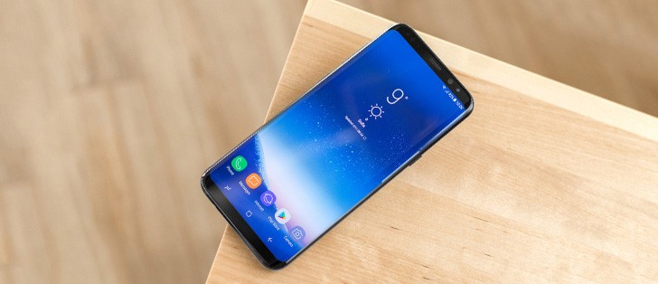
The Galaxy S8+ boots Android Nougat, but in typical Samsung style there are plenty of customization on top. The company's overlay now goes by the simple Samsung UX - the Grace UX name from the Note7 has seemingly died with the phablet itself.
And while the Nougat builds for the Galaxy S7 and S7 edge were mostly a direct reuse of the Note7's user interface design, the Galaxy S8+'s gets a thoroughly revised version with new iconography and other goodies. Before you get to those, however, there's an Always On Display to greet you, and all sorts of unlock options.

The AOD isn't different in principle to what we're familiar with from the S7's Nougat implementation. Only now it's been located in the Lock screen and security section of the settings menu, instead of Display, but there's a handy shortcut suggestion in the bottom of the Display section.
Anyway, there's a selection of analog and digital clocks to choose from, plus a calendar or image option. What used to be a Night clock mode on the S7 edge is now a separate mode of the AOD, which means that you can no longer have the full blown AOD in the day, and the Night clock at... um.. night. In this Edge clock mode you don't get notifications, by the way. You can still set a daily schedule when AOD will be active.
What is truly new is the Home button icon on the AOD, because, you know, the S7 and S7 edge had an actual button. It's a setting, and you can disable the icon, but the 'Home' area will still function, you just need to remember where to press.
Then there's the lockscreen itself which displays the standard Nougat notification feed with grouping and direct reply. There are two shortcuts in the bottom corners, Dialer and Camera by default, but you can change them to any app you want.


Lockscren • Shortcuts settings • Pick an app, any app
You may not get to see the lockscreen at all though, depending on how you choose to handle the unlocking process, and you're not at all short on options. There's the fingerprint unlock, but everyone's got that now, and given the location of the sensor it's not top of the list. Coming straight from the Note7 we have iris recognition, and if that's not enough for you, face recognition will scan and look for your mug. It's either/or, you can't have both iris and facial scan active at the same time, though the fingerprint sensor can work with either of those.


Screen lock settings • Either face, or iris, but why not both?
Iris recognition should theoretically be the safest, as fingerprints could be lifted off of a glass, for example. It works with a dedicated camera aided by an infrared illumination. In our experience, it unlocked the phone nearly instantly when you hold it the right way. Now that right way is the somewhat tricky bit, but you do have the preview to guide you. When there's bright sunlight pointing straight into the camera it may refuse to work, but other than that we had no problems, even in dark conditions.
Face recognition is picky, but in a different way - it failed on us when there's back lighting behind our pretty faces, and not really strong lighting at that.
Both face recognition and iris recognition can be set up to look for you as soon as you wake up the phone. Otherwise you'd need an extra swipe after coming out of standby. Then again, you'd be missing the notifications on the lockscreen entirely if you enable those options.
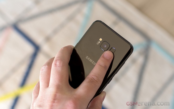
Which is what will happen if you go for fingerprint unlock - perhaps the fastest option of all, if you can find the sensor. Hint: it's out of reach, high up and off center on the back of the phone, where you'd be smearing grease on your camera lens when you try to use it. It's not the fastest fingerprint reader either, but it's always-on, no pressing or waking up required. It also completely bypasses the lockscreen.
There's always the option for a simple swipe unlock, no biometrics whatsoever, as well as PIN, pattern, or password. You'll need to set up one of those three as backup to the biometric methods anyway. Don't go with 0000 for PIN, please.

So many paragraphs, and we're only now making it to the homescreen. Meet Samsung's 'Light and Line' concept for icons and navigation keys. Starting with the latter, now that they're software, Samsung's figured it can give you the option of rearranging them to match Google's idea of Back-Home-Recents, instead of the the other way around. Blasphemy, you say? Relax, it's an option, you can keep it the Samsung way.
The stock icons look cool, there's no denying, and the simple and clear designs for the preinstalled apps make them easy to tell apart. You can have third-app icons on a padding with the same shape as the stock ones, or you can leave them as they are. Multiple grid sizes are available, and you can set them differently for the homescreen and add drawer.


Homescreen • Navigation bar settings • Icon settings • Icons with no padding • Homescreen settings
By default, you have no Apps icon to take you to the app drawer. Instead, you evoke it with a swipe up or down from pretty much anywhere on the screen. It's not the most natural implementation, though - on a Pixel, you practically drag the app drawer up from under the dock, while here you swipe up or down, and the app drawer just appears.
Also, why not keep the downward swipe for calling up the notification shade, which is practically unreachable without major adjustments in grip or thumb stretching? Anyway, you can have the Apps icon, if so you wish, but that won't change the swiping behavior.
Alternatively, you can opt for a one-level UI, iOS-style, where all your apps are on your homescreens and there's no app drawer.


App drawer • Sorting options • Apps icon in the bottom right • Single - tiered mode
The notification shade is nearly identical to what we had with the S7 and S7 edge's Nougat firmware, minus the search bar - that's Bixby's job now, If you ask Samsung. On the first pull only the first six toggles are displayed - just the icons, no text. Pull down a second time or do a two-finger pull (yes, that still works), and you get the full list of toggles, complete with text. Where there's contextual info to be shown, it replaces the button's respective title - under Wi-Fi you'd see the network you're currently connected to, under Bluetooth it's the headphones you have paired.
You can choose between three button layouts, or rather you can select between 3 and 5 icons for each of the three rows - that number you cannot customize. You can pick from 20 toggles in total, so if you want to have all of them there and you go for the 3x3 layout you're looking to have 3 panes of toggles.
Samsung hid the Auto brightness in a drop down menu next to the slider, which also contains a toggle than controls whether you have the slider displayed at the first pull or the second. There's also a red area on the slider where the phone warns you that brightness might strain your eyes - much like headphone volume warnings.


Notification shade: Default view • Brightness settings • Slider on first pull • Toggle rearrangement • Toggle Layout
Notification handling is one of the big changes in Nougat, and we're already familiar with how Samsung adopted it on the Galaxy S7/S7 edge - it's the same here. Gone are the separate cards for each notification - instead, it's more of a feed of notifications. If an app has more than one event to inform you of, the notifications from that app are bundled together, so things don't turn into an endless feed of Gmail messages, for example.
You can, however, unbundle those, and act on them one by one. You can go one step further and expand the card to see part of the message body, and then you can go ahead and reply straight from the notification panel. Google calls this Notification Direct Reply and the rationale behind it is to allow you to streamline your workflow and save you the hassle of having to go into each separate app.
Reader comments
- Anonymous
- 18 Dec 2024
- x{6
Replace battery
- James
- 11 Nov 2024
- rrY
Nope im using the s8 plis in 2024 with the lattest android for s8 plus (android 9)and it does not have may be downloading third party apps might do the trick
- Anonymous
- 18 Sep 2024
- P%v
Does s8 plus have the network speed indicator feature


